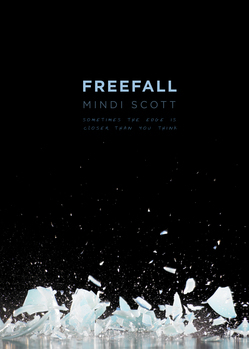
 Mindi Scott's debut, Freefall, has already garnered some impressive praise. The New York Journal of Books says, "In a genre overloaded with bubble-gum-pink teendom and paranormal dark fantasy full of fangs and fur, Mindi Scott's debut novel Freefall stands out as fresh, realistic, young adult fiction... sure to be one of the best contemporary young adult books of the year."Very cool. And the cover? It's stark and mysterious. Here's Mindi to share the story:
"The day I saw my cover for the first time, I kept my Twitter followers in the loop. But I was secretive about it, so they had no idea that that's what I was doing.
"After hearing a rumor that I might be seeing the cover art, I tweeted this: 'Something cool(ish) might happen today, but it probably won't. I should really unplug the internet so I stop checking my email!'
"A little more than an hour later, my editor sent an email with the subject line 'COVER!!' In her note, she mentioned that at the meeting for the sales, publishing, and marketing team, there were literal sharp intakes of breath around the room when the cover art for Freefall was revealed.
"While preparing myself for what I was about to view, I posted this on Twitter: 'Heart is racing.'
"I clicked to download the attachment and held my breath while I waited. And then, this appeared on my screen:
 "I stared at it.
"I thought: I love it!
"I thought: It's gorgeous!
"I thought: But... what does it mean?
 "You see, before seeing the cover, I really didn't know quite how this book was going to be marketed. I mean, I knew that Pulse was comparing Freefall to Jason Myers's novel, Exit Here, right. (I like to say that my book is "Diet Exit Here" or "Exit Here Lite.") I knew they were hoping Freefall would have appeal for girls and for guys. I also knew that they were intending to go with a 'mood piece' for the cover and that the characters would not likely be depicted.
"So, I stared at my screen, at this darkness and beautiful broken pieces and thought, What does this awesomeness have to do with being in a band and taking an interpersonal communications class and trying not to be a screw up and falling in love? Connecting with people will bust you up? What?!
"I exchanged emails with my agent, telling him that I loved it, but I didn't quite understand it. He gave me his take. I forwarded the cover art to one or two or maybe three sworn-to-secrecy friends. We talked it through. There were a couple of different interpretations. I quickly decided, though, that it didn't matter if I understood what my cover meant because I was totally, one hundred percent IN LOVE with it.
"Having come to that conclusion, I tweeted this: 'The cool-ish thing happened, and it was everything I'd hoped for. It was even cooler than cool-ish! [/deliberately not telling yet!]'.
"A short time later, my editor emailed asking if I had any ideas for the missing tag line and I said: Oh, gosh. Not off the top of my head, no! I'm not actually sure what we're saying this story is about at this point. :-)
"She responded with: You know, I keep using your line from the book that says Seth was the last person to see his best friend Isaac alive, and the first to find him dead. But that's a little long for a tag line on the cover... that's definitely the hook we're going with, though.
"And THAT is when it finally clicked for me. I had to be hit over the head with the meaning, but I got there eventually.
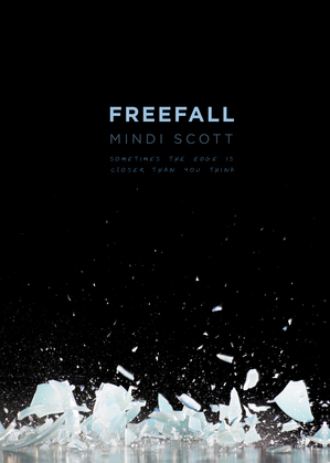
"So here is the final cover along with the tag line that Alyson from Aladdin came up with:
 Thanks, Mindi! I agree that it's an arresting cover, and "Sometimes the edge is closer than you think" sounds like a great movie tagline to me! I really like the clear blue playing off the black in both the ice and the type.
What do you guys think?