 I got an early copy of Mary Hanlon Stone's Invisible Girl, and by the time the final copy was ready, the cover had completely changed! Intriguing. I had to ask Mary what she thought.First, something from the back cover of the book, which is beautifully written. Meet Stephanie, a girl from Boston who's abandoned by her mother and sent to live with a family in Beverly Hills:
Everyone's been asking me questions about my life in Boston. I'm unaccustomed to this much attention, but I've already learned from watching Eva talk about her math and science award that I should appear reluctant to discuss myself. So at first I protest that nothing I do is very interesting, and then I spit out a string of lies, one at a time, like a rainbow of glass beads. Once the lies are out, they grow arms and legs and silent, stoic faces that guard my secrets of unwashed hair, stale snacks from greasy boxes and cold walks home from school in shoes that have long been too tight. The lies surround me with their golden shields and ice-tipped spears, letting no one look in and see my motherless life.
So lovely! Now, here's Mary on the cover:
"I never even thought about the cover as I was writing. I was just living in Stephanie's world! By the time the decisions for the cover were made, I was deep into writing the first draft of the book that's coming out next Spring, The Comedown Life.
 "The first time I saw the first cover I thought, Wow, they really captured how Stephanie tried to be invisible while at the same time being out in public. I really liked it, but I have to admit, when I saw the new cover, I liked it even more because it still had the element of invisibility but also added the lightness and hopeful element upon which the book ends.
"I don't know if the cover is a stock photo or from a shoot, but a lot of the kids who have seen both covers are dying to know who the invisible girl is!
"I really love my cover. It has a sense of mystery about it that is misted with hopefulness and longing. It is very much like Stephanie herself."
 Thanks, Mary! I do like the mystery in both covers. The second and final cover definitely has a breezy, summery feel that captures the protagonist's new world -- it almost makes me think the girl on that cover isn't the main character at all, but someone she meets in LA. Though her protective stance -- legs up, arms crossed -- says a lot and seems to be in line with how Stephanie feels. The first cover seems to focus on the darker side of the story, and it actually reminds me of the hardcover for Chasing Windmills by Catherine Ryan Hyde (left), which is a Lookalike cover with some other books (thanks, Alea!). What do you guys think of this cover change?
PS-Here's the trailer:
Cover Stories
Cover Stories: Shade by Jeri Smith-Ready
 Jeri Smith-Ready stopped by on her Girlfriends Cyber Circuit tour to talk Covers. Her latest book, SHADE, is the first in a young adult urban fantasy series about a world of ghosts only the young can see. When Aura's boyfriend meets a most untimely end, she is forced to reconsider her relationship with the living and the dead.
Ooh! Here's the deal with that dark and stormy cover:
"I imagined your typical young adult urban fantasy cover for SHADE--girl's face, maybe half cut off. I've always loved Simon Pulse's covers. They're so sophisticated and evocative, so my expectations were pretty high. Since violet and red are important elements in the story, I assumed they would be used on the cover.
"My editor sent me their ideas for the cover concept, but it was more of a, 'Here's what we're thinking' rather than a 'What would you like to see?' e-mail. Which is fine, because I'm so not a visual person. I would've been like, 'Um, how about a girl's face, half cut off? Maybe some swirlies? Oh, and definitely use black.' So helpful.
 "The first time I saw my cover, I was Blown. Away. Seriously. I've been super lucky with all my covers, but when I saw the SHADE cover and jacket wrap-around, I cried. I felt like I was in the presence of genius--the designer was Cara Petrus, who designed the House of Night cover series (see book 1, Marked, right) when she was at St. Martin's. She's a goddess.
"My only comments were a series of incoherent noises of glee, so my agent was the one to respond with, 'We unequivocally LOVE THIS SO MUCH. We love EVERYTHING. Really. Home run...THANK YOU THANK YOU THANK YOU!!' "Oh, and when I met Cara in November, I had a doughnut in my mouth, so all I could do was bow to her, Wayne's World 'We're Not Worthy' style. I'm pretty sure she thinks I'm a dork, and I'm also pretty sure she's right.
"There were no changes, other than to add a tagline and cover quote, plus a short scene on the back cover. They also changed the font on my name (see the full jacket wrap photo for the original font, below). It probably changed before I saw it, though.
 "It was shot with a model one night on a Brooklyn rooftop. I need to find out which building so I can visit it and take a picture.
"I adore it even more in its final version. The cover is a soft, luxurious matte, which I cannot stop touching (it's really pathetic how in love I am). The title is debossed on the front and spine, so I keep touching that, too. It's a total sensory experience (except it doesn't smell, and I've never tasted it--I'm not THAT in love).
"One thing I didn't notice at first glance was the clouds in the background, depicting the night sky, which is an important element in the book that Aura shares with the 'other boy' in her life. I loved that Zachary was honored in the cover a little, too, because Aura did star-gazing with him for a school project. I like that the cover manages to tie in so many different elements of the book so gracefully."
Thanks, Jeri! I love a multi-faceted cover. This one reminds me a little of Bleeding Violet and The Soul Screamers series (click for those Cover Stories). It's definitely gorgeous, and the book itself is getting great buzz. A starred review in Publishers Weekly says, "Smith-Ready changes the world completely by simply changing our ability to see."
Nice! I am all for world-changing books.
What do you guys think?
Cover Stories: It's Not Summer Without You by Jenny Han
 Jenny Han shared the Cover Story for The Summer I Turned Pretty last year, complete with inspiration board and amazing on-set back story. Now, she's here with tales of the sequel, It's Not Summer Without You, which just came out last week.
Here's Jenny:
"I actually didn't really have too many ideas or preconceptions for It's Not Summer Without You. Since it's the second in a series, I knew it had to be of the same mood/general look as the first--and I truly loved the first (below). My one thought was, since the first one is so up-close and intimate, I thought the sequel could maybe be from far off.
 "We weren't able to get the same model from Book 1, because she is (obvi) gorgeous and busy and on the cover of Nylon now or whatever. But, after much debate and back and forth, we found someone we liked just as much. We knew that her face would be somewhat obscured, so as long as Belly's 'essence' (ha!) was there, it was all good.
"As a birthday present to me, my editor invited me to come to the set. Best birthday present ever! The set was actually on Rockaway Beach at Jacob Riis Park. There was me, my editor, my book designer, the models, the photographer, and the makeup artist, who kept spritzing the models with some sort of beachy hair tonic. I mostly stayed quiet and watched them work their magic. Everyone was lovely and I just felt honored to be there.
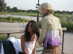 "The one thing I asked for after the fact was to sprinkle some (digital) freckles on Belly. The first model had lots o' freckles and I loved them and I wanted to keep that consistent.
"I love the end product and I truly hope the readers will too. Much love to the designer Lucy Cummins, who works very hard and is pretty much brilliant!"
I just adore the beachy summer feel of these covers, and they certainly depict the books' insides (two boys!) well. Also: Love the on-set shot. Thanks, Jenny!
What do you guys think?
Cover Stories: The Karma Club by Jessica Brody
 Jessica Brody runs Free-Book Friday, of which I am (naturally) a fan! Her debut YA novel, The Karma Club, came out this week, and I invited her over for a little cover talk as a stop on her Girlfriends Cyber Circuit tour.
Here's Jessica:
"When I first saw the cover: Oh my God, I fell in love with it...instantly! They actually showed me two different ones and my editor told me beforehand that this one was her favorite of the two and I couldn't have agreed more! I am pretty bad at envisioning covers so I really didn't know what to expect. I just wanted something fun and colorful because I think that represents the book and that's exactly what I got! It's my favorite cover thus far!
"The only suggestion I made was that they separate the "R" and "M" in Karma because when blended together, I was worried it would look too much like The Karina Club. They agreed and it was quickly changed. "This was actually a stock photo from Getty Images! My editor later told me that they did do a photoshoot with a model but she didn't think it came out right so they set off to look for a stock photo instead. I never actually saw the original cover, although I am very curious!"
So am I! I have seen this photo because it's a favorite avatar of book maven Little Willow! I adore the image, and I also like the idea of karma messing back with someone. What do you guys think?
Oh, and here's the trailer for the book, so you'll know more about it!
Cover Stories: 3 at Unabashedly Bookish
I've been posting some Cover Stories over at Barnes and Noble's Unabashedly Bookish blog, so I wanted to shout them out here, with excerpts: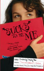 Sucks to be Me by Kimberly Pauley. "For the first book, Sucks to be Me, I actually made a cover mock up with one of those old-school notebooks and a goofy-looking fanged bat. It was really silly. I'm glad they did what they did instead!"
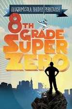 8th Grade Superzero by Olugbemisola Rhuday-Perkovich. "The original title for a long while was LONG TIME NO ME, and I had a lot of thoughts of black/dark blue cover, lower case text, very sparse, very not kid-friendly..."
 The Handbook for Lightning Strike Survivors by Michele Young-Stone. "I figured my best bet was to leave all cover ideas to the professionals. I write books and they sell them. Then, the first two covers arrived wrapped around other books -- so I'd get a sense of the jackets. I did NOT like either one, and I was supposed to choose which one I liked best. I didn't know what to do..."
Like these covers? I do! (Especially note the sneakers on 8th Grade Superzero -- genius!) Click the titles to read the full Cover Stories.
PS-Today is the last day to enter the Gimme a Call contest... go!
Cover Stories: Something Like Fate by Susane Colasanti (+ Contest!)
 Last year, Susane Colasanti shared the Cover Story for her Dawson's Creek-esque image on Waiting For You, and now she's back with a new release--Something Like Fate (a book I dropped in Madrid for Operation Teen Book Drop!).
Also, I have an extra ARC of this book so one lucky commenter will win that, too. Just comment below and leave your cover thoughts before May 5th.
Take it away, Susane!
"Before Something Like Fate, my book covers shared a similar theme. They all featured a boy on the left and a girl on the right with their faces hidden in some way. Plus, they all had a sweet natural lighting effect. Right before Waiting for You came out in paperback, shiny new editions of my other paperbacks were released. The goal was for all of my books to share a uniform look by branding them with new stripy watercolor patterns on the spines. I was so exited about this change! The new spines really pop on the shelves.
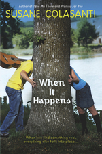
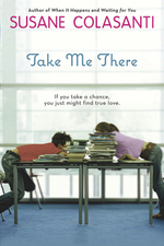
 "My publisher wanted the cover of Something Like Fate to look a bit different. Instead of the usual boy/girl image, she felt strongly that one boy and two girls should be featured on the cover to emphasize the lovers' triangle. I think a stock photo was originally found, but didn't seem quite right. So they had a photo shoot for the cover. It was held at a studio in Chelsea with models from Ford Models. The girls were in high school (their moms were there) and the boy was a few years older. My editor was there, which is how I know some of the behind-the-scenes details.
"The setting is supposed to be an old-school ice cream parlor from the book. At first, they were going to use real ice cream in the photo. They went out and got all of this ice cream, but it ended up melting because it wasn't used. They tried some poses at a counter with the models sitting on stools. Between the models' legs and the chair legs, the image looked too busy. The couch was already there in the studio (although I think my cover designer changed its color to purple), and it was clear that by using the couch as a backdrop for the finger touch, readers would get an immediate sense of what the story's about.
"When I first saw the cover...well, I was less than thrilled. It seemed a bit Gossip Girl to me. Not to dis Gossip Girl - love that show! - I just didn't think it quite matched the tone of my book. It was a shock to see two girls when I was used to just one. I didn't get what a plush couch was doing in an ice cream parlor. Isn't that a recipe for disaster? And the couch seemed huge to me. It was taking up almost half the cover!
 "I loved the fonts and colors, though. I'd requested a pink/purple color scheme, which came out really well. I liked everyone's clothes and the boy's bracelets - those are his actual bracelets he came in wearing. I also liked the big window because it offered an opportunity for natural light. But the initial cover had a much harsher lighting effect that looked fake to me. I asked for the lighting to be softened, which it was. I also asked for the ice cream poster that's hanging in the window to be changed. The original poster was really cheesy - I wanted something with a more vintage look. My contract says that I get a cover consultation, so my feedback was accepted and those changes were made.
"The only change my designer couldn't make was that I wanted to see more of the models and less of the couch. But now I realize that the back of the couch needs to be that high to draw your eye towards that perfect finger touch, which was really hard for the photographer to capture. The models tried all sorts of different poses before nailing that one. They tried holding hands at first. That didn't look right. And if the girl on the left were any closer to the others, it would have changed the tone. I appreciate how difficult it was to create that one awesome shot.
"The response to the cover has been amazing. I've definitely come to love it. I think I just needed some time to get used to the different look. And seeing the cover before the final manuscript changes were made helped because I was able to write that purple couch into the ice cream parlor scene. Now everyone will know that the couch is legit!"
Thanks, Susane! I really do think the cover perfectly conveys the love triangle in the book, and that finger touch is just so lovely. Plus, I hadn't thought about the "natural light" theme in all these covers, but seeing them together definitely highlights that. Pretty!
What do you guys think?
PS-Visit Susane on her website, blog, Facebook, MySpace and Twitter.
Cover Stories: The Cinderella Society by Kay Cassidy
Kay Cassidy has been having a huge launch party (including prizes galore!) for her debut novel, The Cinderella Society, so of course I had to invite her over for cover talk... here she is: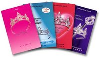 "I envisioned the cover of The Cinderella Society in the vein of the Princess Diaries boxed set (volumes 1-3) with the cute pillow and tiara. Although with slightly stronger colors so the glass slipper would really pop. I liked the feminine feel, though I figured mine would probably be in the purple spectrum since lavender is the color of The Cinderella Society.
"My cover was kind of funny because I actually saw it on the Advanced Reader Copy (ARC) when it was just a filler! I thought my ARCs were going to have plain covers because they couldn't find a cover comp they really liked, so I was thrilled when the ARCs arrived with the pink boxes and glass slipper mockup. The edges of the boxes were rough and unrefined, but I thought the design was very striking, especially with all the dark covers dominating bookstore shelves.
 "In the meantime, my editor kept having the designer go back to the drawing board on the cover. But after several weeks of them having the ARCs in their office and having people see it and immediately pick it up with an 'Ooo,' my publisher decided that maybe they'd already found the winner. My editor asked if I would be comfortable using a version of that as my final cover, and I was delighted.
"I think it's a mix of stock photo and a shoot. The glass slipper was a stock photo (which was great because I was able to buy it so my marketing materials were an exact match) but I think the boxes part was created by the designer herself.
"But actually... now that I think about it, I had looked for a glass slipper graphic a few months earlier on one of the big stock photo sites and couldn't find one. But after my cover came, I went there again and found one that was an exact match. So maybe it was the designer who created it and made it available as a stock photo. I wonder!
"I'm still very happy with it. I haven't noticed anything that I wish had been changed, so it's been wonderful. I think every new author freaks out about their cover (I had nightmares mine was a cartoon), so it's a HUGE relief to have a cover I love."
Ooh, as someone with a cartoon cover that has been hotly debated, I hear you! Thanks so much, Kay! I think this cover is fairy tale perfection. You guys?
Cover Stories: Mia the Magnificent by Eileen Boggess
 I usually feature Young Adult books in the Cover Stories slot, but today I have Middle Grade author Eileen Boggess talking about her Mia trilogy.Here's a little about the latest book, Mia the Magnificent: "Mia Fullerton's life so far has been a series of misadventures, sometimes exciting, sometimes mortifying, and always hilarious (to anyone but Mia). But having already battled her shyness in Mia the Meek and acquired new confidence in Mia the Melodramatic, Mia has to face her greatest challenge yet--independence--in Mia the Magnificent.
Take it away, Eileen!
"I have absolutely no artisitic talent, so I had no idea how my cover should look. Fortunately, my editor, Bruce Bortz, hired Tammy Grimes to design the cover for Mia the Meek and I loved it! I have been happy with the covers ever since.
"For Mia the Meek, Tammy designed three covers and Bruce asked which one I liked best. Both of us agreed that we liked the same cover, so it was easy.
 "For Mia the Melodramatic, there was a little more input. At first, I thought the cover should have Mia dressed as a clown. But when I saw the design, I thought it was a little scary and too childish for middle grade readers. Plus, I discovered there are a lot of people who are scared of clowns, which isn't a good thing when you are trying to sell a book! So, after a lot of revisions, Tammy came up with a cover that truly showed Mia's growth as a character (right).
"The only input I gave for the cover of Mia the Magnificent was that Mia has brown eyes, not blue. I have been very fortunate that Bruce lets me have input on my cover designs. I have heard from many authors that they have had no say on their covers.
"Only the cover for Mia the Melodramatic changed drastically. The rest were great from the start!
"The covers were drawn specifically for my books.
"I like how the covers show Mia's growth as a character. In Mia the Meek, Mia's face is hidden and she is reaching for a flower (which to me represents Mia reaching for greatness). In Mia the Melodramatic, Mia's face is partially shown and she is holding the flower, but it is limp (which represents that Mia is not quite there, yet). In Mia the Magnificent, Mia's face is fully shown and she is holding a perfectly healthy flower (which to me represents she made it!). I also like the lights in the Mia the Magnificent cover, which can be interpreted as headlights or spotlights."
Here's the trio together:


 Thanks, Eileen! I love the colors and the almost comic-book pop of these covers. I think Mia the Meek is my favorite--her hair hanging down is really touching somehow. Also, I'm glad Eileen piped up about the clowns. Totally scary to me too!
What do you guys think?
Cover Stories: When the Stars Go Blue by Caridad Ferrer
 How great is this title (any Ryan Adams fans out there?)? How great is this cover?
Especially because I'm still in Spain (for one more day! Ahhh!) and this is muy flamenca, I had to share the image. Barb (Caridad) wrote her own Cover Story on her blog, and here's an excerpt:
"I don't know why I gravitated to so many of the back-facing portraits. Generally, I'm not a huge fan, but I think it's because even with their backs to the viewer, the models have such life and movement. It's as if I'm breathlessly waiting for them to whirl around, in a blur, and execute a series of lightening fast steps. I can almost hear the clicking of their heels and the sharp clapping of their hands."
Awesome. Go here to read it all!
Cover Stories: The Demon's Lexicon by Sarah Rees Brennan*
 Sarah Rees Brennan cracks me up. Read her Cover Story for the paperback version of The Demon's Lexicon (which is out later this month) and you'll love her too. (Oh, and here's a review of the book by Kate of Read This Book!, in case you want to know what's on the inside... and she used the UK cover so there's one more visual to take in).
Here's Sarah:
"You know, I didn't have an idea for the cover! I'm really not visual at all. When people started suggesting ideas, I kept saying 'Oh, that sounds lovely!' in a dazzled way, like a kid in a really exciting museum. 'Ooooh, yes, that! Ooooh, yes, that!' 'Sarah, you can't have twenty different covers.' 'Oh.'
"My publisher just said 'We've got James Porto to do your cover!' and I said 'Oh my gosh, THANK YOU' and they said 'Hang on till we show you something' and then I waited... and waited... for seeeeveral months. On my fainting couch. When the cover came, I was so nervous I shoved my computer towards my housemate, and asked her if she'd look at it first!
"Well... the initial version was a little different from this current one, and I will say that I went 'Oh please could we change some stuff please' BUT... I asked for some things I thought would make all the difference to the cover: something more active, in which the guy really seemed like he was doing something interesting.
"The art department responded to my suggestions. Boy did they! As you can see, the guy is hella doing something now. And the tornado, which was always part of the cover, is interacting with him in a whole new way, which I never expected and was wowed by.
"The (gorgeous) colour palette is the same, and the storm and rocks that frame the picture, but they used a different shot of the model and added the urban buildings in the background to show the book's set in London. And my friend Saundra Mitchell suggested that the title be cut by his sword, which I thought was so brilliant I feared even to hope that suggestion would be taken! But it was. I was so thrilled!
"I know the guy on the cover was a model. Sadly I do not know things I think it vital for me as an author to know, like 'his name', 'his address' or 'his phone number...' I like how he looks both angry and haunted, though. Angry and haunted about me not knowing his phone number.
"I'm thrilled it represents the book so well: that it looks like there is action, and danger (and dangerous actions!) and I love how, when you look at the storm closely, it could be a flock of sinister birds or buildings disintegrating in the wind. Which fits into the book pretty neatly...
 "I don't know if I'm allowed share the earlier version, but inspiration images, I can totally do! Here's Ed Westwick, who will soon be playing Heathcliff (the role he was born to play!) and Toby Stephens in the latest version of Rochester. I think that the dangerous, more-edgy-than-knives heroes - currently often vampire, werecreature or other supernatural beautiful beast - which are so popular today owe a lot to these villainous heroes of literature.
"Since we always see these characters from other characters' perspectives, I wanted to get into the head of a villainous hero, and so I thought back to the good old... morally ambiguous old days, and tried to take apart mad, bad and dangerous to know from the inside out. And now here he is coming out swinging!"
![]()
So much fun, Sarah! Thank you! I love the action of this cover, and I have to say I really liked the stillness (and, um, the cheekbones) of the hardcover version as well, left. So what do you guys think of these covers?
Oh, and here's the cover of the sequel, out in May.
*Pre-posted! I'm in Spain!
