susane colasanti

Cover Stories: Now & Forever

Susane Colasanti's Cover Stories always signal the start of summer for me -- hooray! Here's Susane with her latest:

"The hottest thing about the cover of Now and Forever might be that the models are a couple in real life.

"Or maybe it’s how the background image totally captures the excitement of a concert. And not just any concert. Now and Forever is about a girl whose boyfriend, Ethan Cross, is the world’s biggest rock star. So of course we had to do some kind of concert venue type design. I couldn’t wait to see which direction the art department would take.

"My contract says that I’m allowed cover consultation. When my editor sent me the first draft of the cover for feedback, something very obvious was missing in the audience. Screens. Not one hand in the air was holding up a screen. I suggested that a few screens be added for accuracy. Fortunately, the cover designers found a background stock photo with someone holding up a screen. There should probably be more screens to reflect how concerts (and life in general) are viewed in 2014. But showing only hands represents the old-school tone of my stories in a way that brings me right back to 1988. Madison Square Garden. Fourth-row floor seats. New Kids on the Block. Before we watched real life through screens, before we worried about getting the best pic to post on Facebook, before we could just go to iTunes and play whatever song we wanted, it was just us and the music. Immersed in the moment so deeply you never quite manage to emerge completely. Connecting in a profound, authentic way impervious to distraction. The elation of musical obsession was the best feeling for me as a teen. It’s a feeling I tried to evoke in Now and Forever, and a feeling the cover evokes as well.

"The cover didn’t change much from the initial design to the final. There was a photo shoot with the models. The initial cover had a stock photo of a boy and a girl kissing in the foreground to illustrate the concept. The background stock photo changed. The spotlights were blurred. That’s about it. I think the cover is gorgeous. I love the gold light on stage and how the book jacket has a shimmery effect that glitters gold in the light. The shimmery effect was something I asked for. I’m stoked that it worked out! Being the massive book nerd I am, I am also compelled to point out what’s happening underneath the jacket: a turquoise cover with pink foil text on the spine. Pink foil text rules.

"There is one thing that’s confusing about the cover. The boy model represents Ethan Cross. Why would Ethan be in the audience of his own show? Shouldn’t they be kissing backstage? I thought that would have been a cool concept for this cover: Sterling and Ethan backstage, looking out at a crowd of fans. But maybe they’re at someone else’s show. Maybe this was before Ethan became so famous he wouldn’t be able to go to a concert like this. Maybe there’s another story behind this cover story…"

Thanks, Susane! US residents can enter to win a copy of Now & Forever below. Good luck! (Also: Hot trailer ahead.)


For more information about Now and Forever, please visit Susane Colasanti's website: http://www.susanecolasanti.com/ Thanks to Ben Bowers and Lily Zahn for bringing Ethan and Sterling to life.

Cover Stories: All I Need by Susane Colasanti

cover1Susane Colasanti posted about her cover shoot over on her blog, and she told me I could snag an outtake and a quote, so I did! "Authors usually have zero input in the planning process when it comes to cover design. Fortunately, my editor asked for input before this photo shoot took place. I told her I’d love to see the models in Vans and flip-flops. Just like Seth and Skye wear in the book. After trying them out, the photo shoot art director decided that barefoot was a better look. Which totally worked out for the best. I love the heart as a tool for hiding their faces. Faces are always hidden on my book covers so you can imagine what the characters look like yourself. The endless possibilities for hiding models’ faces is astounding."

Check out her full story here. So cute.

The final cover:

Colasanti_AllINeed_PreSales.indd

Cover Stories: Keep Holding On

Susane Colasanti has shared many Cover Stories here, including Waiting For You, Something Like Fate and So Much Closer (on that post you can enter to win a copy of the paperback until Wednesday--go!). She's back now with a new book that fits right in with her signature cover style.

Here's Susane:

"Keep Holding On focuses on the consequences of bullying. A lot of the story takes place at school. So I love that this cover features a school setting. The photo shoot took place at a high school in New Jersey. The male model, Ryan Haagen, contacted me after I posted the cover on my blog. How awesome is that? He’s even going to share about the photo shoot for an upcoming feature I’ll be posting before the book comes out on May 31.

"There were two visions I had in mind for the cover of Keep Holding On. I imagined the two main characters, Noelle and Julian, sitting on a bench outside the coffeehouse they went to on their first date. I pictured Noelle leaning against Julian in a way where you couldn’t really see their faces. I also pictured pink lights in the trees on either side of the bench and the coffeehouse window behind them. The second vision was Noelle and Julian in front of her locker. I saw them sitting on the floor leaning back against the lockers. Julian was turned to Noelle, hugging her, and she was looking down. So again, you couldn’t see their faces.

"When I saw the initial cover design, I was happy to see that they went with the school setting. And that there were lockers! It’s always fun to visualize your ideal cover and then have part of it come true. You can’t see the models’ faces on my book covers, so I was a bit concerned by how much of the girl model’s face you can see on this cover. But I think it’s just enough to give readers an idea of what she looks like while allowing for some imagination. I love my readers to be able to imagine the characters in their own way.

"My favorite part of this cover is her purple Converse. Those sneakers were plain at first. I asked for them to be written on because that’s what Noelle does with her sneakers (and what I did with mine in high school). I also asked for locks to be put on some of the lockers. The photo shoot took place right before school started, so the lockers didn’t have locks yet. Which didn’t look realistic. The orange star patch on Julian’s bag is another detail I asked for. His bag has that star on it in the book. I thought including it would make the cover even more authentic. And Julian’s glasses were white at first, so I reminded my editor that they are actually black. I know that’s a tiny detail, but I’m all about the details.

"In the end, this cover totally captured the tone of the book. I think it’s absolutely gorgeous!"

Thanks, Susane! Gorgeous enough to kiss, naturally.

I am HUGELY into details as well, and I'm the kind of person who flips back to the cover as I read, so I appreciate that attention when the cover gets it right. I'm also into the cool blues and greens here. It reminds me of a retro cover somehow, as lots of Susane's covers do, and I like that.

What do you guys think?

Cover Stories + Win: So Much Closer

Last week's winner of Unbreak My Heart is... Aly! Send me your address, A, and thanks to everyone for sharing library love.

This week, just comment on the Cover Story here to enter to win a copy of Susane Colasanti's new paperback release of So Much Closer! Susane was here last year to talk about the original hardcover (pictured below) and now she's back to discuss the brand spanking new paperback version (left):

"Can I just say how much I adore the shiny new paperback cover of So Much Closer?

"This is the first time one of my book covers changed from the hardcover to paperback edition. I loved that the photo shoot for the So Much Closer hardcover was done on the High Line. The High Line is my favorite place here in New York. It plays a big role in the book and has a really unique energy. But my publisher received feedback that the original cover (right) was too street.

"The photo shoot for the paperback cover took place in Hudson River Park, another setting from the book. Ironically, Hudson River Park is right near the High Line. The cover designer toned down the urban vibe by blurring all the buildings in the background. Those buildings are actually in New Jersey – from this vantage point, we’re looking across the Hudson River.

"Aside from the setting, what I love most about this cover is how the designer creatively hid the models’ faces. That umbrella idea was totally brill. I hope you love it, too!"

Thanks, Susane! I think these covers both have a very similar feel that's true to the book, but I am a SUCKER for umbrellas (not to mention cute rain boots) so the paperback has a slight edge for me.

What do you guys think? Comment below for a chance to win the paperback!

Cover Stories + Win-It Wednesday: So Much Closer by Susane Colasanti

Last week, I offered up a copy of Susane Colasanti's new book, So Much Closer to anyone who shared their most romantic city. Now, I'm itching to travel (sigh, but in a good, dreamy way). And the winner is... Yani! Send me your address, Y. This week, Susane stopped by to talk about the cover of her new book, and she's offering a brand-new paperback version of last year's release, Something Like Fate (remember that Cover Story?). Just leave a comment on this Cover Story and you're entered to win.

Now here's Susane with the tale of this so-NYC cover...

"You've probably heard that authors don't get to decide anything about their covers. We can't just imagine how we want the cover to look and then have it turn out like that. That never happens.

"But it happened anyway.

"My cover designer is amazing. I saw Jim a few months before this cover was designed and he asked me if I had any color ideas. It was so cool that he was asking me about the cover because I had been envisioning the exact cover I wanted for a while.  So Much Closer takes place right in my New York City neighborhood, the West Village. One place I’m infatuated with in my nabe is the High Line. It's this old section of elevated train tracks that was turned into a magical green space with lots of trees and flowers. Some key scenes in So Much Closer take place on the High Line. I really wanted the cover to show my characters on the High Line at sunset or at night. I told Jim about my idea.

"Then it was summer and I was wondering what the cover would look like. My books come out in May, which means their covers are done the previous summer. Even though I knew dream covers never happen, the hopeful part of me never stopped believing that it might be possible. That's me, always dreaming big even when something seems impossible! But I really wasn't expecting to get an email from my editor with an initial cover design.

"With my characters on the High Line at sunset.

"Dude. They actually did a photo shoot on the High Line. I was beyond ecstatic. [Below, the photographer talks to the models on set.]


"Early versions of the cover featured orange and pink sunsets. The first orange sunset involved some serious Photoshop action. Marketing thought it was too much. Jim toned down the sunset. I love this pink sunset version (right) even more than the final cover.

"My contracts allow me to have cover consultation, which means I can provide feedback about the initial designs and let my editor know what I’d like to see changed. That’s how we ended up with the pretty cursive font for the title.  The title had a really boring font at first. I fought to keep a bit of pink in the sky. I fought to keep the girl model in her white tee.

"But a lot of people are in charge of deciding how the cover will look. In the end, they went with a white sky. White backgrounds on covers have been hot for a few years now, so I guess I understand. What I don’t understand is why they went with the whole pink shirt/purple sweater combo. Um, hi, 1983 called? They want their clothes back.

"But of course I adore this cover.  How often do authors see their dream cover become reality?"

Thanks, Susane! I think it's amazing that you got a shoot on the High Line -- is this the first High Line book cover? Definitely the first YA High Line cover, I'd bet. Very cool. I have to admit that I thought of an 80s jeans ad when I saw this cover, but that was a good, fun thing in my opinion. And, I love how it keeps the "natural light" thing going (Susane mentioned that the last time we talked covers) -- what a great theme to have running through your cover designs!

What do you guys think of this cover? One commenter below will win the paperback of Something Like Fate (US only this week). I'll choose a winner next Wednesday.

Here are all of Susane's covers, by the way. Such a pretty set, right?

Susane is holding a big contest at her site, too--share your zen place and get a shot at a few of her books, signed and personalized!

Happy Wednesday!

Win-It Wednesday: So Much Closer by Susane Colasanti

I hope you guys like the new blog! It's not quite done but it's very close. I'm really into the new design, but I fear change so much. Please stick with me! This week, I'm giving away a signed ARC of So Much Closer by Susane Colasanti. It'll be out in two weeks, but here's your shot at an advance copy signed by Susane on our last cupcake date! Of course it's filled with romance and a huge nod to NYC -- the setting plays a big part of the story, which I love!

To enter to win, just comment below and let me know what city you think is the most romantic in the world... it can be one you've been to, or one you just dream about. I'm not even sure what city I'd pick--give me ideas!

Happy Wednesday!

If You Like Sarah Dessen...

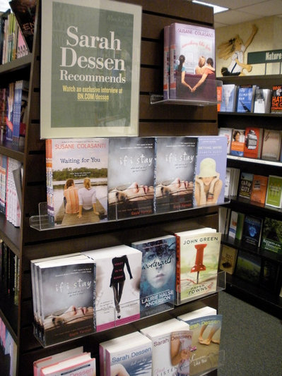
How cool is it that the lovely and amazing Ms. Dessen recommended Violet on the Runway, officially, to readers? I feel like I just won a major award. Check out all these fantastic books by Gayle Forman, Elizabeth Scott, John Green, Laurie Halse Anderson and Susane Colasanti -- I've actually read all of these titles, and I can assure you that Sarah D. has good taste! (In books and TV and hometowns, naturally.)sarahdessenrecommends.jpg Happy Thursday!

Win-It Wednesday: Something Like Fate by Susane Colasanti

The winner of last week's Gimme a Call contest is... Melissa of YA Book Shelf! Send me your address, M. Oh, and Random House is having a contest where you can win a phone and a call from author Sarah Mlynowski, so enter that here.fatecoverblog.jpgThis week's contest is the one I posted on Monday (the Cover Story for Something Like Fate by Susane Colasanti). So head over to Monday's post and leave an honest comment about the cover--what you like or don't (seriously, it's good market research for everyone!), and then you're entered. I'll choose a winner next week. Oh, and here are three more books I gave some love to today in I Heart Daily. Have you guys read these yet? Also: Is anyone else super upset about Jill and Bethenny's friend fight on Real Housewives of NYC? I am almost crying with each episode now. As NY Mag says, it is harming my soul. Sad, I know, but I want them to patch things up! Happy Wednesday!

Cover Stories: Something Like Fate by Susane Colasanti (+ Contest!)

fatecoverblog.jpg Last year, Susane Colasanti shared the Cover Story for her Dawson's Creek-esque image on Waiting For You, and now she's back with a new release--Something Like Fate (a book I dropped in Madrid for Operation Teen Book Drop!). Also, I have an extra ARC of this book so one lucky commenter will win that, too. Just comment below and leave your cover thoughts before May 5th.

Take it away, Susane!

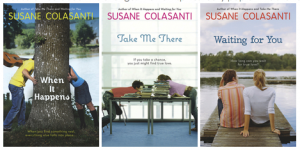
"Before Something Like Fate, my book covers shared a similar theme. They all featured a boy on the left and a girl on the right with their faces hidden in some way. Plus, they all had a sweet natural lighting effect. Right before Waiting for You came out in paperback, shiny new editions of my other paperbacks were released. The goal was for all of my books to share a uniform look by branding them with new stripy watercolor patterns on the spines. I was so exited about this change! The new spines really pop on the shelves.

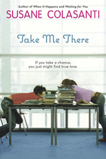
happensnewfb.jpg takenewfb.jpg waitingnewfb.jpg "My publisher wanted the cover of Something Like Fate to look a bit different. Instead of the usual boy/girl image, she felt strongly that one boy and two girls should be featured on the cover to emphasize the lovers' triangle. I think a stock photo was originally found, but didn't seem quite right. So they had a photo shoot for the cover. It was held at a studio in Chelsea with models from Ford Models. The girls were in high school (their moms were there) and the boy was a few years older. My editor was there, which is how I know some of the behind-the-scenes details.

"The setting is supposed to be an old-school ice cream parlor from the book. At first, they were going to use real ice cream in the photo. They went out and got all of this ice cream, but it ended up melting because it wasn't used. They tried some poses at a counter with the models sitting on stools. Between the models' legs and the chair legs, the image looked too busy. The couch was already there in the studio (although I think my cover designer changed its color to purple), and it was clear that by using the couch as a backdrop for the finger touch, readers would get an immediate sense of what the story's about.

"When I first saw the cover...well, I was less than thrilled. It seemed a bit Gossip Girl to me. Not to dis Gossip Girl - love that show! - I just didn't think it quite matched the tone of my book. It was a shock to see two girls when I was used to just one. I didn't get what a plush couch was doing in an ice cream parlor. Isn't that a recipe for disaster? And the couch seemed huge to me. It was taking up almost half the cover!

fatecoverblog.jpg "I loved the fonts and colors, though. I'd requested a pink/purple color scheme, which came out really well. I liked everyone's clothes and the boy's bracelets - those are his actual bracelets he came in wearing. I also liked the big window because it offered an opportunity for natural light. But the initial cover had a much harsher lighting effect that looked fake to me. I asked for the lighting to be softened, which it was. I also asked for the ice cream poster that's hanging in the window to be changed. The original poster was really cheesy - I wanted something with a more vintage look. My contract says that I get a cover consultation, so my feedback was accepted and those changes were made.

"The only change my designer couldn't make was that I wanted to see more of the models and less of the couch. But now I realize that the back of the couch needs to be that high to draw your eye towards that perfect finger touch, which was really hard for the photographer to capture. The models tried all sorts of different poses before nailing that one. They tried holding hands at first. That didn't look right. And if the girl on the left were any closer to the others, it would have changed the tone. I appreciate how difficult it was to create that one awesome shot.

"The response to the cover has been amazing. I've definitely come to love it. I think I just needed some time to get used to the different look. And seeing the cover before the final manuscript changes were made helped because I was able to write that purple couch into the ice cream parlor scene. Now everyone will know that the couch is legit!"

Thanks, Susane! I really do think the cover perfectly conveys the love triangle in the book, and that finger touch is just so lovely. Plus, I hadn't thought about the "natural light" theme in all these covers, but seeing them together definitely highlights that. Pretty!

What do you guys think?

PS-Visit Susane on her website, blog, Facebook, MySpace and Twitter.