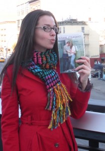
 Susane Colasanti has shared many Cover Stories here, including Waiting For You, Something Like Fate and So Much Closer (on that post you can enter to win a copy of the paperback until Wednesday--go!). She's back now with a new book that fits right in with her signature cover style.
Here's Susane:
"Keep Holding On focuses on the consequences of bullying. A lot of the story takes place at school. So I love that this cover features a school setting. The photo shoot took place at a high school in New Jersey. The male model, Ryan Haagen, contacted me after I posted the cover on my blog. How awesome is that? He’s even going to share about the photo shoot for an upcoming feature I’ll be posting before the book comes out on May 31.
"There were two visions I had in mind for the cover of Keep Holding On. I imagined the two main characters, Noelle and Julian, sitting on a bench outside the coffeehouse they went to on their first date. I pictured Noelle leaning against Julian in a way where you couldn’t really see their faces. I also pictured pink lights in the trees on either side of the bench and the coffeehouse window behind them. The second vision was Noelle and Julian in front of her locker. I saw them sitting on the floor leaning back against the lockers. Julian was turned to Noelle, hugging her, and she was looking down. So again, you couldn’t see their faces.
 "When I saw the initial cover design, I was happy to see that they went with the school setting. And that there were lockers! It’s always fun to visualize your ideal cover and then have part of it come true. You can’t see the models’ faces on my book covers, so I was a bit concerned by how much of the girl model’s face you can see on this cover. But I think it’s just enough to give readers an idea of what she looks like while allowing for some imagination. I love my readers to be able to imagine the characters in their own way.
"My favorite part of this cover is her purple Converse. Those sneakers were plain at first. I asked for them to be written on because that’s what Noelle does with her sneakers (and what I did with mine in high school). I also asked for locks to be put on some of the lockers. The photo shoot took place right before school started, so the lockers didn’t have locks yet. Which didn’t look realistic. The orange star patch on Julian’s bag is another detail I asked for. His bag has that star on it in the book. I thought including it would make the cover even more authentic. And Julian’s glasses were white at first, so I reminded my editor that they are actually black. I know that’s a tiny detail, but I’m all about the details.
"In the end, this cover totally captured the tone of the book. I think it’s absolutely gorgeous!"
Thanks, Susane! Gorgeous enough to kiss, naturally.
I am HUGELY into details as well, and I'm the kind of person who flips back to the cover as I read, so I appreciate that attention when the cover gets it right. I'm also into the cool blues and greens here. It reminds me of a retro cover somehow, as lots of Susane's covers do, and I like that.
What do you guys think?