Last week, I offered up a copy of Susane Colasanti's new book, So Much Closer to anyone who shared their most romantic city. Now, I'm itching to travel (sigh, but in a good, dreamy way). And the winner is... Yani! Send me your address, Y.
 This week, Susane stopped by to talk about the cover of her new book, and she's offering a brand-new paperback version of last year's release, Something Like Fate (remember that Cover Story?). Just leave a comment on this Cover Story and you're entered to win.
Now here's Susane with the tale of this so-NYC cover...
"You've probably heard that authors don't get to decide anything about their covers. We can't just imagine how we want the cover to look and then have it turn out like that. That never happens.
"But it happened anyway.
"My cover designer is amazing. I saw Jim a few months before this cover was designed and he asked me if I had any color ideas. It was so cool that he was asking me about the cover because I had been envisioning the exact cover I wanted for a while. So Much Closer takes place right in my New York City neighborhood, the West Village. One place I’m infatuated with in my nabe is the High Line. It's this old section of elevated train tracks that was turned into a magical green space with lots of trees and flowers. Some key scenes in So Much Closer take place on the High Line. I really wanted the cover to show my characters on the High Line at sunset or at night. I told Jim about my idea.
"Then it was summer and I was wondering what the cover would look like. My books come out in May, which means their covers are done the previous summer. Even though I knew dream covers never happen, the hopeful part of me never stopped believing that it might be possible. That's me, always dreaming big even when something seems impossible! But I really wasn't expecting to get an email from my editor with an initial cover design.
"With my characters on the High Line at sunset.
"Dude. They actually did a photo shoot on the High Line. I was beyond ecstatic. [Below, the photographer talks to the models on set.]


"Early versions of the cover featured orange and pink sunsets. The first orange sunset involved some serious Photoshop action. Marketing thought it was too much. Jim toned down the sunset. I love this pink sunset version (right) even more than the final cover.
"My contracts allow me to have cover consultation, which means I can provide feedback about the initial designs and let my editor know what I’d like to see changed. That’s how we ended up with the pretty cursive font for the title. The title had a really boring font at first. I fought to keep a bit of pink in the sky. I fought to keep the girl model in her white tee.
"But a lot of people are in charge of deciding how the cover will look. In the end, they went with a white sky. White backgrounds on covers have been hot for a few years now, so I guess I understand. What I don’t understand is why they went with the whole pink shirt/purple sweater combo. Um, hi, 1983 called? They want their clothes back.
"But of course I adore this cover. How often do authors see their dream cover become reality?"
Thanks, Susane! I think it's amazing that you got a shoot on the High Line -- is this the first High Line book cover? Definitely the first YA High Line cover, I'd bet. Very cool. I have to admit that I thought of an 80s jeans ad when I saw this cover, but that was a good, fun thing in my opinion. And, I love how it keeps the "natural light" thing going (Susane mentioned that the last time we talked covers) -- what a great theme to have running through your cover designs!
What do you guys think of this cover? One commenter below will win the paperback of Something Like Fate (US only this week). I'll choose a winner next Wednesday.
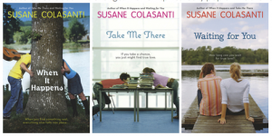
Here are all of Susane's covers, by the way. Such a pretty set, right?


Susane is holding a big contest at her site, too--share your zen place and get a shot at a few of her books, signed and personalized!
Happy Wednesday!
 Last week's winner of Unbreak My Heart is... Aly! Send me your address, A, and thanks to everyone for sharing library love.
 But my publisher received feedback that the original cover (right) was too street.


