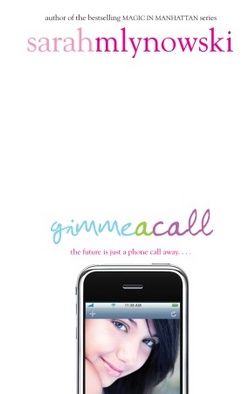
 Sarah Mlynowski's Gimme a Call is a magical summer read! When Devi drops her phone in the mail fountain, she fishes it out to discover that it only calls one number: her number. At age 14, three years ago. The back-and-forth between past and present Devi is quick and funny as she tries to figure out if her fate is changeable. Loved this one!And the cover is way cute, so here's Sarah to talk about how it came about:
"Have you seen the hardcover of GOOD GIRLS by Laura Ruby? With the cool reappearing girl on the cell phone? [Right]
  That's how I pictured the GIMME A CALL cover. Except with alternating Devis--one at fourteen and one at seventeen.
"When I first saw my cover, I loved it. I loved how clean it looked. Loved the type. Loved the glossy phone. It was a big departure from the Magic in Manhattan covers (which I think are adorable, below) but I thought it was gorgeous.
 "There were earlier cover concepts, which didn't make the final cut. The art director (Kenny Holcomb) was amazing--he wouldn't stop until he got it right. Some of them included:
 - Two versions of the same girl, both holding cell phones, looking surprised and vaguely Disney-movie-esque. [Left]
- Girl leaning back off bed while texting. Looked too much like a Verizon ad.
- A very blinged-out cell on a hot pink background. This one was my second fave.
"My editor asked for my opinion on the concepts, but since I don't always trust my own opinion, I forwarded them to my teen cousins. We all agreed that the iPhone cover was 'So Cute.'
"In the original version of the iPhone cover the model was looking up with a knowing smile. It looked a little like a Yaz ad. In the end it came down to a brunette and a blonde. Brunette Devi won. She looks the most like the Devi in my head. And I'm kind of obsessed with her green eye shadow.
"Well, the girl looks a lot like how I imagined Devi. And the type is fun and whimsical, which hopefully speaks to the book. And the iPhone...well, even though the magic phone in the book is a regular plain-Jane cell (no camera, no shiny touch screen) the iPhone on the cover represents the, um....um...um...aren't iPhones cool?"
Thanks, Sarah! I love the final cover. The earlier version feels a little dated to me, but the final one is clean and crisp with great colors, and I just love Devi (she totally looks like Sarah, btw, adorable).
What do you guys think of the cover?
Sarah's Gimme a Call blog tour is in full swing. Visit her here:
Yesterday's post with Little Willow.
Sarah's next appearance will be on Chick Lit is Not Dead!
The GAC Facebook Fan Page.

