Yes, it's Thursday. This site was blacked out yesterday to protest SOPA (more info here). And now: I'm back!
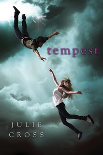
Last week's title, Tempest by Julie Cross, goes to... Keanu lover Natalie! Send me your address, N.
 This week, I've got a copy of Melissa Kantor's The Darlings in Love, and she's here to share the Cover Story! Just leave a comment on the cover and you're entered to win a copy. Here's Melissa:
"I had a fantasy of the cover, which might be different from an idea. When I was a kid, there was this book Forever, by Judy Blume. On the cover was a locket with a picture of a girl's face, and when you opened the cover, you saw more of that picture--the girl's whole body, the boy she was standing with, etc. It was this amazing reveal. [That's the cover, right].  Well, since pearl pendants play a big role in the story of the Darlings, I wanted the cover to picture a chain with a pearl on it, and when you opened the cover, you saw that the pearl was actually on a girl's neck and that girl was standing with her two best friends. There's a name for that (a cutaway? something like that). But my editor said that covers like that tend to snag and rip and that's a real problem. As happens with so many things in life, reality intruded on fantasy.
"Once the pearl necklace idea was nixed, I think we discussed there being three of something, to symbolize the thee Darlings. The only thing I didn't want was three cupcakes. There are a lot of cupcake covers out there.
"When I first saw my cover, I hated it. I am not exaggerating. I remember calling my editor and making it clear that I was furious. I was like, This is the worst cover! What were you thinking? I hate this cover, etc. She's a very calm, rational person, and she tried to get me to be specific, so I more or less listed everything about the cover (from the font to the color to the cookies) and said why I hated it. I don't know that that was what she had in mind when she said, 'Be specific.'
"The one thing on the front cover that I was able to change was the cookies. They looked more like amoebas (is that how you spell it?) than hearts. I also had a lot of complaints about the back cover, and they took some of those to heart.
"Okay, this is somewhat embarrassing, but now I LOVE the cover. When I got my copy in the mail, I thought it looked so pretty and shiny. I love the color (which I originally hated) and I love how you can see the skyline in the cookies! I'm completely ashamed of my initial response, though I will say in my own defense that things look very different in real life than in the computer image I saw. If you have a chance to compare this image with the real book, you'll see what I mean. I think the cookies are great, because Victoria (one of the Darlings) loves to cook and the heart-shapes are perfect because all of the Darlings fall in love in this book."
Thanks, Melissa! I am a huge cookie fan. Sara Zarr's Sweethearts remains one of my favorite covers ever, and this one is crazy cute. Also: I'm hungry. And, by the by, I adore those step-back covers too (I just call them Cover Holes, usually. Very VC Andrews.)
What do you guys think?
PS-Read the Cover Story for the first book in the Darlings series, The Darlings Are Forever.
 Guys, have I told you about how I like to doodle umbrellas with heart raindrops falling on them? I do. It's kind of my thing. I do this whenever a restaurant has paper and crayons available at the table (which I love).
The cover of Meredith Zeitlin's Freshman Year and Other Natural Disasters reminds me of my doodles, and it sounds good. For one, the main character lives in Park Slope, Brooklyn (and I do too). For two, it's Meredith's debut and I have a soft spot for first novels. For three, the main character auditions for Fiddler on the Roof, which I also did in high school (and did not make it--our high school was filled with drama kids and super competitive! I swear! Plus, I can't dance). So I guess I'm confessing that I often am drawn to books that seem like they could be about me...
 Anyway, all this is to say that I'm giving away a copy of this book this week, and you should want it for all of the reasons listed above and more. More being that I found these photos of Meredith Z. (right) and isn't she cool? Yay, Manic Panic. And also, the trailer is great.


