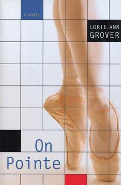
 The worlds of modeling and ballet have always seemed connected to me. Wisps of girls with strong inner determination are the ones who survive the shark pools of both fashion and dance. I'm so happy to have the fantastic Lorie Ann Grover (readergirlz Diva extraordinaire) here to share her cover story for On Pointe. The book, written in verse, tells the story of Clare, a very tall girl who dreams of becoming one of 16 dancers chosen for the City Ballet Company. Here's Lorie Ann on the cover:
"Okay, I have to say, I sound like a picky pants in this Cover Story. So particular! But it is the world of ballet. Oh, my. Everyone was so patient with my requests! When I began to discuss the image for On Pointe with my editor Emma Dryden of Margaret K. McElderry Books, Simon & Schuster, I begged her to represent high quality toes shoes on the cover. In the ballet world, your shoes are everything. Seriously.
"Back when I danced with the Miami Ballet Company, I special ordered my shoes from Germany every month. The shoes were constructed according to an outline and diagram of my feet. Those were the kind of shoes I wanted on my cover. I knew that I'd lose the respect of dancers today if the publishers showed inferior shoes.
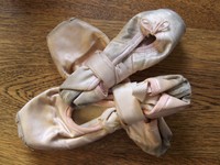
 "The art department asked for a photo of my old shoes to help them in their search for the perfect image.
"I pointed out the square toe and flatter boxing. I provided brand names to narrow down the possibilities. Just as important to me was the fact that the model be in good form or position. I couldn't bear her to be over extended with a weak arch or not fully up on pointe. And please, I asked, no new shoes! They needed to look worn and used to be in keeping with my story.
"When the final cover was presented to me, I was so pleased! Perfect form, perfect shoes, all the way down to the placement of the elastic and the knotted ribbons. They aren't brand new, but worn and broken in. It's a beautiful stock photo of a real dancer.
"In terms of the composition, I loved the placement of the feet close to the edge of the book. It creates so much good tension. The font is elongated and thin like a dancer. The added lines and blocks of color are reminiscent of Mondrian paintings. What could be stronger for a book titled, On Pointe?
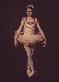
 "As for the flap, I was told it's unusual to use an author photo. However, when I shared this image, the art department decided they did want to include it.
"So after all the fuss about the cover toe shoes being so exact, there I am at age seven, on pointe, in horrible shoes with ribbons hanging out. In bows! Ack! The cover designers were kind enough to remove the dangling ribbons from the final flap photo. Shew. And whenever I visit schools I take the opportunity to lecture on not going on pointe until you are done growing. Unlike me, who was put into toe shoes at seven because I was the size of a twelve year old. But that's another story..."
How fun is Lorie Ann?! I love how much her own life experience went into this story, and this cover. What do you guys think?
PS-If I had my way, I'd wear a tulle tutu as often as possible. With sparkly shoes.