 I have gushed about Morgan Matson's fantastic road trip book in the past, and requests for the Cover Story kept coming in, so here she is! Morgan...
"I really didn’t have a specific image of the cover as I was writing the book. It’s funny, but I was so focused on getting the story down I didn’t think about the other aspects of the book – like what form the cover might take – until I’d finished the first draft.
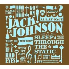
 "My editor asked me what I was thinking, cover-wise, and I brought her a few images, including a Jack Johnson album (right) – I was thinking in a much more graphic format, and less of a photographic direction. Some early cover versions took this approach – I think a very early cover idea was a map of the country, looking like a postcard. But as soon as I saw the picture of the two people, holding hands, on the highway, I knew that we’d gotten it. I was SO thrilled with the cover, especially the blurry mountains in the background.
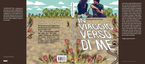
 "It’s funny, but the Swedish cover used the same picture, but didn’t crop it. But I prefer not seeing the faces on the models (it’s a stock image). I just think the cover works so well, and captures the feeling of the book so perfectly. A lot of similar aspects – the road, the dotted line – cropped up in the Italian version (left), which was nice to see.
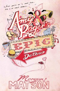
 "I was actually in London last winter, so was able to stop by S&S UK and see the early version of the British cover in person. I also love the British cover (right) – and it’s funny, because this was what I’d had first had in mind for the US cover! I like how different the two covers are, but how they both work SO well for the story. The artist, Mary-Anne Hampton, read the book, and you can tell because of all the tiny details in the drawing that come directly from the book. What’s fun to me about the British cover is that since Roger draws in the book, it almost seems like he could have done the cover, as the style matches some of his drawings. Also, there are tiny hearts ALL over the cover, and I’m still finding some. :)
"It’s been fun to see UK readers debating the merits of the two covers. I’m thrilled with both of them, and feel so lucky to have such talented designers and artists working on them!"
Thanks, Morgan! I am so into everything about this book (mainly the story, which is always a good thing), but also all of these various covers. I'm impressed that each one has a feel that seems right for the book! I love the original cover, but I also adore the illustrated UK version--it reminds me of this awesome illustration for my own Lovestruck Summer cover. I have to admit that the Italian design is my least favorite (maybe the combo of photo and illo don't quite work for me), but the other two ROCK.
What do you guys think?