morgan matson

Cover Stories: Second Chance Summer

Guys, Morgan Matson is here! You know I love her, and she has a new book out, so we must read it asap. Also: The Cover. Here she is to tell its tale: "I had absolutely loved my cover for Amy & Roger’s Epic Detour [read that Cover Story here]. I wasn’t worried about how the cover for the second book would turn out. I was still in the midst of writing the first draft of the book when my editor asked me what I had been thinking about for the cover.

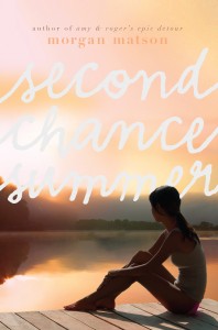
"I mentioned that since the book takes place in a summer lake community, with a dock being a very important part of the story, maybe there could be a dock featured somewhere.  An initial idea I’d had was two sets of bare feet on a dock, or hanging over the edge and skimming the water.  And then I basically just gave her vague, summer-conjuring words – pine trees! Mountains! Lake!

"By the time I saw the first cover proof, we’d actually been going back and forth a lot on the title.  I tend to pick long, not-particularly-evocative-titles, and then cling to them stupidly.  The original title of Amy & Roger’s Epic Detour was Amy & Roger Discover America.  Which now seems so not to fit the book at all! When I was writing the first draft, I had been calling the book The Summer of Second Chances.  My editor had suggested Second Chance Summer, but I wasn’t totally on board with it yet.  But that all changed when she sent me the cover proof.  I adored the cover, and I loved the way that the title fit on it.  Which is probably a strange way to settle on a title, but ever since I saw the cover proof, I knew that was the book’s title.

"And I just adored the image.  It captured the book so perfectly, and the mood of it – the sun setting, the dock, the trees across the lake.  And I love the detail of the girl wearing a pink bikini.
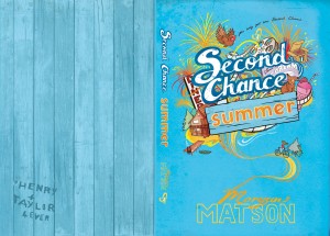
"One thing I’m also grateful for is that my UK covers are so different.  They give much more information to the events of the book.  In the UK cover (right), you can see all the little details that make up the story.  So I love having two versions – one evokes what the book will be about, and one that gives you concrete details of the story."

Thanks, Morgan! Here's what I love: The colors. I mean. That sunlight, so muted and soft and dreamy, like sunset or even very early morning. And I'm with Morgan on the title script--it flows perfectly, becomes part of the image. Total summer, with tinges of sadness and hope.

What do you guys think?

 

Cover Stories: Amy & Roger's Epic Detour

I have gushed about Morgan Matson's fantastic road trip book in the past, and requests for the Cover Story kept coming in, so here she is! Morgan... "I really didn’t have a specific image of the cover as I was writing the book. It’s funny, but I was so focused on getting the story down I didn’t think about the other aspects of the book – like what form the cover might take – until I’d finished the first draft.

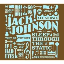
"My editor asked me what I was thinking, cover-wise, and I brought her a few images, including a Jack Johnson album (right) – I was thinking in a much more graphic format, and less of a photographic direction. Some early cover versions took this approach – I think a very early cover idea was a map of the country, looking like a postcard. But as soon as I saw the picture of the two people, holding hands, on the highway, I knew that we’d gotten it. I was SO thrilled with the cover, especially the blurry mountains in the background.

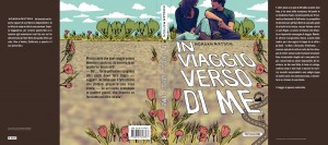
"It’s funny, but the Swedish cover used the same picture, but didn’t crop it. But I prefer not seeing the faces on the models (it’s a stock image). I just think the cover works so well, and captures the feeling of the book so perfectly. A lot of similar aspects – the road, the dotted line – cropped up in the Italian version (left), which was nice to see.

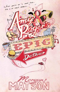
"I was actually in London last winter, so was able to stop by S&S UK and see the early version of the British cover in person. I also love the British cover (right) – and it’s funny, because this was what I’d had first had in mind for the US cover! I like how different the two covers are, but how they both work SO well for the story. The artist, Mary-Anne Hampton, read the book, and you can tell because of all the tiny details in the drawing that come directly from the book. What’s fun to me about the British cover is that since Roger draws in the book, it almost seems like he could have done the cover, as the style matches some of his drawings. Also, there are tiny hearts ALL over the cover, and I’m still finding some. :)

"It’s been fun to see UK readers debating the merits of the two covers. I’m thrilled with both of them, and feel so lucky to have such talented designers and artists working on them!"

Thanks, Morgan! I am so into everything about this book (mainly the story, which is always a good thing), but also all of these various covers. I'm impressed that each one has a feel that seems right for the book! I love the original cover, but I also adore the illustrated UK version--it reminds me of this awesome illustration for my own Lovestruck Summer cover. I have to admit that the Italian design is my least favorite (maybe the combo of photo and illo don't quite work for me), but the other two ROCK.

What do you guys think?

Win-It Wednesday: Amy & Roger's Epic Detour

Last week's winner of Susane Colasanti's Something Like Fate is... Krystal! Send me your address, K.

This week, I'm celebrating the fact that Morgan Matson's road trip book just came out in paperback--it is beyond delightful. I spent all weekend consumed by it, feeling like I was on the open highway driving across America with an amazing boy and eating regional fast food while looking at quirky local sights. And, of course, simultaneously working out all of my emotional issues.

This book is seriously great, you guys! I wrote more about it (and two other great paperbacks) on I Heart Daily today. Have you read it?

In any case, now's your chance. I'm giving away one copy of the newly released paperback this week. Just share one road trip story below. It can be yours, a friend's, or just one you dream of experiencing.

Here's mine: I went to Graceland with my friend Ruthie, thinking that we'd spend a couple of hours and do the basic tour. Seven hours later, we emerged with Elvis magnets, Memphis post cards and a flashy TCB necklace. That place is MAGIC (and Morgan's characters know that too). Just saying.

Happy Wednesday!