The minute I saw Mari's amazing Gamer Girl cover, I knew I wanted the back story. Luckily, she's nice! And there's a good story to tell. Here's Mari:
"One of the things that originally sold Gamer Girl to my editor was the idea of creating a very visual package to wrap the story in. After all, the heroine of the story, Maddy Madison, is a budding manga artist herself, so she'd want it that way!
"During an initial conversation, my editor asked me to send along some examples of manga that I felt represented my heroine's personal style. I suggested she read the Dramacon, a really fun contemporary manga from Tokyo Pop. If you haven't read the series, I highly recommend it. My editor followed my suggestion and ended up falling in love with the series and it really gave her a better understanding of the anime/manga world. (The series takes place at a manga/anime convention.)
![]() "What especially fascinated her were the different faces the artist/author, Svetlana Chmakova would draw to illustrate the moods of her main characters. My editor wanted to do something similar for Gamer Girl. So she suggested we do internal emoticons of the heroine at the beginning of each chapter. This way the reader would get a hint when starting a chapter if the heroine were happy, sad, excited, or angry--just by looking at the drawings.
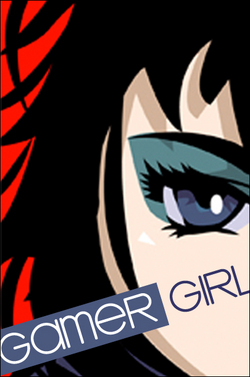
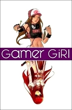
"As for the cover itself, they offered two different mock-ups to start.
"What especially fascinated her were the different faces the artist/author, Svetlana Chmakova would draw to illustrate the moods of her main characters. My editor wanted to do something similar for Gamer Girl. So she suggested we do internal emoticons of the heroine at the beginning of each chapter. This way the reader would get a hint when starting a chapter if the heroine were happy, sad, excited, or angry--just by looking at the drawings.
"As for the cover itself, they offered two different mock-ups to start.
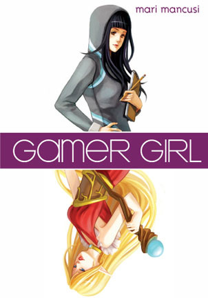
"While I liked both in different ways, my editor, agent and I unanimously liked the second style best--featuring my heroine Maddy on top and her alter-ego video game character Allora on the bottom. It just really captured the idea of the book--of having a whole other persona online that's almost a separate person from the real life you. The other cover was fine--it was just kind of generic.
"After we decided on style, the publisher had an artist (the talented Elise Trinh) draw the cover. She did an amazing job--really capturing my character and her alter-ego, just as I imagined them. Maddy even has her sketchpad to draw her manga.
 "I realize the cover is a lot different than most on the YA shelves today. Seems like a lot of publishers are going for a dark, mysterious, romantic, glamorous feel. But that's okay with me. After all, part of the message of the book is about celebrating our differences--and so having a different sort of cover really works! Not to mention all the white space really makes it stand out on the shelf, which is never a bad thing. All in all, I couldn't be happier with how it turned out and I hope readers feel the same."
Thanks, Mari! As I've said in the past, I love this cover. You guys?
PS-I posted about the new Twilight dolls over at readergirlz today.

