mari mancusi

Cover Stories: Scorched by Mari Mancusi

9781402284588-PR Mari Mancusi has shared Cover Stories here before, including one of the most popular Cover Stories ever for Gamer Girl! She's back with a new cover, revealing this week for the first time, and a great story. Here's Mari: "With seventeen books under my belt, the Scorched cover consultation wasn’t exactly my first rodeo. But for some reason I was more nervous than ever about what they’d decide for the cover. I just felt a book like this really needed the right cover. But what would that right cover entail? For once I didn’t have a clear picture in mind.

"I knew I wanted a strong looking heroine. It was important to me that Trinity didn’t look like a damsel in distress in a pretty gown. I also knew I wanted the cover to appeal to both genders—as the book has points of view from both Trinity and the two boys—Connor and Caleb—sent from the future to stop the dragon apocalypse. And I liked the idea of an orange and red color palette—to really pop on bookstore shelves. I wanted it to be vivid. To be violent. To be on fire.

"And, you know, it couldn’t hurt to have an actual dragon on the cover…

"I was delighted when I found out they were hiring an artist to create the cover. Which, in hindsight, makes sense. I mean, casting call for dragons on Craigslist, anyone? I was even more delighted when I found out they chose Tony Sahara who did the beautiful Eon and Eona covers. This was an artist who knew his dragons.

"You can see some of the rough cover comps he sent as we tried to settle on an overall concept (below). The one with the dragon rampaging over the city feels very Godzilla-like to me. Which is kind of awesome, but perhaps not exactly right for this particular book. I also really liked the covers that showed the close-ups of Trinity and the dragon—with the title in the middle. They look a little softer—almost romancey.

scorched_011713a - Early Comp Cover 2 scorched_120612d - Early Comp Cover 1 scorched_010813c - Early Comp Cover 3

"But nothing could come close to the design that was finally chosen. A cover literally on fire. A girl standing with her dragon—eyes defiant, challenging—as if to say, 'You really want to mess with this?' And the dragon—though fierce and awesome—looks down at her with affection in its eyes. You look at this cover and wonder—what is their connection? Why is she so protective of this monster? Is there something about this dragon that we don’t know about? Something worth saving?

"I love this cover with the passion of a thousand burning suns. Now that I’ve seen it, I couldn’t imagine anything more perfect for the book. And I cannot wait to see it on bookstore shelves in September."

Thanks, Mari! Love this story. The cover screams DRAGON, and readers will know just what they're in for!

What do you guys think?

Cover Stories: Skater Boy

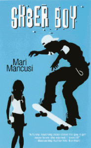
Mari Mancusi has written a ton of YA novels, the latest of which are the Blood Coven series [read those Cover Stories]. Her very first Young Adult book, though, was Sk8er Boy. Now it's  out of print and she's got the e-rights, so she was able to create her own updated cover. Cool, right? Here's Mari with the story: "You never forget your first. And for me, that was Sk8er Boy. My first true love and the title of my first young adult romance, published in 2005. Perhaps the most autobiographical book I've ever written, it's a sort of Romeo and Juliet with text messaging.

"I originally sold the book to Dorchester, a romance publisher who had just introduced a new line of young adult books called Smooch. I had done one other romance for them, but this was my first teen book. So you can imagine how excited I was to see the cover.

"It looks pretty silly now (right), but you have to remember, at the time, those iPod commercials (see below) were really big and so I guess the artist felt it would appeal to a teen crowd. Still, though I knew it was trendy, I never felt as if it captured the feel of my actual book. It's not romantic, for one thing. It's not sweet. You don't get a good feel for the plot or characters. Oh and I hate the girl's purse! At the time, everyone had hobo bags and large purses--hers looks like something out of the late eighties. As does her outfit...

"In short, the cover did not capture the story inside the book. And you know how people judge books by their covers...

"Fast forward six years. The book is now out of print. And I have the rights reverted back to me. Which means I'm able to offer readers the book once again, by self-publishing it as an eBook.

"And this time I didn't have to settle for a cover that didn't fit the book. I had complete creative control. And so I worked with Theresa M. Evangelista, who does covers for Penguin books, to create the perfect feel for my re-release. Theresa worked on another one of my books, Gamer Girl [read that Cover Story], in the past, so I knew she'd come up with something amazing.

"And she did! As you can see, we chose a very sweet, romantic photo and Theresa applied an instagram style filter to give it an even softer look. We also changed the title from Sk8er Boy to Skater Boy--since everyone was always messing up the spelling anyway and I wanted it to be easier to Google. I even had Theresa apply a little sticker for the "First Kiss Club", a new brand I've been working on of upcoming sweet, contemporary romances for tweens and teens.

"I'm so happy with how it all came out. Finally, I have a cover that fits my book. And best of all, now a whole new generation of readers can enjoy my very first teen book!"

Thanks, Mari! I love this tale of retaking an old cover and making it new. Very, very cool. And: That moment on the new cover is hot. What do you guys think?

PS-Skater Boy is available on Kindle or Nook for $3.99!

Cover Stories: Gamer Girl (paperback) by Mari Mancusi

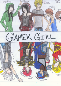
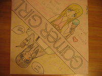
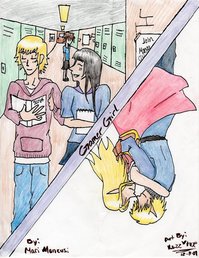
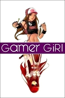
gamer girl softcover.jpgMari Mancusi's Gamer Girl has a really great Cover Story that I ran when the hardcover was released. Today, the paperback is coming out, and Mari has an update to the tale. Here she is: "It's been a year and a half since the original Gamer Girl came out in hardcover, though it's lived on throughout that time as part of both the Scholastic Book Fair and Book Club. (In fact, I think that's where the majority of my readers discovered it!) And I've realized the best thing about this cover is that it's easy for readers--many of them manga artists themselves--to recreate it. I've gotten tons of fan art from readers who drew their own versions of Maddy and Allora, which I love!


Gamer_Girl_by_Mari_Mancusi_by_BlueFireFoxChibi.png Ceiling_Tile_by_dramapixie97.jpg GAMER_GIRL_m_y_v_e_r_s_i_o_n_by_XCloseXToXNothingX.jpg

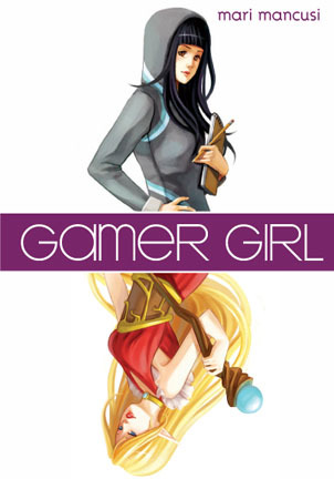
"Now it's time for the paperback version of the book to be released. They kept the same cover--which I'm thrilled about--but added an extra tagline, which you have to turn upside down to finish reading. I think the tagline really makes the book pop. It asks the question: 'What do you do when your ho-hum real life - doesn't live up to your amazing virtual reality?'" (Compare the two covers below, hardcover on left).

gamer hardcover.jpg gamer girl softcover.jpg

Thanks, Mari! I think the tagline is great, and I know Gamer Girl has been a huge reader favorite. I loooove the fan art. Seriously, that is amazing. I still remember when a reader named Hailee dressed up like the cover of Violet in Private -- I loved it!

What do you guys think of the Gamer Girls cover and its subtle change?

Cover Story: Gamer Girl by Mari Mancusi

The minute I saw Mari's amazing Gamer Girl cover, I knew I wanted the back story. Luckily, she's nice! And there's a good story to tell. Here's Mari:

"One of the things that originally sold Gamer Girl to my editor was the idea of creating a very visual package to wrap the story in. After all, the heroine of the story, Maddy Madison, is a budding manga artist herself, so she'd want it that way!

"During an initial conversation, my editor asked me to send along some examples of manga that I felt represented my heroine's personal style. I suggested she read the Dramacon, a really fun contemporary manga from Tokyo Pop. If you haven't read the series, I highly recommend it. My editor followed my suggestion and ended up falling in love with the series and it really gave her a better understanding of the anime/manga world. (The series takes place at a manga/anime convention.)

Emoticons1130.jpg "What especially fascinated her were the different faces the artist/author, Svetlana Chmakova would draw to illustrate the moods of her main characters. My editor wanted to do something similar for Gamer Girl. So she suggested we do internal emoticons of the heroine at the beginning of each chapter. This way the reader would get a hint when starting a chapter if the heroine were happy, sad, excited, or angry--just by looking at the drawings. "As for the cover itself, they offered two different mock-ups to start.

GamerGirlA.jpgGamerGirlB.jpg

"While I liked both in different ways, my editor, agent and I unanimously liked the second style best--featuring my heroine Maddy on top and her alter-ego video game character Allora on the bottom. It just really captured the idea of the book--of having a whole other persona online that's almost a separate person from the real life you. The other cover was fine--it was just kind of generic.

"After we decided on style, the publisher had an artist (the talented Elise Trinh) draw the cover. She did an amazing job--really capturing my character and her alter-ego, just as I imagined them. Maddy even has her sketchpad to draw her manga.

GamerGirl%20Final.jpg "I realize the cover is a lot different than most on the YA shelves today. Seems like a lot of publishers are going for a dark, mysterious, romantic, glamorous feel. But that's okay with me. After all, part of the message of the book is about celebrating our differences--and so having a different sort of cover really works! Not to mention all the white space really makes it stand out on the shelf, which is never a bad thing. All in all, I couldn't be happier with how it turned out and I hope readers feel the same."

Thanks, Mari! As I've said in the past, I love this cover. You guys?

PS-I posted about the new Twilight dolls over at readergirlz today.