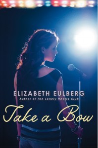
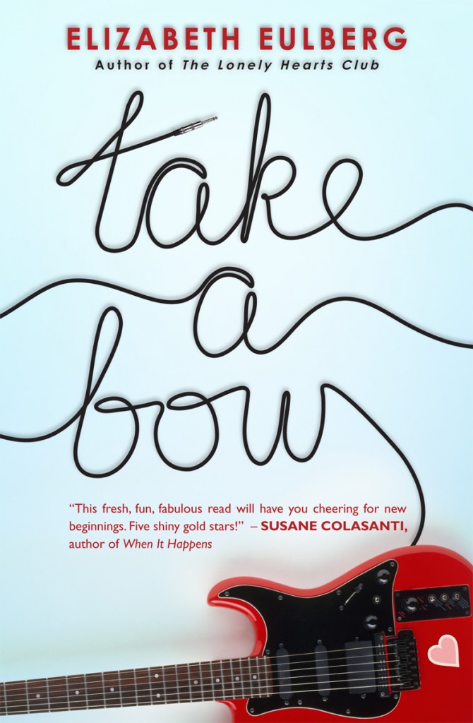
 The fantastic Elizabeth Eulberg is here today to share the story of her latest cover. Take a Bow is told in four points of view (so hard!) and I've heard only raves about how awesome this book is (MTV's Crush gave it a standing ovation). YES! Also, the cover is blindingly eye-catching, no? Here's Elizabeth:
"I usually don't start thinking about the cover until I'm almost done with the book. I didn't really have a clear idea of the cover until I had the title (the book was untitled for awhile). Then once we settled on Take a Bow as the title, I automatically envisioned a cover very similar to the final cover. It's really freaky how in sync the book designer (the fabulous Elizabeth Parisi), my editor (David Levithan), and I are. We've been on the same page for all of my books. Just the other day, I told David my thoughts on the cover for my next book and they were already mocking up covers with the exact same concept - scary! The only difference between my idea for Take a Bow and Scholastic's was that I was picturing four people "taking a bow" to reflect a key scene in the book, but I think the one person is more dramatic and personal.
"I really don't like having faces on covers of books, it's just a personal preference I've always had. So when David called me to tell me their idea for the cover, my first thought was 'that's exactly what I was thinking!' but I only wanted to see the back of the head. When he said they were going for a side view, but in shadow, I was a little hesitant. But then I got to have an opinion on the model who'd be on the cover, which was a huge treat. And, OF COURSE, David, Elizabeth, and I all picked the same person. There was a photo shoot with the model we selected. She really is perfect and I've only seen two photos from that shoot, but can only imagine all the amazing shots they got.
"I LOVED the cover when I saw it. I realize how extremely lucky I am to have loved all my covers. Back when I was in publicity, I got to be part of the jacket committee so I know how many opinions, rightfully so, go into deciding a cover. So I do always hold my breath when I open up a book cover for the first time. I loved this one right away. The first version was a little different than the final version, the character had on a different outfit and the shot was further away. In the end, we decided to go with a different shot of her closer up, so it felt more personal. When I opened up the second cover (which ended up being the final cover), I was really nervous since I liked the first cover so much. But I think the second one is so much better.
 "I should probably mention that my nickname is 'Two Cover' Eulberg, because for some reason, I always have two covers for my books, the first cover always ends up changing. And, without fail, I get nervous when the cover changes and then I always like the second one better. I can't even look at the original cover of The Lonely Hearts Club anymore. That was another instance where I was a nervous wreck about the cover changing, then I suggested using Abbey Road as inspiration (but no faces!) right at the same time Elizabeth Parisi walked into David's office and recommended the exact same thing.
"David's great about asking me my opinion on the covers. The only comment I had on the final cover was that I thought my name placement was weird. It really threw me when I first saw it because it wasn't on the bottom, where it had been for my first two books. I don't know why this one thing caught my attention, but after sitting with it for awhile, I didn't mind it at all. And I know having your name above the title is a compliment to the author, but I guess I wasn't expecting it!
"I have all my covers up on the wall where I write. As soon as I got the final cover, I hung it up on my wall and would look at it often. I'll even admit to hugging it a few times (because I'm a nerd like that). I really think it perfectly captures the book. Especially the pressure these characters face competing for different performance spots and the feeling that they are always auditioning or performing."
Thanks, Elizabeth! You know, I wanted a girl's back for my first Violet on the Runway cover (here's that Cover Story), but they insisted front-facing was the way to go and I ended up loving it. This side profile, though? Awesome in so many ways. You can see her nerves, but also her poise; her performance hair, but also her personal style. I love it.
What do you guys think?
 Elizabeth Eulberg shared the story for the hardcover of Take a Bow, and now the paperback is out this month with a brand new face! Here's Elizabeth to talk about the change:
 "You'd think I would've learned my lesson by now. Back before my first book, The Lonely Hearts Club, was published three years ago, I got a call from my editor that the cover was changing. I got really nervous, but then I saw the new cover and was instantly relieved (mostly because I didn't realize they were using my idea!). It's still my favorite cover (right).

