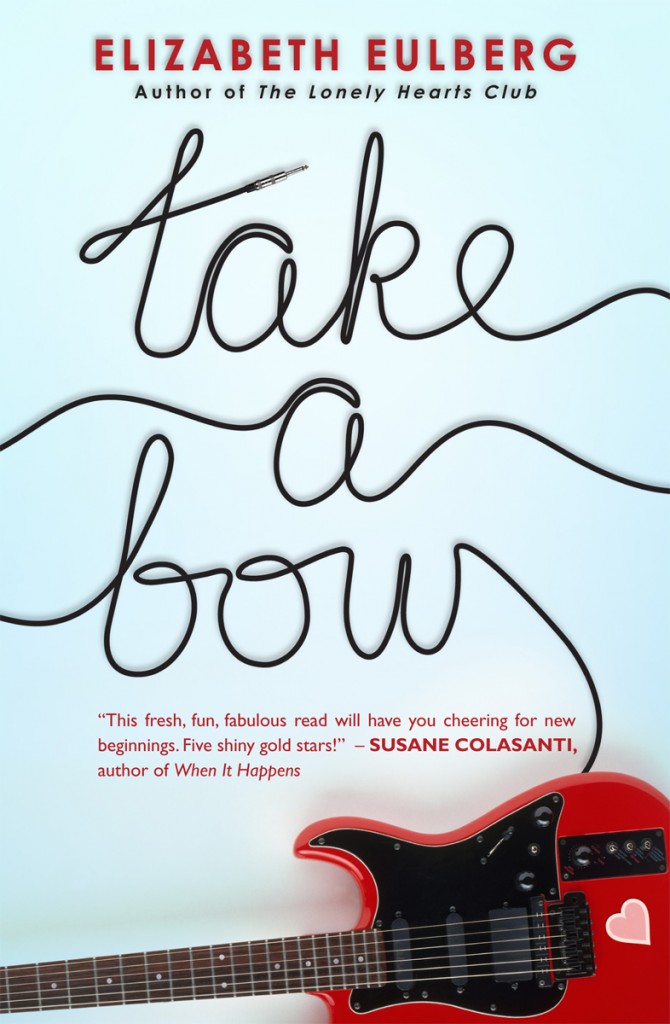
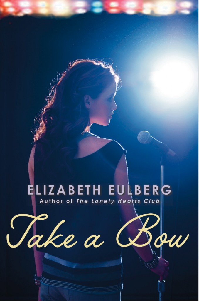
The fantastic  Elizabeth Eulberg shared the story for the hardcover of Take a Bow, and now the paperback is out this month with a brand new face! Here's Elizabeth to talk about the change:
 "You'd think I would've learned my lesson by now. Back before my first book, The Lonely Hearts Club, was published three years ago, I got a call from my editor that the cover was changing. I got really nervous, but then I saw the new cover and was instantly relieved (mostly because I didn't realize they were using my idea!). It's still my favorite cover (right).
"So fast forward to a few months ago when my editor informed me that the cover was changing for the paperback release of my third novel, Take a Bow. But I love the cover (below right)! Why does it have to change? There was some sulking involved.

"Then the cover was sent to me and I was told that I could wait a few days to let them know what I thought. But I didn't need to. I LOVED this new cover the second I saw it. While I still adore the original, I think the new cover is perfect for the paperback: it's bright, it stands out, it has a guitar on it!
"Plus, I think boys might not be too embarrassed about picking it up. It's now my second favorite book cover of mine (behind The Lonely Hearts Club). So I promise going forward to not judge a cover until I see it!"
Thanks, Elizabeth! I like the new cover a lot too. I'm finding myself drawn to less people more object covers lately, and I love the little heart on the guitar. Adorable without being cloying.
What do you guys think of the cover redesign?

