sarah beth durst

Cover Stories: Drink, Slay, Love

Sarah Beth Durst has shared the Cover Stories for her novels Enchanted Ivy and Ice, and now she's here to tell her perspective on the scintillating cover of Drink, Slay, Love. "Creating the cover for DRINK, SLAY, LOVE was a traumatic experience. The problem began when the vampire hired to pose as Pearl came to the photo shoot hungry. She drained three assistants before someone had the presence of mind to pass her the bottle of donated blood that you see on the cover. The photographer snapped shots of her as she sated the last of her hunger with the bottled blood. Though they'd originally planned for a panorama, he was forced to do a close-up due to the carnage that littered the studio behind her.

"Okay, that's not true. She only drank from two people and both survived.

"Seriously, I don't know the story behind this cover. I only know that I love it. The little smile on her face perfectly captures the attitude of my vampire girl Pearl. Pearl is fierce, funny, fearless, and mostly evil... or at least she is before her unfortunate encounter with a were-unicorn. She was the most fun to write of any character I've ever written.

"This cover was designed for Simon & Schuster by Evan Schwartz and Jessica Handelman. My hat is off to them. And I hope they didn't lose too much blood."

Thanks, Sarah! I mean, I wouldn't have messed with this perfection either... that cover is hands-down gorgeous. Anyone else think Pearl's lips look kind of like Anne Hathaway's?

Oh, and in case you wonder if the insides live up to the outsides, here's what Kirkus had to say: "Combining a sense of humor with the dark appeal of supernatural romance, this book is funny, scary and thought provoking all at once. Even jaded fans of the supernatural will find fun in this one."

NICE. Happy Monday!

Win-It Wednesday: Drink, Slay, Love

I know it's Thursday. The baby thing again. It's time-consuming, so let's just pretend it's Wednesday. I liked hearing your favorite love scenes, and the winner of Lola and the Boy Next Door is... Ashly! Send me your address, A. This week I'm giving away a copy of Drink, Slay, Love by Sarah Beth Durst. Look at that bright red-laden cover. I love it.

It makes me think of Coke, which is my favorite soda. Regular Coke, not diet. I cannot resist it. So, what's your favorite soda (or other beverage, if you're a virtuous non-soda person)? Tell me in the comments and you're entered to win this lovely hardcover.

Happy Wednesday!

Cover Stories: 7 at Unabashedly Bookish

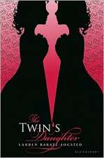
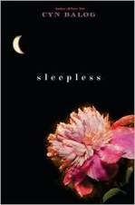
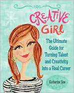
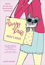
Over at the bn.com blog... click through to read the full stories.twins.JPGThe Twin's Daughter by Lauren Baratz-Logsted. "My publisher did not ask for input before beginning work, but once they started coming up with covers--and there must have been over 20 iterations before the final cover was settled upon--my opinion was solicited every step of the way." Read more... sleepless.JPGSleepless by Cyn Balog. "I had always hoped that the moon would play into my book a little, because I am just a sucker for the moon (my first name means 'belonging to the moon')..." Read more... hungryforyourlove.JPGHungry For Your Love, edited by Lori Perkins. "Hungry for Your Love started as an ebook at Ravenous Romance. When I sold my short story 'Inhuman Resources' I never thought it would end up in a physical book store. Nonetheless, trends catch on quickly and within months this anthology about zombie love sold to St. Martin's Press. Suddenly zombies were big!" Read more... creativegirl.JPGCreative Girl by Katharine Sise. "When I first saw my finished cover, I actually got very choked up! There was something about seeing the cover that made the book feel very real and tangible. I could suddenly picture it on the shelf, instead of as a solitary project that I'd been working on for a year and a half from my living room couch next to my dog." Read more... enchanted ivy.JPGEnchanted Ivy by Sarah Beth Durst. "This cover is a painting of a real person. She emailed me several months ago and said that she was the artist's model. I love knowing that there's a real person that looks like Lily out in the world!" Read more... 10wayseloisa.jpgTen Ways to Be Adored When Landing a Lord by Sarah MacLean. "Romances have a really particular look--you know what I'm talking about... the ravishing (sometimes ravished) beauty, the handsome gentleman, and the famous clinch. Now, some people don't like the idea of a clinch... but I love them. They tell me that the book in my hands is a broad, sweeping love story, and that it's going to end with a happily ever after that will leave me sighing and wanting more." Read more... doggy.jpgThe Doggy Divas by Lauren Brown. "I was adamant that the cover not look too young as can be the case when writing about tweens and animals. We decided it needed to look sophisticated yet fun -- no easy feat. There's a fine line between going totally, over the top girly and keeping it 'cool' for lack of a better word." Read more...

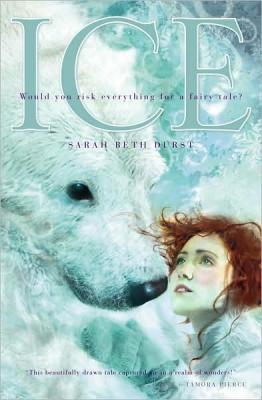
Cover Stories: Ice by Sarah Beth Durst

This month, I got to hear the lovely and curly haired Sarah Beth Durst read from her new release, ICE. It was a great peek into her reimagined fairy tale, and when she reads out loud, she sounds kind of like the queen from The Neverending Story, which is pretty darn cool. ice.jpgHere's Sarah with her lovely, easy Cover Story:

"I can quote for you word-for-word the entirety of my involvement in the design of the cover of ICE.

"EDITOR: Here is the cover art for ICE.

"ME: Eeeee!!!

"EDITOR: Do I hear trumpets?

"ME: Eeeeeeeeeee!!!

"EDITOR: Where did the parade come from? Hey, who let in the elephants?

"ME: Eeeeeeeeeeeeeeeee!!!!!

"EDITOR: As I was saying, we're happy with it, and we hope... Really, Sarah, fireworks?

"Okay, it wasn't exactly like that. There was only one elephant, and the fireworks were tasteful. Seriously, though, I had zero involvement in the cover. I had hoped there would be a polar bear on it, but I didn't know what my publisher was planning until the jpg arrived in my Inbox. When it arrived, I did in fact shriek, jump up and down, and begin dancing around the room.

"The cover, I think, perfectly captures the book. The characters look exactly as I imagined them, as if the artist peeked into my brain to see Cassie (a 16-year-old Arctic research scientist) and Bear (basically, the Angel of Death for polar bears).

"I'm told that the image began as a photograph, and they did several photo shoots before they settled on the correct girl and the correct pose. I am reasonably certain that the reason it took several models was that they wanted just the right shot and not because the polar bear kept eating the models.

"After the girl was selected/digested, the artist then incorporated the photo in the final work of art using a technique known to laypeople (such as myself) as incomprehensible magic.

cityofglass.jpg"The artist is Cliff Nielsen. He also did the art for THE MORTAL INSTRUMENTS series and the latest edition of THE CHRONICLES OF NARNIA. When I found out that he'd be doing the cover for ICE, I spent at least an hour Googling examples of his work and daydreaming about what he'd design for my story. He exceeded all my expectations. I really hope I get a chance to meet him and thank him someday. Before the day that the image arrived in my Inbox, I hadn't known it was possible to fall in love with a jpeg."

That Cliff Nelson does some fantastical covers! I love the white contrasting with Cassie's red hair, and I think it has a great arctic fairy tale feel. What do you guys think?

Shop Indie Bookstores