Over at the bn.com blog... click through to read the full stories.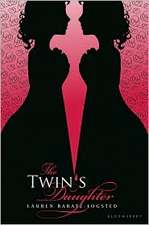 The Twin's Daughter by Lauren Baratz-Logsted. "My publisher did not ask for input before beginning work, but once they started coming up with covers--and there must have been over 20 iterations before the final cover was settled upon--my opinion was solicited every step of the way." Read more...
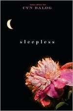 Sleepless by Cyn Balog. "I had always hoped that the moon would play into my book a little, because I am just a sucker for the moon (my first name means 'belonging to the moon')..." Read more...
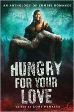 Hungry For Your Love, edited by Lori Perkins. "Hungry for Your Love started as an ebook at Ravenous Romance. When I sold my short story 'Inhuman Resources' I never thought it would end up in a physical book store. Nonetheless, trends catch on quickly and within months this anthology about zombie love sold to St. Martin's Press. Suddenly zombies were big!" Read more...
 Creative Girl by Katharine Sise. "When I first saw my finished cover, I actually got very choked up! There was something about seeing the cover that made the book feel very real and tangible. I could suddenly picture it on the shelf, instead of as a solitary project that I'd been working on for a year and a half from my living room couch next to my dog."
Read more...
 Enchanted Ivy by Sarah Beth Durst. "This cover is a painting of a real person. She emailed me several months ago and said that she was the artist's model. I love knowing that there's a real person that looks like Lily out in the world!" Read more...
 Ten Ways to Be Adored When Landing a Lord by Sarah MacLean. "Romances have a really particular look--you know what I'm talking about... the ravishing (sometimes ravished) beauty, the handsome gentleman, and the famous clinch. Now, some people don't like the idea of a clinch... but I love them. They tell me that the book in my hands is a broad, sweeping love story, and that it's going to end with a happily ever after that will leave me sighing and wanting more." Read more...
 The Doggy Divas by Lauren Brown. "I was adamant that the cover not look too young as can be the case when writing about tweens and animals. We decided it needed to look sophisticated yet fun -- no easy feat. There's a fine line between going totally, over the top girly and keeping it 'cool' for lack of a better word." Read more...
sleepless
Cover Stories: Sleepless and The Unspoken, both by Thomas Fahy
 This Cover Story is by request from Travis of Inked Books! If you've got a request, just let me know and I'll do my best to dig up the story behind the cover.Thomas Fahy's on Sleepless has a creepy cover, to be sure. Here's the premise: Emma Montgomery has been having trouble sleeping. Whenever she closes her eyes, all she can see are horrible nightmares ... nightmares of gruesome murder. And she's not alone. All of the students in Dr. Beecher's secret society have been having terrible dreams and sleepwalking. Now, as their classmates start turning up dead, Emma and her friends race against the clock to keep themselves awake and find out what is causing them to kill in their sleep--before the next victim dies.
And here's Thomas to talk about the cover:
"Unlike some of my other books (where I had plenty of time to think about possible cover art), the cover for Sleepless is the first thing that my publisher decided on when I presented them with my book idea. My editor told me that when the staff at Simon & Schuster was discussing my book proposal someone in the room came up with the idea for the cover--a young girl wearing a sleep mask with blood oozing out beneath it.
"Apparently, everyone loved this visual image. By the time my editor called to ask me to write Sleepless, the press was set on that cover (which he described to me on the phone that day). I have to admit, I really liked the idea. It suggests one of the scariest aspects of the book for me--the epidemic of sleepwalking that causes a group of teens to do terrible things in their sleep. They only come to realize the things they've done through horrifying dreams ... snapshots of what happened while they were sleeping.
"Whenever friends see this book in my living room, they pick it up and say, 'Wow, you wrote that? Looks scary!' I guess the cover does a good job of selling the book!
 "In my experience, presses don't really want an author's opinion on cover design. They feel that their marketing department knows best. I've been very happy with the artwork on the covers for both my teen books. My previous teen book, The Unspoken, actually has two covers. The cover for the hardback edition shows a church with five creepy ghosts above it (right). The book is about several teens that are haunted by their childhood memories of growing up in a cult and the prophecy that they will die from their worst fear in five years. I thought this was a good, scary cover.
 "Then the press changed it for the paperback (left), which I didn't realize would happen. The new cover shows a hand clawing through the ground. I like this cover as well. Literally, it shows someone who has been buried alive and is clawing to the surface (which does happen in the book). Since the book is also about buried secrets and the things we're afraid will surface, I think this cover works great for that, too."
Thanks, Thomas! All the covers totally creep me out, which is a very good thing for the stories. The Sleepless cover is so arresting, I think. I would have to turn it over to sleep at night! What about you guys?