Cover Stories

Cover Stories: Zen and Xander Undone

Talking to Carolyn Mackler about her new paperback cover for Tangled got me thinking about paperback changes, and here's another one for you guys. Amy Kathleen Ryan's Zen and Zander Undone recently got a big cover change, so she's here to share that story:

"I didn't know about the change. It came as a complete surprise when I got my author's copies. They didn't even tell me they were considering a redesign. This is very different from how they usually do things. Before, they've always seemed to value my opinion. I think maybe they were in a real hurry with this one.

"I liked the new cover immediately. I liked the subtlety of it, though it no longer portrays the two sisters. The girl on the cover could be either of the sisters, so it's fine by me. A different department handles paperbacks. I imagine that my editor approved the cover, but I do not think she was at the center of the redesign.

"The hard cover (right) was from an original photo shoot [read that Cover Story], and I found it very flattering that my publisher would go to that expense and trouble for me. With the paperback, I would be surprised if they didn't use a stock photo, since they already spent so much money on a cover that didn't end up working well.

"Honestly, I think I prefer the paperback cover. It's nicely evocative and artistic. My only regret is that it doesn't make it clear that Zen is the name of a person. I've always worried that the title could make it sound like Xander is really into Zen Buddhism and she's coming undone. But it seems to be selling much better than the hardcover did, so I can't complain. It's enough to make readers pick up the book and read the jacket copy, and that's all we can ask of a cover, isn't it?"

Thanks, Amy! I love these hair untying shots -- I really do. I think the new cover would draw me to the book more. What do you guys think?

PS-Alea has a great Hardcover vs. Paperback feature if you want to see more of these changed covers!


Cover Stories: Tangled by Carolyn Mackler

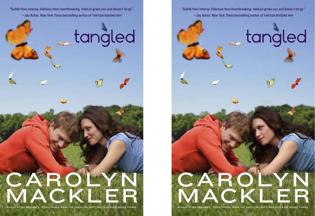
Carolyn Mackler's Tangled has a new paperback cover, and it's out this week. So I had a chat with her about the changes (and also how she came to write with Jay Asher)! Here she is: "My publisher had the vision for the hardcover jacket - the blue and pink tangling hearts (below right), and also this new paperback cover. I love its energy, especially with the butterflies since they strangely showed up in three of my four characters' stories.

"Harper was wonderful about including me in the development of Tangled's paperback cover. They wanted to do a photo shoot with models, and I got to look over several headshots and pick who I thought would work on the cover. The girl is Jena for sure, but in my head the guy is a mix of Dakota and Owen. They're brothers, so they have the same basic look. And Jena DOES kiss both of them. Surprised? Shocked? If you read the book it'll all make sense.

"When I saw the new cover, I loved it! I like the sharing-an-inside-joke vibe between the girl and the guy. It made me wonder what the models were talking about during the shoot.

"They showed me several shots of the guy and the girl in different stages of embrace, cuddle, and glance. I picked the sharing-a-joke vibe, which felt right for the story. Also, I asked them to change the color of the guy's sweatshirt. The model had been wearing an orange sweatshirt, but on the cover it looked a bit pink. Per my request, they changed it to the grayish color. If only I could change things around in my closet with one click.

"I've also included two works-in-progress, that show a different vibe (sultry, but no inside joke) and the notorious pink-orange sweatshirt:

"One thing that's cool about this cover is, if you look at the very top, you'll see a few lines of praise from Jay Asher, the bestselling author of Thirteen Reasons Why. When he gave that amazing quote for Tangled, we didn't even know each other. But soon after, we started emailing - and decided to write a novel together! Our upcoming novel, The Future of Us, comes out in November. And wait until you see the cover. VERY COOL."

Thanks, Carolyn! I think both of these covers, different as they are, give the same feel. Very Tangled (I loved this book). Also: Totally into smiling over the sultry.

What do you guys think?

And, I can't wait to see the real cover for The Future of Us! You can read another of Carolyn's Cover Stories, for Guyaholic, here!

Cover Stories: Fairy Bad Day

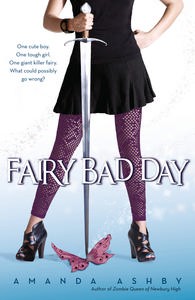
The lovely Amanda Ashby is here to talk about the cover of her latest book, Fairy Bad Day (read a review from Supernatural Snark), which, as you can see, has tons of personality. "I had no idea of what the cover would be like when I was writing it (hahaha—most of the time I was pretty sure it would never even reach the stage where it would have a cover!)

"My publisher asked for input, and I went and looked at a whole heap of covers to give me some inspiration. I found quite a few adult urban fantasy books that had headless characters who were leaning on a sword and I really loved them so I mentioned the idea and then, to my complete surprise, that’s what I got!

"When I saw the design, I was stunned! I had no idea that they were considering the idea I’d sent them but of course they made it so much better than I ever could’ve imagined. My favorite part, apart from the sword was the wonderful little white stars that sort of spiral up. They really pop on the real cover!

"My agent wasn’t convinced of the outfit and thought it was a big dowdy but since I quite liked it (my heroine is definitely not into fashion) in the end we just asked for the skirt to be shortened. My editor was totally fine about that (she actually seemed a bit amused that that’s all we asked for!). I’ve always assumed that that they shot it, but I guess there are stock photos of everything. I actually only learned quite recently that it was designed by the same person who did my Zombie cover, right [read that Cover Story here], which is pretty cool!

"The original tagline was 'A boy, a girl and on giant invisible killer fairy.' However, we always knew that we were going to tighten it and in the end we came up: 'One cute boy. One tough girl. One giant invisible fairy. What could possibly go wrong?'

"I’ve just received one of the Australian copies (my US copies haven’t arrived yet) and it’s soooo much cuter than the arc covers. It’s deliciously glossy and the stars really seem glittery!"

Thanks, Amanda! Glossy and glittery--you're singing my tune. Plus this cover made me laugh, always a good thing. What do you guys think?

Cover Stories: My Life Undecided

Jessica Brody, who's on tour with the Girlfriend Cyber Circuit this week, is here to talk about the cover for her new release My Life Undecided! The book is about 15-year-old Brooklyn, who starts a blog to enlist readers to make all her decisions for her: Should she join the debate team? Try out for rugby? She lets readers decide. But soon she finds out that some things in life you just can't choose -- like who you fall in love with.

How fun does this book sound? Here's Jessica:

"I’m pretty bad at visualizing things. I know what I like when I see it but coming up with it myself is often hard for me. However, I did have an idea of doing some kind of cover that represented choice, since that’s the theme of the book. And I envisioned some kind of split cover with two different images to represent the main character’s battle with choices. But I think the current cover does a good job of representing the theme. She’s clearly indecisive!

"The cover for this book was a bit of an emotional roller coaster for me. We had a very early original cover that was similar to this one (that I loved!) but it quickly came to our attention that it was VERY much like another book that was already on the market. So it had to be changed.

"Then we had a second cover that I didn’t really like much. I told my editor that and she was thankfully able to get it changed. But it was complicated because at the same time, they were redesigning the cover for the paperback of The Karma Club [read the story behind the hardcover] so that it would match the look and feel of My Life Undecided. It was getting a little crazy with all the back and forth and we were running out of time. Finally, they came up with this one and the current paperback for The Karma Club (right) and I loved it. It was exactly what I was hoping for. Simple and clean yet at the same time fun and colorful. Phew!

"The girl on the cover is a stock photo. But I really think they did a good job choosing one that captures the feeling of the book. This girl looks fun, cute and a bit quirky, which is exactly how I’d describe Brooklyn Pierce."

Thanks, Jessica! I think the final cover has great colors. It reminds me a little of Elizabeth Scott's Something, Maybe (which has a fabulous Cover Story), I think because of the hat and the soft lighting.

What do you guys think?

PS-Watch the amazing trailer for the book:

Cover Stories: Leanna Renee Hieber

Leanna Renee Hieber has a set of haunting covers, and the third book in her Strangely Beautiful series came out in May. She's here to share the story behind the cover of The Perilous Prophecy of Guard and Goddess:

"It’s uncanny how much of what I envisioned translated onto this cover.

"Since I’ve been very active in the marketing process, I was asked early on what I was hoping for / interested in and had an in-person conversation with the art director (whom I love) and was delighted that we were all on the same page, my editor included. Once the 'look' of the series was already established with book one, and it worked really well for the series, I knew the parameters and style we were working with, so it was honestly just a matter of deciding background image and colours. My publisher has done a great job of creating a distinct STRANGELY BEAUTIFUL series look, my three covers are gorgeous all together (see below). What I love about my books is that the covers are unlike anything else out there today, which is quite a feat.

"When I first saw the cover, I thought that it was pretty much spot-on perfect! I made cooing noises. The only tiny thing I may have tweaked was giving the goddess more luminous, shimmering looking hair, something truly other-worldly.

"I didn’t share the tidbit about the hair because in this business you pick your battles and that was such a tiny thing not worth battling over (I save up concerns for bigger picture issues), plus the colours often print differently than they register on screen. I’ve been so impressed with how utterly unique my covers are, and how spot-on to the feel of my books they are, there’s really nothing to complain about. I feel very lucky! [See the full jacket below.]

"I believe the cover shows a mixture of stock and altering images, and including that iconic script font that I love so much. (It dominates the covers and is an integral part of the branding of the look of the books).

"The more I see it the more I love it, which is such a gift in this industry!"

Thanks, Leanna! I think all of these covers seem like they have a veil of mist or smoke over them, a bleary-eyed feeling, and that certainly sets an emotional tone before readers look at page one.

What do you guys think?

Cover Stories: The FUG Girls

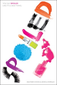
I talked to Heather Cocks and Jessica Morgan, aka the bright lights behind the hilarious Go Fug Yourself, about the cover of their Young Adult debut, Spoiled! "I like to imagine [the designer] Liz going shopping for a ton of makeup and then just dumping it all out on her desk and playing around, smearing it everywhere, having a day of feeling like a toddler in mommy's bathroom..."

Read the rest on bn.com.

PS-And YAY for the blog being back! Some image links are broken still, but I'm working on fixing that.


Cover Stories: Between Here and Forever

Elizabeth Scott has been here before to share Cover Stories (which I'll link to when my blog is fully functional again--soon, soon!). Now, she's on a Girlfriend Cyber Circuit tour, and she's back with a beautiful tale of Between Here and Forever: "I had no idea about the cover at all--when I'm writing, I never think what I'm writing will be published, so I don't think about it. I wasn't asked for input on the cover, but let me tell you, this cover was everything I had no idea I wanted--and MORE!

"When I first saw my cover, my exact thought, as written to my editor, was, 'OMG I LOVE it! It's so perfect and holy crap, the way it ties into Bloom [below left] is BRILLIANT!!!' (I tend to be very caps happy when I'm happy :-)

"Everyone at Simon Pulse is amazing about taking feedback--at some houses, you just get your cover and that's that, but Pulse really listens to its authors.

"The cover on the book is the exact image I first saw, which is rare, as usually there's at least some tweaking. It's a stock photo, and I adore it. I love how perfectly it fits the book, and I love that it's a nice shout-out to  Bloom as well."

Thanks, Elizabeth! I love soft greens and girls with flowers. It just gets me every time. What do you guys think?

PS-I should also note that Elizabeth's 2010 novel, The Unwritten Rule, is out in paperback with a new cover. Compare the hardcover and pb below. I like both, but I have to say, that orange-red dress on the gray background (and that fanning, glossy hair)? Divine.

Cover Stories: Girl Wonder

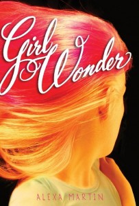
When I saw the cover for Alexa Martin's Girl Wonder, I whispered to myself, "Superhero hair." I always wanted superhero hair, always envied girls who had the courage to have it. Instant enchantment. Here's Alexa with how the cover came to be:

"When my book was first acquired by Disney Hyperion it was called Ski Season. Back then, I definitely had a strong notion of what I wanted the cover to look like. For my birthday that year a friend had given me a card by the artist Nikki Mclure. The image on front was of an old-timey looking ski scene.

"'That’s my book,' I thought. 'Yup.'

"Though I have misplaced the card and can’t find the image anywhere online, here is a link to Nikki Mclure’s portfolio.

"I know, right? She’s an amazing artist and illustrator and also lives in the Pacific Northwest, like my main character, Charlotte—and also like me!

"But after I edited out all of the skiing from my book (which is another story all together... kind of a scary story but thankfully one with a happy ending) Ski Season was re-titled Girl Wonder.

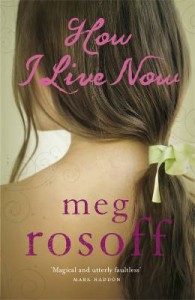
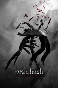
"My editor and I brainstormed some possible cover ideas, and I sent her a list of twenty of my all time favorite YA covers, including How I Live Now, by Meg Rosoff, The Dead Tossed Waves, by Carrie Ryan, and Hush Hush by Becca Fitzpatrick (see all below). I’m a huge believer in the power of a great cover. In spite of knowing better, I too am guilty of judging a book by it’s cover (at least before I read it).

"So yeah, I cared. I cared a lot.

"It had to be fabulous. Eye catching. And it had to do the story justice.

"I was at a complete loss.

"In Girl Wonder, my main character Charlotte moves to a new town and is befriended by Amanda Munger. Amanda is glamorous, sexy, bold, and carefree. She is also brilliant, rich, and has a long history with Neal Fitzpatrick, Charlotte’s secret crush. Amanda has everything Charlotte thinks she wants. And she also has hot pink hair.

"'It was like her hair was a reflection of some inner radiance,' Charlotte tells us the first time she sees Amanda sashaying down the schools halls like she owns the place.

"Four days before I was to have neck surgery related to a rock climbing fall (another story for another time) Hyperion sent me four possible images of what they were thinking for the cover. They were all amazing but by far and away I loved the first one best. It was perfect. It was my cover. I had to have it!

"Here’s what I wrote to my editor about that image:

“'It's so sophisticated and wild and fun and jazzy and makes you want the pizazz that the girl with the hair possesses... just as Charlotte wants to BE Amanda. My favorite for sure! From an artistic standpoint, I think the image is the one that you'd remember years and years down the road... or want to frame in a swanky apartment.'”

"I forwarded the image to my agent (who was as instantly smitten with it as I was) and told her that I loved my cover so much I wanted to sleep with it under my pillow!

"Thoughts of my cover helped distract me in the hours before my surgery. Imagining how my cover would look on the shelves at bookstores helped me to forget about the pain after surgery. It gave me an endorphin rush… or something like that!

"As my May 3rd publication date drew closer and closer I grew jittery. I want people to love my book and my character. There’s so much about the publication process that’s beyond the author's control.

"There’s one thing I’m not worried about, however. My cover. It kicks ass!

"Thank you Kevin Madsen and Marci Senders and the rest of the Disney Hyperion design team. You’re way high up on my gratitude list!"

Thanks, Alexa! I believe I've gushed quite a bit already, but I just have to say it again: I love this cover. And the reviews? They're pretty great too. What do you guys think?

Cover Stories: The Summer of Firsts and Lasts

Terra Elan McVoy is back with a new release that has a cover that's just as colorful and summery as her previous ones. Yay! Here she is with the Cover Story:

"I try never to think about my covers when I’m writing, mainly because I’m a writer, not a professional marketing person, and I know that these kinds of things are usually best left in the hands of people whose job it is to be good at this! I just hoped (and knew) that it would tie in well with the covers of Pure and After the Kiss [read those Cover Stories here] that everyone (including me) loves so much!

"I do remember having a conversation with my editor about the cover when the initial planning stages were going on. I was thinking there had to be some sort of yummy thing that involved three in some way. I was brainstorming--because The Summer of Firsts and Lasts is about camp—maybe a s’more? There’s marshmallow, chocolate and graham cracker: three ingredients, so I thought that might work. But it turns out there are some other books with s’mores on them and we wanted to go a different route. As soon as I saw ice cream I was like: Perfect!

"I swear, when I saw the design I just thought, 'I am so lucky.' The color was a surprise, because I think I was maybe picturing something green (like summer trees), but I just ADORE the hot pink. I wouldn’t have thought of it, and I love it. It pops so much and the three flavors of ice cream... perfect!

"We had to do a whole separate photo shoot for the ice cream, because the original images they were using just didn’t look real enough when they put them together. I have to say that I LOVE picturing an ice cream photo shoot just for my book, right?

"Ultimately, I just feel so lucky that there are such amazing, creative people in the Art Department at Simon Pulse. I think the attention to detail—making all my book covers tie together—is really incredible and just works so well. I love the simplicity of the ice cream cone in this book—it is so perfectly summer. And of course there are three flavors to represent the three different girls. I’m not sure though which flavor stands for which sister. I think the green is maybe Violet, but then I can’t decide whether it’s Calla or Daisy who is the strawberry. So maybe Daisy is the green? But then it depends on whether it’s mint or pistachio... I’m still not sure!"

Thanks, Terra! How pretty do her covers look together, above? They are like a collage of summer itself. Also, I love the idea of an ice cream photo shoot and ice cream flavors/colors as character representations. Delicious.

What do you guys think?

Cover Stories: I'm Not Her

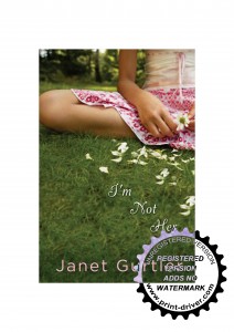
Janet Gurtler's original title was The Weight of Bones, and she had a very different cover at first, so I had to find out how it evolved from the initial version (below) to the final (left). Here's Janet: "I had no clue what the cover of this book would look like when I was writing it.  I never do. I mean I love imagining my work in progress as an actual book, but in my mind the cover is still pretty much blank. I’m just not a visual person in that way. I have zero artistic ability. As in none. I can barely draw a stick man. I’m happy that there are talented cover designers out there to come up with covers!

"The cover for I’m Not Her was presented to me as I was still digesting a title change. Originally the title of my book was The Weight of Bones. It really had a cover story all it’s own! The first cover presented to me was orange and yellows and kind of arty and eclectic. The designers had come out with some really beautiful but really different designs so they opened up a vote on the Teen Fire website.  You can see the old cover ideas here.

"Popular vote was for the black and white image but the consensus was that color was needed. I was given several colors to look at and as a team we chose this cover (right). I thought the cover selected was truly beautiful. It was eerie and dark and kind of broken, the way some of the characters in the book are. I really loved it.

"Ultimately though, my wise publisher thought the book didn’t convey the right tone. It looked more like a dark paranormal story or a truly dark story like Wintergirls and in the end, it probably wouldn’t have reached the right audience. (Publishers are wise like that). So in the end I sorrowfully let the title and cover go.

"Honestly I loved the old cover and old title so hard, it was a little tough to get my mind around the new title. But when I saw the cover that went with it, I was really, really happy. Within a day I was madly in love. The colors are beautiful. It’s so pretty and to me there is so much about the picture that the reader can interpret. Hopefully the cover does what it is supposed to do, and entices readers to pick up the book to take a look at it. And hopefully, from there, (deep cleansing breath) readers like what they read and purchase I’m Not Her!

"My editor is a wonderful woman and she did ask for my feedback on the cover. There were a couple of other covers presented at the same time, we all loved this one the best!

"When the final version of this cover was sent to me, they’d added the bubble over the title (see top image). To me, it finished off the look incredibly well. I was actually really impressed with the back cover of the book too when I got the ARC. The artist incorporated the bubble for the back cover copy in inverse colors and I think it looks FAB!

"Honestly? I am gushy in love with this cover. It wasn’t LOVE at first sight but I am head over heels now. The wilting ripped up flower has meaning, because the story isn’t a light happy one. I like how it’s contrasted with beautiful, hopeful colors though, because as tragic and heartwrenching as the story is, ultimately it is about finding your true self and learning how to become and love who you are.  So I think the bittersweetness portrayed in the cover suits the story."

Thanks, Janet! That is a huge visual and title shift to go through as an author, and I understand why it took you a while to get used to and love the new direction, but rest assured that it's lovely! (And I like the title font change from first to last version of the new cover, too.)

I snagged this publisher's description of the book, and I have to say that I think the final cover tells this story more than the first. What do you guys think?

Brainy Tess Smith is the younger sibling of the beautiful, popular, volleyball-scholarship-bound Kristina. When Kristina is diagnosed with bone cancer, it drastically changes both sisters' lives. Sometimes the things that annoy us the most about our siblings are the ones we'd miss the most if we lost them.

In this YA literary coming-of-age novel that will appeal to readers who love Jodi Picoult and Sarah Dessen, sisters Tess and Kristina discover not only who they are, but who they can become.