 It's a love day, no matter who's around you to love. Just spread the hearts. And though I try not to tout I Heart Daily too much on this blog (because it's kind of like people showing you their baby photos--isn't she the PRETTIEST BABY EVER!?--which of course he or she is, always), but today I have to share our Valentine's Day cards, created by awesome site designer Martina Fugazzotto. You can download, print and cut them out if you want to celebrate today but you're not into Hallmark cards.And today, we have a guest post by the lovely Jocelyn Pearce, who recommends giving a gift from Heifer International. You can read all about why, but let me just say that Jocelyn's words convinced me to create a wedding registry with Heifer International so my guests can either buy a family in Cameroon a flock of chicks in my name, or they can get me a blender.
Seriously, check it out. It'll make you feel good.
Happy Valentine's Day!
PS-Bookworm just got to read Violet on the Runway! Check out her review here.
Other Stuff
Photo Friday: Cover Girls (Sarah Dessen and... Me!)
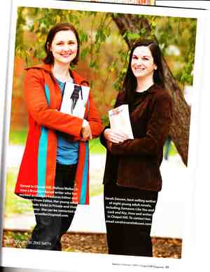 When my hometown magazine, Chapel Hill, contacted me and Sarah Dessen about doing a joint interview, I thought I might be imagining things. They wanted to feature both of us, as authors from Chapel Hill who write for teens. Which is, pretty much, the biggest honor ever.Sarah and I had a great time--she's as cool and fun as you'd expect her to be--and the magazine ran a looong story in the January/February issue. Which also happens to have us on the cover! This big photo is from the interior--I just like it better because on the cover I feel like I look ridiculous! And I like that jacket.
Anyway, I'll paste each page of it below... feel free to click to enlarge so you can read details on my 9th grade crush (Yes! They named names!) and Sarah's take on perfectionism and parking lot slacker-dom. We also both talk basketball, of course (though they did cut some of that conversation--I think we each had three or four Carolina basketball stories. It comes with the town.)
Happy Friday!
PS-I know, I know, my scanner isn't what it should be. Sorry about the crookedness and the patchy color! Best I could do.
Bonus Cover Story: Screwball by Keri Mikulski
**Quick note: Go to Linda Gerber's Love Fest for romance advice from me today (eek!) and also a chance to win pink lip gloss and Keeping the Moon by Sarah Dessen!** You guys must know Keri Mikulski from her fun blog and her sporty series, which starts with SCREWBALL! I invited her over to tell her home plate cover story, and here we go:
"Since the beginning, I pictured a simple cover for SCREWBALL and I always adored Lauren Myracle's TTYL series covers. I didn't want the cover to be too sporty or completely non-sporty. Instead, I pictured something in the middle.
"I was lucky. My publisher elicited my input about the cover from day one. I was so new to the book world (still am), so I had no idea what to expect. She sent me some early designs and ideas and asked what I thought and I was honest.


 "At first the covers were shot with models. But, the final cover I believe is a stock photo. In a weird twist of fate, my best friend since elementary school's sister, Jodi Raines, completed the second round of designs. Jodi sent four designs to my publisher and I immediately fell in love with the final pick (far right). Jodi did an amazing job and she's extremely talented.



 "My editor sent me some different colors and ideas (pictured above) and we both agreed on the purple background and light purple letters. Luckily, Jodi is super laid back and open to suggestions. But, honestly, when I saw the second round, I knew the purple cover was the one. I was thrilled and completely trusted Jodi's total vision.
"When I received the ARCs in the mail, I was ecstatic. The cover looked awesome and better then I ever imagined. I'm still blown away by designers. It's unbelievable how someone can read a story or a plot summary and develop an image that expresses the 60,000 (+) words in one pic. Wow."
And Keri asks: "Do you think we made the right choice?"
I do! I like simple covers and don't always need models. This one has a great feel to it with the dirty heart--it shows a tough softness that echoes in the book.
(Though I wonder if that cute guy and girl were sad they didn't get to be on the cover of Keri's book! I don't know why I think about stuff like that, but I do.)
What do you guys think?
Win-It Wednesday: FADE by Lisa McMann
I'm totally going to recycle that "what made you happy today" question, because every day I heard more and more about what was making people happy and that made me happy. It was a smilefest. Anyway, the winner of What Would Emma Do?, as chosen at random, is... Dragon's Pizza! She has a cool Pretty Little Liars skin on her myspace page (still need to read those books!) and is playing Taylor Swift's Love Story. A girl after my own heart! Send me your address, DP. Now, this week I'm giving away an ARC of the much-anticipated FADE, by the Lisa McMann, whom I'm kind of friends with. I mean, we've hung out a few times and I adore her. So in my mind, that makes us friends. Anyway. The book is just as good as it's predecessor, NY Times Bestselling WAKE, and I actually think it's even a little better because the action is so intense in this one! You'll love it.
So, Valentine's Day is coming up, and on I Heart Daily, we did a feature where the amazing Ben Kweller (Do you guys listen to Ben? You should so listen to Ben) picked out his favorite love songs. Go check it out because: 1. It rules. It's an amazing mix of songs; 2. Ben is a truly romantic soul. And when it's true, it doesn't come off as cheesy, so that's a bonus. Listen and love.
That was a long interlude, but it's all coming together here: To enter to win the copy of FADE, comment below and tell me what your #1 favorite love song is, right now. I mean, it might change tomorrow, but what's the first one that pops into your mind? For me, in this very moment, it's Resurrection Fern by Iron & Wine (if you click through it's the last song on that list). Worth a listen. I promise.
PS-Don't forget that Lisa is running this Fund Your Dream Contest (the prize is $1000!) until early March, so enter if you're between 14-18. I mean, why not?!
PPS-Tonight at 9pm EST: Carolina-Duke. Go Heels!
UPDATE: Carolina 101, Those Other People 87. WOOOHOOOOOOOO!!!!
Wendy Toliver is Pretty... In the Dark
 Today I have three questions for Wendy Toliver, author of the just-released Miss Match! The story is about Sasha Finnegan, who has a knack for setting people up. At 16, she turns her talent into a business, molding high school crushes into true love--until it turns out her crush wants to be set up with her sister!I love romantic comedy novels, and Miss Match sounds like a lot of fun. I also noticed way back when that Little Willow pointed out that the cover showed a girl in a normal size (albeit a cartoon girl) and that struck me too! So I asked Wendy some questions about image, and she told me that she's very pretty... in the dark. Read on.
 You chose to make a not-stick-thin narrator (and that shows on the
cover, which is really cool), and you say she's not drop-dead gorgeous
either. Why that conscious choice?
"I was a teenager once (hold the laughter) and I know how important image is at that age. I wanted to tell a story where the heroine is not model-thin-and-beautiful, but has so many other things about her that are admirable and lovable. I wanted to create a character who doesn't get by on looks alone, but learns to find her inner beauty."
How did you feel about your appearance and weight when you were a teenager? Did your perception change as you got older?
"My weight has always been pretty low, for my 5'9" height, but I had issues with other things, like my color (VERY white) and my skin (acne-prone). In fact, one of my most painful memories was sitting in a friend's basement watching movies with a group of kids, and a guy said, 'You're pretty in the dark.' Of course, now that I'm an adult, my husband loves to say that just to be funny. But at the time, it really hurt. (And by the way, back then, Oxy and Clearasil were the only acne meds, and I had a bad reaction to Benzol Peroxide.) Now, I'm 35 and I started working out 4 days a week (in addition to chasing my 3 sons around the house) and though I weigh 5-10 pounds more than I did before I had kids, I like the way I feel and I am lucky to have a husband and family that makes me feel good about myself. I try to pass that on to my kids, so they have a healthy self-image."
If you had to cast an actress today as your narrator, could you?
 "I think Miranda Cosgrove (iCarly) has the perfect face for Sasha Finnegan, but she'd have to gain some weight because she's so thin. America Ferrera comes to mind as a 'real girl,' and though she's too old to portray Sasha, here's a cute story. My father-in-law was watching the Golden Globes or some sort of awards ceremony where America was on the red carpet looking amazing. 'Is that Ugly Betty' he asked. We said yes. 'Hmm. She's pretty!' :)"
 Yes! I love this photo of America and Betty that shows how much Hollywood makeup and hair and styling can do--and also how much America (and every girl who stays true to who she is) shines from within. Thanks, Wendy!
Two things: ALA and a Twitter Interview
 First the ALA has just named Violet on the Runway a 2009 Popular Paperback for Young Adults! I'm so excited, and in great company--check out all the picks here.Second, I've been interviewed by the very cool Erin of Books in 140, who conducts interviews via twitter in 140-character increments. So much fun! Come say hi.
Are you guys on twitter? Follow her at @booksin140 and follow me at @melissacwalker.
Happy Saturday!
Photo Friday: Beauty Treatments
Okay, so I'm being a guinea pig for a magazine where I have to try out a bunch of treatments around NYC, and last week I had two: 1) Eyelash extensions, 2) Spray tan. I can't give away all my thoughts on these--that's for the magazine--but I will tell you that I felt very "not me" for a while. Here's a pic that my friend Katie took over the weekend: I wasn't wearing a stitch of makeup, and I was darker than nature intended. (I know it's not very tan; I'm pale as a ghost normally).
Happy weekend!
PS-For some reason the picture isn't very clear unless you click to enlarge--then it comes into focus and you can see the eyelashes more.
PPS-Found out about Deborah Reber's new venture: Editing teen memoirs. Wanna get yours published? More info on readergirlz.
UPDATE: Adding another lash photo upon request. The closed-eye shot. Sorry it's blueish--Photo Booth on my Mac is often that way.

Bonus Cover Story: EVERMORE by Alyson Noel
I keep seeing EVERMORE, the first book in Alyson Noel's Immortals series, everywhere! I hear that though it's only been on shelves a week or two, it's already in a second printing. This is definitely on my to-read list. And, Alyson is a member of the GCC, so she's here to share her Cover Story. Here's Alyson:
 "I did use some visuals while I wrote. I have this image of a blond girl--this is how I imagined Ever to be. Except Ever has bangs, which are pretty significant in the story. But still, I was drawn to her wistful sadness with a hint of inner strength--that rang very 'Ever' to me!
"And I used this catalogue to decorate the house for a very significant Halloween party  in EVERMORE--it was so much fun, I wish I could've done it for real!
"However, I had absolutely no visions for the cover! None. Nada. Zilch. Couldn't even imagine what it might look like. I work this way with all of my books! When my editor (the awesome Rose Hilliard) called one day to ask for my input, I didn't want her to know I hadn't given it the slightest thought, so I quickly mentioned some recent covers  I liked, talked about colors (Purple! I love purple!), and mentioned that the tulips are hugely symbolic so we might want to add a few of those too. Then she took our ideas to the Art Department--et voila--a few weeks later, the EVERMORE cover appeared in my e-mail box and it was love at first sight!
"They used a photo-shopped stock photo. I learned this via one of my favorite YA bloggers who noticed they used the same photo on EVERMORE as they did in that gorgeous NORTH OF BEAUTIFUL cover. But they used the photo in such different ways it didn't really bother me at all. Just like it doesn't really bother me when someone is wearing the same dress as me--there's room for us all!
"When I first saw EVERMORE's cover, I thought: WOW! And then I called my husband into the room and we both stared at the computer screen and said a simultaneous: WOW! Like a chorus. Like we'd been practicing our 'wows' or something. I seriously fell in love with it, and I e-mailed my editor right away to tell her so!
"My editor is awesome to work with, and so far we've collaborated on both the EVERMORE and BLUE MOON covers. I'll be revealing BLUE MOON soon--I'm very excited about it! I did see an original for BLUE MOON, and it changed quite a bit--for the better!
 "This brunette is the inspiration for two characters (identical twins) who show up in BLUE MOON. Her choppy bangs, her defiant oddness, her playfulness, really summed it up for me!
"The Art Department takes all suggestions to heart! Every single one of them! And I think they did such a tremendous job with both covers, I can't wait to see what they do with UNTITLED BOOK #3!
"I never saw an original version for EVERMORE, only the end result. Here's how I feel about the cover: I LOVE, LOVE, LOVE it!"
I think it's gorgeous too, and I love the purple and red combo--it really stands out. What do you guys think?
The Violet Books on Sale!
This is the quickest post ever to say that, yes, I do amazon-stalk my books, and I just saw that they're offering Violet on the Runway and Violet by Design for just $2.99 each for a limited time! Bargain alert!
 Just in case you've been holding off buying them, I had to let you know that here's your shot. Click the books to go straight to the $2.99 version. And, no, Violet in Private isn't on sale, but you can get ALL THREE for $15.97 right now. Pennies, people, pennies!
xo,
MW
Photo Friday: My Real Housewives Moment
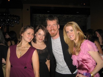
This week, my friend Sarah Grace and I got to attend a party at fancy "supper club" Bruno Jamais for Simon & Alex of Real Housewives of New York fame. They're writing a parenting book, of course (People magazine was there too).