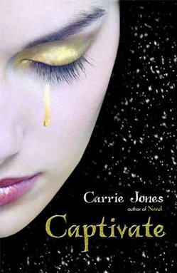
 Last year, Carrie Jones shared her awesome Cover for Need right here, and now she's back to talk about the New York Times Bestselling sequel, Captivate (Bloomsbury)! Congratulations on the amazing success of this series, Carrie, and thanks for being here as part of the Girlfriends' Cyber Circuit tour.Take it away, Carrie!
"I had no cover ideas -- I am so horrible at that. My publisher didn't ask for input -- and when I first saw the cover, I sort of passed out because it was so awesome.
"My editor asked if I wanted to make suggestions, but I didn't want to. I really loved the cover. Except, I wanted to apply a little wax to the girl's eyebrows. That's just me though. I'm obsessive.
"I have no idea if it's a stock photo or a photo shoot, actually. * feels dumb * Bottom line: I really love it. I love that it ties into the cover of the first book. I love that more of her face is exposed."
And sometimes a Cover Story is just that simple -- especially when it involves a gold glitter tear. So pretty and emo. Sigh. I actually love her eyebrows--and those lashes (divine!). What do you guys think?
Here's the book trailer btw:
PS-There's a Bloomsbury sweepstakes going on that has some big prizes! Enter here.
Cover Stories
Cover Stories: Shine Coconut Moon by Neesha Meminger
 Neesha Meminger's Shine Coconut Moon is high on my to-read list (also: The Gossip Girls are reading it!). I heard an excerpt from it last year, and I just know I'll love it! Read the very cool Lyn Miller-Lachmann's review on readergirlz.Plus: The Cover. I had to find out the back story. Here's Neesha:
"Thank goodness no one asked me for my thoughts on what should go on the cover! As I was writing the book, the only thing I could think of was a giant coconut in the shadow of a waning moon. Ugh.
"The only thing I said to my publisher was, 'I'm fine with anything except a headless woman.' Obviously, you know just how far that input got me {grin}.
 "Okay, truly? When I first saw my cover, I was disappointed with the headless model. I really had a hard time moving through that. For South Asian women, it's a bit of a double-edged sword. On the one hand, we're absolutely thrilled that there is SOME representation--especially if that representation is not of the usual, passive, submissive, sari-clad, new-immigrant variety we're used to seeing on television and in movies. On the other hand, yes, it absolutely objectifies young women as does all of the mainstream media we see every single day.
"But, when my husband came over to look at it over my shoulder, his first response was, 'Holy #$%@! That's an AWESOME, eye-catching cover.' As he walked away, he mumbled, 'Arresting . . . that's what it is. Arresting' I started liking it a lot more almost immediately.
"The one big thing I asked them to change, they did (see Neesha's post, which goes into great detail about the important back cover changes). My editor was completely behind me (thank goodness!), and the final result, at least in *my* humble opinion, is stunning. I love the juxtaposition of the traditional painting on the back and the modern, tough, sexy girl photo on the front.
"Only the back cover changed. The front was pretty much the same as it was in the sketches I saw. The front cover was shot with a model.
"I quite like it now, actually. I totally agree with the headless/objectification argument, and yet, at the same time, I see how rarely young, Indian-American teens get to see themselves as tough and sexy and hip in ANY mainstream media. While we can't see the model's face, I still love that she exudes confidence, she's a hip young Indian-American woman who is facing forward, thumb hooked into the belt loop of her jeans . . . ready to take on what life throws at her."
I love this final assessment of Neesha's, and it's fascinating to hear about the back cover battles. In the end, I agree with her husband: Arresting. What do you guys think?
Cover Stories: Dream Life by Lauren Mechling
 Lauren Mechling (she of the enviably glossy hair) shared her Cover Story for Dream Girl here last year. Now, she's back to dish on the sequel, Dream Life, which is all butterflies, all the time. Whee!"Dream Life is a sequel to Dream Girl, so I knew it would likely feature a cover in keeping with the visuals of the first book, which always reminds me of Japanese candy. Shortly after I'd started writing it I was given an even more specific idea to store in the back of my mind: my very cool editor Krista Marino showed me a photograph she was hoping to use on the new cover. If memory serves correctly, it showed the same model as the one who plats Claire on the cover of Dream Girl. But instead of sitting and looking lady-like, she was flung across a couch, her head tilted back and her arm falling down to the floor. It was very dramatic and much less lady-like than the first image. It was intense. I liked it.
"So a year or so later, when it came time to see the cover image Random House's design genius Angela Carlino had whipped up, I saw the damsel-in-distress image had been given the boot. Instead there was a picture of the model seated and reading an antique book, surrounded by a blur of butterflies. It hardly screamed 'danger!' which was a surprise. I was also surprised by how much I liked it. Even though Claire isn't much of a reader and butterflies don't really figure into the book, it captured the quirky, mysterious spirit of the book.

 "The bubblegum pink of the first book's original cover (now it's blood red for paperback, see the contrast at right) had been a problem for book shoppers, as they mistook the book for chick lit instead of a weird dark mystery. Conveying Dream Life's sinister side was definitely a problem the designers had to deal with, and I was impressed with their solution. It would have been easy to make some black-and-red Twilight knockoff. Somehow the story's edgy element comes through, even if the model is striking a demure pose and surrounded by butterflies (not exactly werewolves!).
"And so the only feedback they heard from my end was: 'I LOVE it.' Which I totally meant."
Thanks, Lauren! I really like the whimsy of these covers, all. The contrast of her paleness with the lovely green wall color is great. What do you guys think--will readers get the edginess of the books?
Bonus Cover Stories: Getting Revenge on Lauren Wood
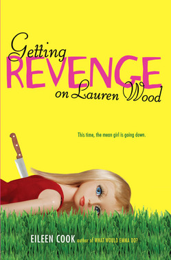 The lovely Eileen Cook is here to share the story of her new release, Getting Revenge on Lauren Wood.
"There is a scene in the book where the main character dresses up a Barbie doll in a cheerleader outfit and then chucks it into a wood chipper. I thought it would be fun to show someone holding a Barbie doll by it's hair and sticking a pin into it- voodoo style.
"I shared my idea, but the art department warned me that Barbie is trademarked so they frown on people sticking pins in her on book covers.  The designer did like the concept so she ordered a custom made doll from China and created the cover we ended up with (left).
"I believe I may have actually squealed out loud when I saw the final cover (above). I was THRILLED. I think it's super eye catching and captures the book perfectly.
"I really lucked out in that my editor and the art department have always been open to my making comments and feedback. There was a very early version of the cover that showed a girl staring out looking snarky and while I didn't hate it- I thought the picture could have been on a thousand different books. It didn't feel unique. The art director also wasn't thrilled with her first version so it was back to the drawing board.
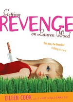 "We went through about three versions. The first was the most different as it was a photo of a girl, then the cover we have now but with a plain white background and then the cover as it currently exists.
"The cover is a photo shoot of the doll they ordered. The doll came wearing a pair of lacy panties. Makes you sort of wonder about who typically orders these dolls. Her panties didn't make the shoot.
"This is my favorite cover. I love pretty much everything about it from the picture to the color and the font."
I'm always kind of mesmerized by doll covers, and this one is especially intriguing with the knife (and also the back story of how she arrived in just panties--yikes). I also think they got the colors/fonts right. What do you guys think?
Cover Stories: Far From You by Lisa Schroeder
Lisa Schroeder's Far From You comes out in paperback this week, and it's got a new cover. I asked her for the back story: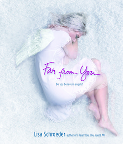 "I'm not a very visual person, so I really don't think about cover images when I'm writing the book. I also think it's important to be open to whatever the art department comes up with. I would never want to have my mind set on something specific and then be disappointed because it's so different from what I envisioned it to be.
"My publisher hasn't ever really asked for my input, and I'm okay with that. I've had many people tell me all my covers have been fantastic, and I agree. They know what they're doing, and I trust them to know what is going to represent the book well and sell it!
"The first time I saw the new cover for the paperback version of FAR FROM YOU, I thought it was probably one of the most beautiful covers I'd ever seen. But I also freaked out a little bit because it's more of a symbolic cover than a literal one. If you look at the cover, you'll see it's a young girl lying in the snow, and she has angel wings.
  If people think they are going to be reading a book about a girl who turns into an angel, they will be wrong. There are angel references in it, and I love the tag line - do you believe in angels. But I do worry a little bit about what people might think if they read it expecting something it's not.
"The cover was a done deal. The sales and marketing team were very excited about it and so, the decision was made that it would be the final cover. I'm guessing it's a stock photo that they manipulated to get the look and feel they wanted.
"It's much more of a commercial look than the original hardback cover (above right), and I
 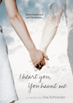 think more similar in looks to the cover of I HEART YOU, YOU HAUNT ME (left), which is probably a good thing for a paperback release.
"I love the cover. I really do. I just hope people remember that covers don't always depict images that show exactly what the book is about. I think people are fairly used to that idea when it comes to images of objects that are put on the front of books, so hopefully they'll realize that can be the case with images of people as well."
I hear what Lisa's saying, and I really like the white softness of the new cover at the same time. Overall, I think it's a win. I think the paperback is more compelling than the hardcover visually. What do you guys think?
UPDATE: Alea of Pop Culture Junkie just did one of her awesome Harcover vs. Paperback posts about this cover, so go weigh in there too!
Cover Stories: Bleeding Violet by Dia Reeves
 When I saw the cover for Bleeding Violet by Dia Reeves, I knew I'd have to ask her about the back story. That motion, those colors, that tagline: "Crazy never looked so beautiful." Divine. Here's Dia:"Before I ever got a book contract for BLEEDING VIOLET, I knew that writers had little or no say in what their covers look like... and my experience pretty much proves that to be the norm. But even though I knew I wouldn't be consulted, I thought that I should be prepared just in case. Better to have ideas and not need them, than to need ideas and not have them. I had a list of artists in mind whose work I thought was really dark and cool, like Jonathan Barkat and Saara Salmi, and I had a million cover ideas for BLEEDING VIOLET.
"My ideas for the cover were all creepy, in keeping with the tone of the novel. I imagined stuff like a girl in a violet dress that was dripping blood or even a literal violet in a bloody vase. I also thought of different covers that might illustrate the main character, Hanna's, bipolar state. For instance, a girl with a pretty smile hiding an ax behind her back. I also considered that the cover might focus more on the town itself because it's a major character in the novel. Something atmospheric with lots of dark trees and monsters peering through the leaves or a dark road leading into town full of floating doorways.
"But it was a wasted effort. My editor told me there would be a photo shoot (which was exciting, because most books have to make do with stock photography), and then a week or two weeks later he sent me the results. My initial reaction to the BV cover was embarrassment. I thought it was really sexy. Maybe too sexy. My first thought was that it was a girl writhing around naked in bed.
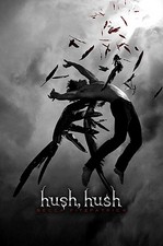
  But upon further study, I realized she was neither naked nor in bed--she was wearing a dress and only writhing around on a bunch of purple fabric (Hanna makes her own clothes and only wears purple, which explains all the fabric on the cover, in case you were wondering). It still looks pretty sexy though. I remember Suzanne Young who wrote THE NAUGHTY LIST (and has a pretty sexy cover herself, right) joking that she and I were gonna bring sexy back to YA. Plus Becca's HUSH, HUSH cover, below, came out around the same time, so that made me feel less alone in my sexiness.
 "So even though I had no say in the process, I really like my cover a lot and so did everyone at Simon Pulse, so there wasn't any hassle of going back to the drawing board and changing anything. I also LOVE that they used a black model on the cover. When I was a kid, I'd have killed to see a black girl on a fantasy/horror book, so the idea that the next generation gets to have what I didn't makes me almost insanely happy."
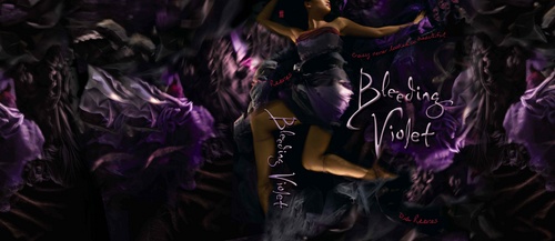 I'm happy about that too, and that the cover's true to the story. Also, check out the full wrap, above. The movement and fabric look are fantastic here--it makes me want to dive into a pile of tulle and silk and velvet. What do you guys think?
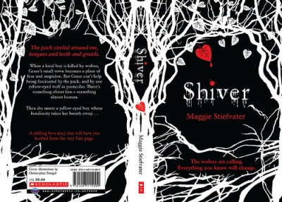
Cover Stories: Shiver by Maggie Stiefvater
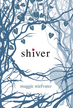 Maggie Stiefvater had one of my favorite covers this year with Shiver, and Linger--her upcoming summer release--is already a 2010 favorite. I had to hear the story behind these simple, subtle designs. Here's Maggie:
"I was a professional artist before I went full-time with my writing, so I'm possibly even more opinionated about book covers than most authors. I had mocked up a few covers for SHIVER, but nothing that I was really happy with -- I was way too close to the project. They were all before the title change (which I think is crucial to the final cover design) and so they were all less wintery and more autumnal.
"My publisher didn't ask for input, but they did give me the right to go 'OMG KILL ME NOW INSTEAD OF USING THAT COVER.'
"When I first saw the cover, I loved it. Seriously. No holds barred. It was nothing I would've come up with on my own (though I do have a painting I did when I was 15 that is eerily similar) but it was artsy, unique, and fit the book absolutely. They said, 'we want you to know you can say you hate it and we'll stop here and come up with something else.' But it was amazing. They asked again with the cover for my sequel and again, it was lovely, so I didn't have to say anything.
"The cover changed slightly, and they let me know about each change. The wolf's head turned a little, and they closed up some of the white space at the bottom.
 "The design was done in-house by the cover designer, who had actually read the book, too, which made a huge difference for both SHIVER and the sequel, LINGER (right). It let him build in a lot of nuance that I think otherwise would be missing. I'm also thrilled that it's not a stock photo. I think it looks totally different from anything else out there, and yet not so far out there that you're like 'that's some weird woo woo there.'
"I love the subtle wolf in the corner of SHIVER's cover. It's like the novel itself -- mostly about people and winter, and then the wolves are almost incidental. The werewolf addition is really subtle, and the almost invisible wolf hints at that."
I just adore this cover. What do you guys think? I also found the UK cover, which is pretty too, but doesn't have the wolf! I'm all for the US wintry version.
Cover Stories: Beautiful Creatures by Kami Garcia and Margaret Stohl
I have two amazing authors here today, Kami Garcia and Margaret Stohl. Since they're both talking, I'm going to Q&A this Cover Story. Their book is the very-buzzed-about Beautiful Creatures. I haven't read it yet, but I can't wait!Here's the story behind that gorgeous cover:
 MW: Did you have an idea in mind for your cover as you were proposing/writing the book?
Margie: We did. My sister-in-law, who is a graphic designer, even mocked it up. It was a black and white image of an enormous moon, with iridescent green lettering that said Sixteen Moons. I had nearly forgotten about that.
Kami: We had pretty much forgotten about that by the time we got to Little, Brown. We were so overwhelmed that the book was being published, we didn't think much about it.
MW: Did your publisher ask for your input on the cover design before the art dept started working?
Margie: I don't remember if they did, but we were all so excited that Dave Caplan was going to be our designer, because we loved everything he had done, that we had a lot of faith in Little, Brown to get it right. And actually, Amazon has just nominated the Beautiful Creatures cover as one of the six best in Children's and Teen fiction of the year, so we were right to trust him! (Go vote on it at Amazon until December 17th!)
Kami: They told us Dave was the designer, and that he would show us a concept when he came up with something. The "something" was the BC cover. That was his first try.
MW: What did you think the first time you saw your cover? Truly!
Margie: We flipped out. When we saw the image of the tree, with the lettering and the foil, we just freaked. We know how important the cover is for a YA debut novel, and we've felt so lucky Beautiful Creatures turned out to be such a, well, beautiful creature!
Kami: I couldn't believe how dead-on it was. The trees look exactly the way we envisioned the road leading to Ravenwood, and we LOVED the purple. The hand lettering is what we refer to as "the sparkly font."
MW: Did the cover change much from the original version you saw?
Margie: Not that I remember. We saw it once without the wonderful font, and then finally with the font and the color and the foil all mocked up. It was stupendous, even then.
Kami: Dave tweaked the purple a little before printing, but that was it.
MW: Do you know if your cover was from a photo shoot or still life, or if it is a stock photo that the art department found that could capture the feeling of the book?
Margie: I don't know where Dave found the central image of the tree on the front. I'd love to find out.
Kami: I have no idea. I know the tile was hand lettered by Si Scott.
MW: How do you feel about your cover, in the end? Have you found any hidden meaning in it or anything you didn't notice at first glance?
Margie: I still love it. I love the way the road opens to draw the reader into the world of Gatlin. It's perfect for our book.
Kami: It is so amazing -- from the way it captures the feel of the book to its graphic and artistic qualities. As far as I'm concerned, Dave Caplan is the rock star of cover design!
I'm with Kami and Margie. Love this cover. It's almost like the negative of a photograph, no? And that font is like liquid text--lovely! Plus, the reviews are raaaaaving. (Check out Hope's Bookshelf, The Compulsive Reader and The Story Siren.)
What do you guys think of the cover?
Cover Stories: What I Wore to Save the World by Maryrose Wood
 The lovely Maryrose Wood is here to share the stories behind the beyond-amazing covers of her Morgan series (you guys must have read/seen these magical books, yes?). The third title, WHAT I WORE TO SAVE THE WORLD, was just released, so now seems the perfect time for Maryrose's Cover Story. Here goes:
"I didn't have an idea for the cover. I love the visual arts and find them a great source of inspiration and creative rejuvenation (perhaps because they force my hyper-verbal brain to think on the other side), but I don't ever imagine book covers as I'm writing. It's hard enough thinking of titles!
"At some point while I was finishing up WHY I LET MY HAIR GROW OUT, the first book in the series, I got an e-mail from my editor that said: 'The art department wants to know what color Morgan's hair is.' Morgan is the main character of the book. 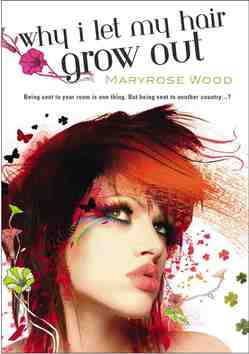 So I tried to explain: 'Well, it was originally strawberry blonde, but she died it black, then cut it off, and the stubble is now streaked orange, so your guess is as good as mine...' I had no idea why they wanted to know until they sent me the finished cover to look at.
"For the second book, HOW I FOUND THE PERFECT DRESS, I recall that there was more discussion because they were suggesting titles for the book, and we were simultaneously trying to come up with an image to match the title. The word 'wish' was suggested at one point, and the image of a candle, but I just couldn't make it work (it is Morgan's birthday in that book, but to me the birthday candle/wish thing seemed both too on-the-nose and not quite what the book was about).I was glad that we ended up with HOW I FOUND THE PERFECT DRESS, which I thought was concrete and fun, and the ironically pink prom dress Morgan wears in that book is an important part of the plot. The cover used lots of pink and a very magical-looking dress.
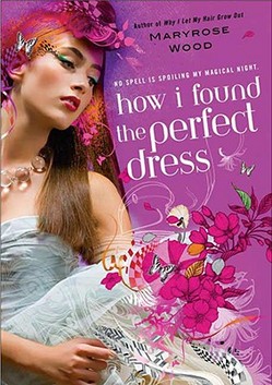
"WHAT I WORE TO SAVE THE WORLD was also a title that was late in coming, but the art department knew all along that there should be a dark, nighttime feeling to the background and that Morgan's locket would be featured. Both choices are perfect for the book.
"With the first book I was knocked out by the cover, I thought it was just gorgeous. I had had no idea what they were planning to do, so it was a happy surprise. I was also a little nervous, because it looked quite different from any other YA covers I had seen. Of course, as soon as the readers saw it we heard nothing but raves. I still get tons of compliments from readers on all three covers. A lot of them say WHAT I WORE TO SAVE THE WORLD is their favorite, though!
"My editor was always open to comments from me and from my agent, but honestly, all three Morgan covers came out of the art department pretty much the way you now see them. Our comments were mostly along the lines of, 'Wow, you guys did it again.' On the third book I did make some minor comments about the type treatment. Some little adjustments were made for the final version, which I think looks fabulous.
"The three covers you see look very much the way the looked when I first saw them. I should point out that this could be considered unusual. Many of my author pals angst terribly over covers and get deeply involved with the design process if the publisher doesn't come up with something spectacular right away. With the Morgan books I was lucky!
"I knew that artist Sarah Howell created the illustration. Starting with a real photo and adding fanciful computer illustration is typical of her work; you can see many gorgeous examples on her website (MW note: So cool! Definitely click that link!). But I didn't know where the original photo came from until I received an email from a very nice woman who said, 'You don't know me, but I wanted to tell you that my daughter is on the cover of your book!' I was gobsmacked! She was the one who told me the story. Her daughter had taken a modeling class, and the test shots from the class were sold as stock photos. The daughter had no idea the photo had been used on a book cover until a friend of hers saw WHY I LET MY HAIR GROW OUT in a bookstore and called her cell phone, screaming.
 "The thing about stock photos is that keep turning up. I recently learned (from those eagle-eyed readers!) that the photo used as the basis for the WHAT I WORE TO SAVE THE WORLD illustration also appears on the UK cover of PRIVATE. It's fun to see what the photo looked like before Sarah Howell got hold of it. Of course, I prefer my cover!
"I love all three covers. They're distinctive--you know it's a series right away--as well as being beautiful. Best of all, they capture the essence of the books, which combine the real life and faerie-world adventures of a teen girl with a strong, vivid personality. Morgan Rawlinson, the main character in the series, is a sassy, sarcastic, lovably bad-ass kind of teen girl, with relatable feelings of being cranky and insecure and rebellious and all that. I love that the girl on each cover is not merely pretty, but also intriguing and unique-looking. I think all three show a little spunk beneath the faery glitter!"
I have long admired Maryrose's covers, and I think all three are just gorgeous. Honestly, I think I like WHY I LET MY HAIR GROW OUT, the first, best. I was enchanted at first glance. You guys?
Bonus Cover Stories: Perfect Shot by Debbie Rigaud
Debbie Rigaud is part of the Girlfriends Cyber Circuit, and she's also the proud author of a new Simon Pulse Romantic Comedy, Perfect Shot. It's about a volleyball star who enters an online modeling competition to get closer to her crush. Soon, this tomboy finds herself off the volleyball court and the middle of the fashion world... and she wants to win. I like this plot (surprise)--lots of models actually did play volleyball at some point because it's a tall girl's game! Here's Debbie:
 "The Simon Pulse Romantic Comedies series are all awesomely illustrated by Amy Saidens, so I had a general idea of what the cover would look like. But since PERFECT SHOT is the first in the series to feature an African-American protagonist, I was extra curious to see Amy's rendering of the characters.
"I was asked to give a short description of the main characters, including their personal style. I described love interest Brent as a clean-cut version of a teenaged Lenny Kravitz. Swoon!
"When I first saw my cover, I was excited! I own a number of Simon Pulse Ro-Com books, plus over the years I've spotted them at libraries and bookstores, so contributing my own characters to this popular series is a thrill.
"My editor Michael del Rosario was the coolest. He invited me to make comments/suggestions and took my feedback to the art department. PERFECT SHOT is my first solo book, so getting a glimpse into the cover process in this way was an education for me.
"I was happy to see that the art department made the minor adjustments I'd suggested. Everything seemed to go smoothly, so that put my mind to ease. As you can imagine, with this being the first cover featuring Black characters, the art is especially significant to me.
 "Based on the suggestions I made, the characters look more distinctly ethnic in the African-American sense. The most obvious change is that London (the main character) got a haircut. In the original her hair flowed down her back (right), but they obliged my request for a shoulder-length coif.
"Amy and the art department hooked me up. They did a fabulous job. From the general look of the characters to the smallest detail (like volleyball insignia on London's jersey), I couldn't be happier with it!"
I love that Debbie got to make some changes--looks like London's skin got a shade darker--and I agree that her haircut is way cuter short. What do you guys think?
PS-Leave a Mark is auctioning off a marked-up copy of Lovestruck Summer today (where I wrote all through the margins about the back story of writing the book, character names, inspirations, etc). It's all for charity! Please go bid if you can.
