 Kristen Tracy is a fun person with a totally great Cover Story for one of her many books, Crimes of the Sarahs. Here goes:"I wasn't sure about a cover image. I LOVED my first cover for Lost It (right). In it, my main character loses her virginity underneath an unseaworthy canoe, and the cover attempted to capture a literal depiction of this--sloppily patched canoe with both boy and girl legs poking out suggestively.
  For Crimes of the Sarahs, I wasn't sure how to depict a group of four girl criminals.
"At some point my editor asked me if I had any cover image ideas, and the only thing I could think of was a group of girls with their heads stuffed inside nylons, possibly robbing something. But my editor had actually stuffed her head inside a nylon once in high school with a friend and they'd taken pictures of this and she assured me that it doesn't look so hot, especially not for a book cover.
 "I really liked the cover right away. They'd told me it was going to be inspired by the movie poster for Usual Suspects and I thought that sounded pretty cool. I remember they sent me pictures of the models and asked me what I thought. I really liked them. And I even forwarded some of the photos to a friend of mine at work to see what he thought and he wrote me back right away and told me that if I was going to send him pictures of 14-year-olds wearing bikinis that I needed to put that in the subject line so he didn't open them at work. I thought he made a good point. I don't know why some of them were wearing bikinis. No crimes were committed in my book by bikini-clad teens. I'm certain.
"My editor wanted me to be happy. And I thought the cover was wonderful, so I was happy. We were all happy. I think even the models were happy. Though I am wildly projecting when I say that, because I have no first-hand knowledge of any of the models' emotional states.
"The only limitations I placed on the designers were the physical descriptions of the four girl criminals in my book. Sarah A (the ringleader) was blonde. Sarah B wore a Detroit Tiger's ball cap and chewed a lot of gum. Sarah C was a redhead, and not particularly fashion-forward. Sarah T (the narrator) had brown hair. The art department and my editors used my character descriptions to build a very accurate cover of my girl criminals. Even their heights are correct.
"We used models--gorgeous girly ones with attitude and obscene amounts of teen hair and four sets of handcuffs. (To be honest, it was sort of like looking at four different versions of my high-school self, except not at all.)
 "The cover didn't really change. They nailed it. And we all cheered.
"I find hidden meaning all the time. But I can't say that I've found any in the cover of Crimes of the Sarahs. The one image that feels loaded with symbolic meaning that I've been unable to unpack is the tank top worn by Sarah C (right). It has three fish on it. Two are headed in one direction and one is headed in the other. What's going on with that third fish? Does it know something? Is it fighting with the other two? I know it has a story. I know it's not just a random image of three fish. That third fish is up to something. . . but what? It's a mystery--a big, wet, swimmy one.
 "At the website www.crimesofthesarahs.com there are a ton of model shots that we culled through to pick the cover. The models look so adorable in the handcuffs (like Sarah B., left). I don't understand all the different scenes they shot, but they made me laugh. The models make the funniest faces. And change clothes. It was so fun to watch my story come to life and watch these four girls interpret my characters. It was a great experience. And my web designer Little Willow did an amazing job building the Sarahs' website."
Thanks, Kristen! I love this story and all the outtakes with the models (you guys should definitely click through to see them all.) I love that each character is truly represented on this cover--we all know that sometimes doesn't happen--and it has a really fun vibe.
What do you guys think?
*Pre-posted: I'm in Spain!
Cover Stories
Cover Stories: The Heart is Not a Size by Beth Kephart
 Beth Kephart is a master storyteller. Her words are poetic. I've said this 1000 times, and it's true in each book.
Here she is with the Cover Story for her latest work of art, The Heart is Not a SIze:
"Because my fourth young adult novel, The Heart is Not a Size, was inspired by a trip that I took to a squatters' village in Juarez, I had a strong visual sense of the country and the people I hoped the book's cover might portray. Georgia, my narrator, is, like me, a photographer. She has her new digital camera perpetually hanging from her neck. It was my hope, originally, to have one of Georgia's photographs grace the cover of the book--a portrait of the gorgeous children Georgia meets perhaps, or a study of shadows and contrast during a raging dust storm.
"But such absolute realism, Marketing worried, could suggest--to a bookstore browser--that Heart was a work of nonfiction, and so a different route was pursued. "Initial designs for the cover featured a Caucasian girl in a cute, short T-shirt; the photo was cropped tightly, revealing the model's mid-section and nothing more. It was a bright cover--eye-catching and commercially appealing--and I knew that Harper had given the look much care and concerted effort. But I worried that Juarez wasn't there, nor Georgia (who is hardly fashion forward). Harper graciously took another look and produced the cover that was ultimately selected.
"The photograph is not one I took, and it is, from what I understand, a careful montage. It suggests a story that takes place far away, in a country about which we do not know nearly enough--a country that now broadcasts itself to us in extremely painful headlines.  Drug wars, murders, assassinations. That is the Juarez we've come to know. But there is so much more to that place.
"When I was in Juarez, in 2005, I met people who were gorgeous inside and out--children and parents whose fates I wonder about every day. If only I could safeguard them with my love for them, I think. All I can do--all I have--is the book that they inspired."
Thank you, Beth. Now, watch a video with many of Beth's Juarez images (like the gorgeous one at right), and an excerpt read by Beth herself:
What does this cover say to you guys?
Cover Stories: Spring Break by Kayla Perrin
Kayla Perrin's Spring Break Cover Story is up on Unabashedly Bookish at Barnes and Noble, but I thought I'd leave a teaser here. The cover went from the original version (left) to the final version (right):
 And here's an excerpt:
"Now, you have to understand how conservative publishing is. They like things black and white -- literally. So they had two black college girls on the cover, but didn't include the white girl. My agent and I were able to convince the publisher to try something different, and even my editor thinks the new cover is fantastic. Ashley needed to be there. I hope that readers are able to see beyond 'color' and pick up this book because it's a great read!"
Read the full Cover Story here. You have to register to comment, but I'd love that!
Happy Saturday!
Cover Stories: Prophecy of the Sisters by Michelle Zink
Michelle Zink got a redesign! Her Prophecy of the Sisters has a new cover for its paperback incarnation, and Guradian of the Gate, its sequel, follows that design. So how does Michelle feel about the changes?Read on:
 "I'm always so focused on channeling the story that the cover doesn't occur to me until well after the book is complete. Prophecy of the Sisters was my first published book, and I was so focused on writing something worthy of publication that I never dared to DREAM about the possibility of a cover! With Guardian of the Gate, I originally envisioned another graveyard statue (because that's what was on the cover of the Prophecy hardcover, left). Once I heard that Little Brown would be rejacketing the series, I immediately imagined something very pretty that would stand out on the shelves and reflect the sensuality of the era and the books without being obviously historical.
"I've always felt strongly that everyone has a job to do in bringing a book to the shelves of a bookstore. I rarely second-guess my agent's advice (because I trust him implicitly and he's never steered me wrong), and I try not to question the advice and expertise of my editor, the Marketing department, my publicist, etc. It's not that I can't think for myself, it's that the skills necessary to write a great story are so different form the skills of an editor, a publicist, a cover designer. Maybe because of this, it never occurred to me that I might be included in the cover design, and when the talented Alison Impey designed the first Prophecy cover, I saw immediately why she'd created it! Once I was told the series was getting new covers, my editor sought my ideas and suggestions for the new look, and we had some really great back-and-forth about our ideas for the new look. We were totally on the same page, which was awesome!
"I had mixed feelings about the first cover, not because I didn't love it. I TOTALLY loved it. I knew how unique and striking it was and how different from anything else in the YA market. But I wasn't entirely positive it would be warm enough for the average teen reader. Bloggers are savvy when it comes to covers and adults tend to see covers very differently from teens, but the average teenage girl (I have a teenage daughter and am surrounded by teenagers so I see firsthand how they choose books) who just walks into a bookstore looking for something to read is often drawn to things they can identify with and/or things that are beautiful and sensual.
"The original Prophecy cover had done its job bringing in a tremendously loyal following among readers of dark fantasy, but as time passed, we noticed a growing trend of young people saying things like, 'I didn't know if this would be my kind of book, but I ended up loving it!' The book was often called 'addicting' by these same teens, and we started to wonder if we could expand that audience with a different look. All of that led to the new covers, which I loved on sight! I immediately believed they were going to do great things in the way of extending the readership of the series.
"I did give feedback on all my covers, but my feedback was sought earlier and given more weight with the new covers. From what I've heard, this is completely normal! Debut authors are rarely given heavy consideration in the design of their covers which makes perfect sense. I'm a writer, not a designer!
"With the redesign, the art department really, really did take my suggestions to heart! I was able to give feedback on the proposed photographer (by looking at samples of her work) and the models (by looking at their casting photos) before they were hired. My editor and I spent at least an hour one night just brainstorming ideas for giving the new covers the right blend of drama, intensity, sensuality, and semi-era neutrality that I thought would be so important in a new look. I'm so grateful for the opportunity to play such an active role!
"The final covers for the Prophecy paperback and Guardian of the Gate didn't change much at all. The brainstorming we did ahead of the shoot really paid off, and I think we started out all on the same page. Plus, with a gifted designer like Allison, a talented photographer, and such gorgeous models, the covers didn't need much!
"The new covers were shot with models (twins, in fact!) that were chosen after Little Brown held a casting call for the cover shoot. Originally, they thought they might need to choose non-twins to allow for some differentiation on the cover (even though the book is about twins, we didn't want them to be totally identical on the cover), but in the end, the stunning twins you see now ended up being too perfect to pass up! I think I gasped aloud when I saw them! [Here's the full jacket for the new paperback]:
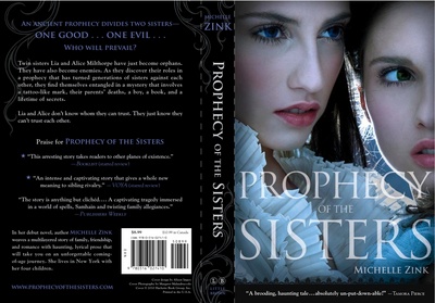 "I ADORE my new covers! I had the kind of immediate, knee-jerk, 'Oh, my God, these are unbelievably gorgeous!' reaction that I hope will be mimicked by teen girls in bookstores.
  I know it's sometimes hard for existing readers to get their heads around a cover change, but the new covers are going to open the series up to a whole new audience. Not only are the girls on the cover beautiful, with the kind of classic bone structure that I always pictured Lia and Alice as having, but they both have an intensity in their eyes that really speaks to the book. It's hard to capture that in a photograph, I think, but it is really done well here.
"I love how the lighting on the Prophecy cover is cool and blue. It reflects the feel of the first Prophecy cover in a fresh new way, and I love the expression on the girl's face on the Guardian of the Gate cover. It almost looks like she's getting ready to flee something, which is very, very fitting for Guardian. One of my favorite things about them is the texture visible in the small glimpses of clothing on both covers. It brings a subtle sensuality to the image that lends itself well to the story's era without being cliched or overtly historical. I confess that I sometime can't help taking another look at them!"
Thanks, Michelle! I have to admit I love the darkness of the original hardcover, but I get the marketing concerns about what readers will gravitate to in a bookstore, and the new covers are definitely way pretty.
What do you guys think?
Bonus Cover Stories: The Unwritten Rule by Elizabeth Scott
 I read Elizabeth Scott's latest novel in one day last week while I ate gingerbread cookies and drank coffee and tried to avoid my revisions. Total treat! (You can win a copy of it, along with four other great titles, on I Heart Daily--and enter the contest to win Living Dead Girl right here on this blog!) Oh, and check out Adele's review of the book to learn more about the inside.Here's Elizabeth herself to chat about the gorgeous purple cover!
"I didn't really have an idea for the cover. I just knew I wanted it be as pretty as my other Simon Pulse covers are!
[See two cover tries for The Unwritten Rule in this lineup of Elizabeth's other books (the bottom one is the final, just in different colors):]
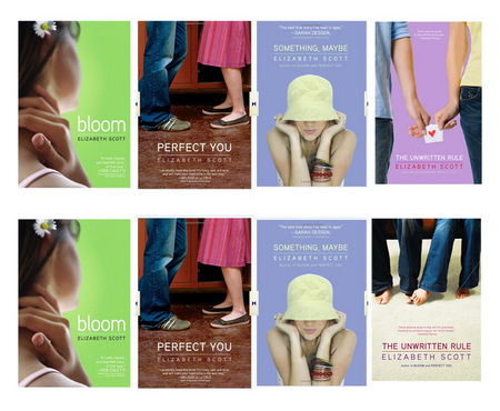 "My editor and I talked about what would look good, and we both thought hands touching or passing a note might be cute. But it turned out that there was a much better picture out there!
"We looked at a lot (A LOT) of images before *the one* was found and we talked about all of them. [See three below!]


 "When I first saw my cover, I thought, 'PERFECT!' And it is. I think it is the cutest cover!
"Simon Pulse has amazing designers, and when I saw the original image that ended up being my cover, I asked about making the background purple because a previous picture I'd seen had a purple background I liked. And they did that, and then we decided the carpet needed to be purple too, just to pull it all together. And the designer did all of that, plus more, and it looks amazing!
"It was a stock photo that the designer tweaked quite a bit--in addition to the color changes, she also did some work with the model's feet and even their jeans!
"I still think it's perfect--I smile every time I see it."
Me too! I do like it the best of all the choices--though the note-passing one is my #2 (maybe with a shorter manicure--those long nails are freaky). What do you guys think?
PS-Don't you love how Elizabeth and Simon Pulse let us share all these test covers?! They did it with Something, Maybe too. FUN.
Cover Stories: Beautiful by Amy Reed + The Melting Season by Jami Attenberg
So you guys know how I'm doing some Cover Stories for Barnes & Noble now, right? It's fun! So many covers, so little time. For example, Amy Reed's Beautiful Cover Story is up at Unabashedly Bookish. How cool is that full cover wrap?!
 Also check out the Cover Story for Jami Attenberg's The Melting Season. An excerpt: "The first cover I saw I hated immediately! It felt like it had nothing to do with the emotional thrust of the story, and it seemed frivolous. It was basically a woman in a white tank top with little snowflakes floating around her. (The snowflakes kind of looked like bubbles, which kind of made me hate it even more.)"
Ooh, how will it be resolved??? Go read. Haha.
Cover Stories: Before I Fall by Lauren Oliver
 Lauren Oliver's Before I Fall is one of my favorite books that I've read in 2010--I really loved the voice. Sarah described the book as "Groundhog Day meets Mean Girls," and I think that's spot on (read Sarah's review here to learn more about the book).We're here, of course, to learn about the cover! What else? Here's Lauren:
"You know what? I really didn't have an idea for the cover. I am probably the least visual person in the world, weirdly enough. When I have to memorize phone numbers, for example, I memorize the sound of them. I just realized this recently. I have essentially the opposite of a photographic memory, and again, almost no visual sense. Maybe that's why I almost failed Photo 1 in high school.
"My publisher didn't ask for input, but I trusted them completely. HarperTeen is renowned for doing gorgeous covers; I want to eat all of their books. There is nothing an author likes better than a book that will sell by virtue of the cover alone, regardless of the quality of the text itself! It's a huge relief.
"When I first saw my cover, I was stunned. I thought it was breathtaking, literally.
"Originally we felt the cover was too summery; the grass was too green, the flowers too vivid. My book takes place in February and has a kind of bleakness to it, so it just felt too cheerful.
"The art department took that note to heart. Thanks, Joel Tippie! There were adjustments made to the cover's shade/colors. (Compare below -- original on the left, final on the right):

 "I think it was probably a stock photo. That's my sense, anyway. But I'm not sure a photo shoot could have better encapsulated the feel of the book.
"Initially I assumed that the girl on the cover was Sam, the main character, even though her physical description is very different in the book. But a teen reader actually pointed out to me that she thought the girl on the cover was Juliet--a character who seems minor at the beginning of my book but proves to be absolutely critical. That had never, ever occurred to me, but as soon as she said it, I realized that the girl on the cover does look like Juliet! I like that the cover lends itself to both interpretations.
"I've also always liked that the girl on the cover kind of seems like she might just be lying there, or--because of the pattern of reflection in her eyes--as though she might actually be dead."
And on that eerie note, does it remind you of the cover for Anna Jarzab's All Unquiet Things? Alea?! It's funny because I do think of this book as having a bright, sunny cover, but I see that it was once even brighter, and I'm glad it was softened a bit.
As I said I thoroughly enjoyed the book (and, OMG YES!, of course that's Juliet on the cover! I didn't even think of that!). That won't make sense unless you've read the book, but either way: What do you guys think?
Bonus Cover Stories: A Wish After Midnight by Zetta Elliott
 Zetta Elliott is here today to talk about the covers for A Wish After Midnight. Zetta self-published the book at first, and then it was picked up by AmazonEncore for traditional publishing! Lyn Miller-Lachmann wrote a beautiful review of Zetta's book for readergirlz, so check that out.Here's Zetta:
"My story's a little unusual because I first wrote AWAM in 2003, and at that time I had no idea whatsoever what I wanted the cover to look like. I was just happy to have finished, and I was sending out query letters to agents and editors. Five years later, after endless rejections, I heard about Lulu.com through a friend and decided to give my book its own life in the world.
  My award-winning picture book, Bird, was coming out in the fall of 2008, and so I hustled to get AWAM ready for release at the same time.
"Shadra Strickland, who went on to win two major awards for illustrating Bird, agreed to design the cover for AWAM. I gave her the elements I wanted to include, selected a color, and she produced a cover design I absolutely loved (below left). I really wanted my main character, Genna, to be represented accurately--in popular culture, you don't often see dark-skinned black girls celebrated and/or placed front and center. So I bought a stock photo, photo-shopped it to make the girl's skin tone correct, and then Shadra skillfully combined the sankofa symbol and my photo-shopped picture of the fountain in the Brooklyn Botanic Garden.
[Here are the old and the new covers, side by side:]

 "I wasn't asked for input, but in our early negotiations, my editor made a point of saying that the AmazonEncore edition would have a cover that far outshone the one on my self-published book. I didn't quite appreciate that remark at the time, because I loved my cover! But the whitewashing controversy was raging, and I was quite vocal on my blog about how I would react if some designer misrepresented my book by putting a white model on the cover. This happened with Justine Larbalestier's novel, Liar, and then again with Jaclyn Dolamore's novel, Magic Under Glass. In both cases, public outrage forced the publisher to stop production and design a cover that accurately reflected the appearance of the main characters. I wasn't sure if my editor was following my blog, but I think all publishers are more careful now (and some were always ethical regarding this matter).
"The first time I saw the cover of my book I was really impressed with the concept--and struck by the color contrast: a cool blue for midnight, and warmer tones for the urban scene. I thought it made a strong impact, but I also immediately noticed some details that didn't work for me.
"Fortunately, my editor is awesome and he immediately asked for my feedback on the cover. I made a detailed list, starting with what I liked, and he responded right away by thanking me for making such great points. Mainly I was concerned about some Victorian fussiness--my novel is a time-travel story, so the designer was trying to capture a contemporary urban feel but also a sense of the 19th century. But because my character is believed to be a fugitive slave, I wanted the cover to suggest the hardship of that time. We started out with a metal plate that showed my name and the title; I wanted something a bit more weathered (it was white) and suggested those copper plates that mark historic sites, which eventually weather and turn sort of blue. The images of the two girls didn't quite work for me, either--they were both obviously brown-skinned, and at least one girl had natural hair, but it was also apparent that they were two different girls. The photos were meant to suggest the transition between past and present, but I felt that only worked if it was one model shot in color and b&w, not two different models. Their images had a sort of lacy frame, and so I suggested removing the frames or scrapping the girls altogether.
"I definitely felt that some of my concerns were addressed by the designer. The frilly frames were removed, as was the white metal plate. Instead, a simple yellow band displayed my name and gold flourishes were added beneath the plain white title. I'm not a flouncy kind of girl, but when I saw the interior of the book, and the way the flourishes were continued on the title page, I understood and really appreciated that artistic decision. The glaring white light in the alley still gets to me sometimes, but I've also had teenagers remark on the photos of the two girls (which they like) so I think, overall, the cover really works.
"The biggest surprise was when my author copies arrived and I saw the BACK of the book. For the ARCs, the back cover had a synopsis and brief bio, but the final edition has this gorgeous 1850 painting of New York City--I love it! The coloring really picks up the yellow band on the front, and creates the perfect juxtaposition between contemporary and 19th-century New York. I was given two options for the final synopsis, and when I asked for a revised option, my request was granted. The Encore team has really made me feel like a partner in this whole process! I've also gotten a few compliments on the spine, too, which I hadn't thought of as important (but it is, since most books don't face forward in a store).
"Thanks for this opportunity to talk about my book! I'm really proud to show it to the world..."
Check out the trailer for A Wish After Midnight:
And thanks, Zetta! I have to say that I really like the simplicity and the color combination of the first cover (I love black-and-white-with-one-color covers, like the Violet series covers...). But I also like the images and symbols in the second cover. What do you guys think of the covers?
Cover Stories: Hot Girl by Dream Jordan
 When I saw the cover for Dream Jordan's Hot Girl, I couldn't stop staring at it. It is so up-close and arresting--and I love her expression. So hard to figure out but so intriguing!So, you know, I emailed Dream. And she told me this story:
"Originally, I envisioned my protagonist Kate dressed in sweats, sitting on a park bench with a basketball under her foot. I thought by depicting Kate as a tomboy, the reader would get a welcoming surprise when she's made over into a HOT GIRL.
"My publisher didn't ask for my input. In hindsight, I'm glad they didn't because I love my cover! The only nitpick I had upon first seeing my cover was the character's lips. I thought the lipstick was too shiny, and funny-looking. What I didn't realize is that the computer image of my book cover was a less refined version of the actual hard copy. The hard copy is more than I could have imagined. I especially love my novel's bind featuring those glossy lips, which ultimately entices a browsing bookstore patron to pick my book up!
"My cover's reception has been phenomenal. Female readers love Kate's perfectly arched brows, and the boys love that she's pretty. Sometimes, I'm asked if I'm the female on the cover. I don't see the resemblance, but I'm truly flattered and flabbergasted when that happens!"
I've seen Dream at a reading and she's totally gorgeous, so I get why people ask her that! In any case, I really love this cover. What do you guys think?
PS-Read Little Willow's review!
Bonus Cover Stories: Reality Check by Jen Calonita
 Jen Calonita writes really awesome books for Little, Brown's POPPY imprint (Secrets of My Hollywood Life series, anyone?). Her next novel, Reality Check, has a unique, doll-covered cover. She posted a full Cover Story at her own site, and she let me excerpt a little bit.
Here's Jen:
"I'm lucky to work with a wonderful publisher that always shares their ideas with me, but I can't take any credit for the fabulous ideas and designs. It's all them! Thankfully I always adore what they do. I'm particularly excited about the cover for my upcoming novel, Reality Check, which is about four best friends whose lives change dramatically when they get their own reality TV show. The book's designer, Erin McMahon, and my editors, Kate Sullivan and Cindy Eagan, came up with the look for each doll, and they did an amazing job. The clothes the dolls wear were all designed by Erin! I wish she'd make clothes for me. Aren't the outfits cute?
"I love, love, love the idea of dolls on the cover of this book. Each doll looks like one of the four best friends in the novel, which is great, but when you dig further, and think about the story, having dolls represent the girls says something else about the book as well. I don't want to give too much away, but you'll know what I'm talking about when you read the book..."
Read the rest of Jen's Cover story, and see more behind-the-scenes cover shoot photos on her site.
What do you guys think of this one? I know Pretty Little Liars also did a doll thing, but this one really stands out to me in a cool way. PS-Anyone else into Blythe dolls? So cute.