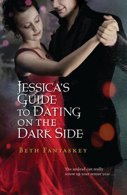
 Beth Fantaskey's covers look almost like they're underwater to me--they're shadowy and muted in an enticing way. I invited her to share the stories of her two novels, and here she is!"When I wrote Jessica's Guide to Dating on the Dark Side, I had no ideas for the cover. I couldn't even imagine selling a book to a publisher! But as we started discussing art, I got a very firm idea in mind. I really wanted to use an image from the first chapter, where the vampire prince, Lucius, stands in the middle of a lonely country road, watching his destined princess's school bus disappearing into the morning fog. I could just picture him from the back, straddling the yellow line.
"Of course, the people at Harcourt had different ideas, and when I saw their first sketch, I was beyond disappointed. It was a line drawing of two angular, gawky people dancing. The fact that I didn't even save the image speaks to how much I hated it. Who doesn't save the artwork for her first book?
"But I was a new author, and I didn't complain - and I'm glad, because when I saw the finished cover, I almost cried in a good way. I thought it was beautiful and captured the spirit of the story.
 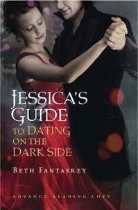 The model who represents Jess looks eerily like how I picture her in my mind - although I will say that Jess is heavier in my imagination. Readers comment on that, too, sometimes. (See different typeface on the ARC cover, right.)
"The cover for Jekel Loves Hyde was created by the same artist, Cliff Nielsen, and this time I didn't even think to suggest anything - except to ask that Tristen Hyde's face be partially obscured, like Lucius's. I really like the idea of letting readers imagine the hero however they want.
"(Although I sometimes wonder if the male models ever see my books and feel cheated...)
"Anyway, from the first viewing, I liked the look of Jekel even more than Jessica's Guide. I love the unusual green-and-purple color scheme, the bubbling beaker, and the evil glint that's starting to form in Jill's eyes. And the way Tristen is holding Jill, which could be protective or menacing, really captures their relationship.
"However, I did ask for a few changes, because Jill - who's supposed to be a shy, mousy girl - was even sexier in the first rendering. The people at Harcourt agreed she needed toned down, and the artist de-glossed her lips, photo shopped out some cleavage - and gave her eyeglasses. (I asked for the plastic frames she wears in the novel, but you can't get everything, right?) The side-by-side images show subtle differences between a cover midway through the process and the final result.
 "Ultimately, I think the covers for both my books really represent the stories inside, and I guess that's about as much as an author can hope for!"
Thanks, Beth! I LOVE that Jill got her glasses. Hooray for girls with glasses--I'd love to see more on book covers! What do you guys think of these covers?
Cover Stories
Cover Stories: Illyria by Elizabeth Hand
 The moment I saw the lovely cover for Elizabeth Hand's Illyria, I knew I had to ask her how it came about. And when I read this review, I knew I had to read it (it's high in the pile!).Meanwhile, here's Elizabeth with the Cover Story:
"Put simply, I adore this cover. It may be my favorite, from anything I've ever written. It's very different than the artwork for the original UK edition, which had a very small print run and a lovely, Edward Gorey-esque black-and-white pen-and-ink drawing that showed Maddy and Rogan in the attic (below). This one is more romantic and dreamlike. I find it very easy to imagine myself in those boots and that cape.
 "But I don't really think of cover art when I'm working on a book. For some reason the only similar thing I daydream about is the music that will play over the end credits of the movie (not that one's ever been made, but still), when, of course, the screen is BLACK. But this story was inspired by so many real people and events and places from my own life that I pretty much just plugged them into the appropriate places in the text when I was imagining it.
"My wonderful editor, Sharyn November, sent me some early mockups of a cover that were totally different from this one -- a photograph of a stage set for a production of 'Twelfth Night,' with a shipwreck, footlights, etc. The image was very striking, but it didn't give the feeling of a toy theater, and it lacked the dreamy magic I envisioned for the toy theater. I wanted something of the feel of Bergman's Fanny and Alexandra, maybe my favorite movie, poised somewhere between the real waking world and the even more intensely imagined erotic inner world that, in Illyria, is symbolized by the theater in the secret attic.
"When Sharyn sent me the images for the final cover, I immediately thought, This is it. Not only did the figures resemble the characters in my head, they looked like the real-life Maddy and Rogan at seventeen. My friend Anne, who I've known since high school, saw the image and wrote that it looked just like me -- my cape, my beret (actually a cape hood in the photo), my boots.
"That was actually kind of eerie, because I'd felt that same thing. So my immediate reaction was that someone had shoved a camera into my head and somehow captured those two people. I LOVED it.
"I don't think I had any suggestions -- I think everyone at Viking who saw this immediately felt the same way I did: This is it. I was very fortunate.
 "As it turns out, the artwork isn't from the inside of my head, but from the inside of Bernardo Bertolucci's head -- it's a still photo from his movie 1900. I was never a big fan of his older stuff (I liked more recent films like Stealing Beauty and The Dreamers), but my college boyfriend was a huge Bertolucci fan. So I saw everything, including 1900. Now I want to go back and see it again, to figure out which scene this came from. I especially like the fact that the guy is the very young Gerard Depardieu. I asked Natalie Sousa, Viking's marvelous designer who came up with this, and she said she 'took the fog element and continued it over the couple's faces to give it more mysterious air.' I think it works beautifully.
"What I love most about this cover is how it sums up everything about Maddy and Rogan's relationship -- their intense focus on each other, their dreaminess, but also the sense that their love is truly otherworldly, and suspended somewhere in time. Like those twinned figurines in a music box, dancing together to a song only they can hear. The fact that you can't see their faces clearly underscores that. They're always sixteen. Even in middle age; they never lost that purity or connection. At the novel's end they're in each other's arms again. That's where I like to think of them always, eternally suspended inside their shared dream."
Beautiful story, Elizabeth--thank you! I do think this cover has a suspended feel, an otherworldly mist. And I love that it's from a movie still. Are there other covers out there like that. Anyone know? What do you guys think?
Cover Stories: Della Says: OMG! by Keris Stainton
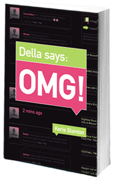 Keris Stainton's May novel has a cover that is filled with chat! I had to ask her how it came about.
"The original title was Della Says: OMG! WTF? I wasn't a fan of this title and, as it turned out, neither were the retailers, so the WTF was dropped. Oddly enough--considering how opinionated I am about other people's covers--I didn't have an idea for mine. It took me such a long time to even realize it would be getting a cover (doh!) and then, once I realized that, I couldn't even begin to picture it.
"My editor asked me if I had any ideas and I said, 'Oh no... I'm sure it'll be fine,' and she looked startled. But my mind was completely blank.
![Dellasays[2]-1.jpg](http://static.squarespace.com/static/53482f88e4b0b891fcd5a71e/5350081be4b048f0b406808a/5350135ce4b048f0b408d612/1397756764404/Dellasays%5B2%5D-1-thumb-200x305-1726.jpg?format=original) "When I first saw my cover, I was horrified. As it turned out, it was just a 'cover concept,' but still. It was so PINK. And while I love pink it just didn't work for me. It looked like a textbook rather than a novel (right).
"When I first saw my cover, I was horrified. As it turned out, it was just a 'cover concept,' but still. It was so PINK. And while I love pink it just didn't work for me. It looked like a textbook rather than a novel (right).
"My editor let me make comments. I'm a bit worried about sounding like Joey from 'Friends,' but the IM chat in the background was my idea.
"Now, I actually really love the cover. I love the pink and the green and I like the chat in the background and even the two colour spine. I particularly loved that it was mainly black. I was excited because there were hardly any black covers and I thought it would stand out.
"Of course, that was before all the vampire books appeared..."
Thanks, Keris! I definitely prefer the slick black final to the pink mockup, and I also think dropping WTF from the title was the right move (see the cover with WTF below). What do you guys think of these covers?
Cover Stories: Gimme a Call by Sarah Mlynowski
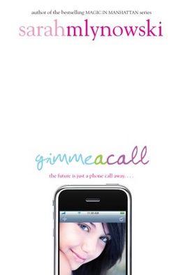 Sarah Mlynowski's Gimme a Call is a magical summer read! When Devi drops her phone in the mail fountain, she fishes it out to discover that it only calls one number: her number. At age 14, three years ago. The back-and-forth between past and present Devi is quick and funny as she tries to figure out if her fate is changeable. Loved this one!And the cover is way cute, so here's Sarah to talk about how it came about:
"Have you seen the hardcover of GOOD GIRLS by Laura Ruby? With the cool reappearing girl on the cell phone? [Right]
  That's how I pictured the GIMME A CALL cover. Except with alternating Devis--one at fourteen and one at seventeen.
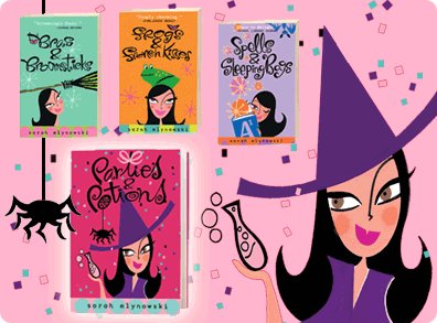
"When I first saw my cover, I loved it. I loved how clean it looked. Loved the type. Loved the glossy phone. It was a big departure from the Magic in Manhattan covers (which I think are adorable, below) but I thought it was gorgeous.
 "There were earlier cover concepts, which didn't make the final cut. The art director (Kenny Holcomb) was amazing--he wouldn't stop until he got it right. Some of them included:
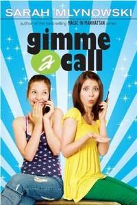 - Two versions of the same girl, both holding cell phones, looking surprised and vaguely Disney-movie-esque. [Left]
- Girl leaning back off bed while texting. Looked too much like a Verizon ad.
- A very blinged-out cell on a hot pink background. This one was my second fave.
"My editor asked for my opinion on the concepts, but since I don't always trust my own opinion, I forwarded them to my teen cousins. We all agreed that the iPhone cover was 'So Cute.'
"In the original version of the iPhone cover the model was looking up with a knowing smile. It looked a little like a Yaz ad. In the end it came down to a brunette and a blonde. Brunette Devi won. She looks the most like the Devi in my head. And I'm kind of obsessed with her green eye shadow.
"Well, the girl looks a lot like how I imagined Devi. And the type is fun and whimsical, which hopefully speaks to the book. And the iPhone...well, even though the magic phone in the book is a regular plain-Jane cell (no camera, no shiny touch screen) the iPhone on the cover represents the, um....um...um...aren't iPhones cool?"
Thanks, Sarah! I love the final cover. The earlier version feels a little dated to me, but the final one is clean and crisp with great colors, and I just love Devi (she totally looks like Sarah, btw, adorable).
What do you guys think of the cover?
Sarah's Gimme a Call blog tour is in full swing. Visit her here:
Yesterday's post with Little Willow.
Sarah's next appearance will be on Chick Lit is Not Dead!
The GAC Facebook Fan Page.
Cover Stories: Life, After by Sarah Darer Littman
 Sarah Darer Littman's latest novel, Life, After, came out last week. I've been looking at this gorgeous cover for six months, and I can finally share the story behind it. Here's Sarah:"Because one of the underlying themes of the book was that on 9/11, our country finally began to understand the kinds of terrorist threats that the rest of the world had been dealing with for decades, I wondered if they might incorporate the Twin Towers on the cover. The initial cover design did.
"I wasn't sure I was that crazy about that first cover. It was very subdued and to be honest, a little depressing, which is more the mood of the first part of the book when Daniela, the main character, and her family are living in extremely difficult circumstances during the economic crisis in Argentina. But to me, it didn't capture the hope and the optimism at the core of the story -- that a terrorist act shatters lives, but we cannot let it conquer our spirit; that with courage, faith and love, we will prevail.
"I was a bit uneasy about using the images of the Towers. I'd sent the cover design to Claudette Greene, to whom the book is dedicated. Claudette lost her husband on United 93 and she expressed concern. The other thing that didn't work for me was that the background image was supposed to be Buenos Aires, but there was nothing that made that apparent. As far as I was concerned, it could have been Queens.
"Fortunately, my editor was very responsive to my concerns. I said that if we were going to use the Buenos Aires background, I thought there there had to be some recognizable landmark. I did some research and sent them a bunch of images from Google. But the problem is that Buenos Aires doesn't have a landmark that would be known to a world wide audience in the way that Paris has the Eiffel Tower or New York has the Statue of Liberty. The most major landmark, The Obelisk, looks too much like the Washington Monument. I could see that it was going to be problematic trying to create that distinction in a way that would be recognizable to an American teen audience.
"I'm happy to say that the art department took my concerns to heart; the cover changed completely. Unbeknownst to me, they went back to the drawing board and did a complete redesign. I was absolutely thrilled with the result. It was a much brighter, cleaner and more inviting cover than the original design, and I love the way it's been carried through to the inside of the book, with leafy designs on each chapter heading.
"The illustration is from IStock. I love it! I think it's a more hopeful and optimistic image than the cover than was first proposed. The cover image draws from an actual tree that's important to Daniela in the story but is also symbolizes two themes of the novel: roots, torn up when families are forced to immigrate from their native country to be replanted in new ground, and rebirth - after the devastation of a terrorist attack, and when starting life in a a different land and culture."
Thanks, Sarah! I'm so, so glad this cover ended up where it did. The final version is beautiful.
Here's the trailer for the book:
What do you guys think of the cover?
PS-You must watch this StoryCorps animation of Sarah talking to her son Josh. It's touching, funny and true.
Cover Stories: Pure and After the Kiss by Terra Elan McVoy
 Terra Elan McVoy has some of the best covers I've seen, and I had to ask her to stop by and share some stories. Here goes:
"Honestly, I had no idea about my covers. I am a writer, not a graphic designer or marketing specialist. So I decided to worry about what was going in between the covers, and to let the amazing geniuses at Simon Pulse do their magic. It seems to have worked out pretty well so far!
"When I saw the mock-up of the hardcover for Pure (left), the first thing I thought was,'Gah!' and then 'Gorgeous!' Really, I couldn't believe how smart and pretty and amazing it was, and I loved that Cara Petrus (the designer) put in the details of the five rings along the spine. Everything was just so deliciously perfect--almost TOO perfect. I laughed, too, because I lead a book group for middle school girls, and anytime they see a book with a pink cover, they're like 'Ooooh I want to read that,' no matter what it is. So, mainly, I just thought how incredibly lucky I was. It was the same for the cover of After the Kiss. I hadn't really thought about the cover at all, and then I saw it and I was like, 'Yes, absolutely. Beautiful.'
"I'm sure my editor would have taken suggestions, but basically all I could do was drool on myself in every case.
 "I will say that while I LOVED the hardcover version of Pure, when my editor told me they were going to change the cover for the paperback, I did offer up some input. I worked at a children's bookstore at the time, and also had friends who had middle school aged girls; I had heard here and there that some people thought the cherry on the cover was a little too mature, especially considering that the content of the book was more about friendship. So I brought that up to my editor, and then she and Cara came back with the yellow version with the daisy on the cover. And I love it so much, because, as Meg Ryan says in You've Got Mail, daisies are such friendly flowers, and this is just subtle and perfect and wonderful. So, now I am doubly blessed, because I have got this gorgeous, glammy pink hardcover (that got nominated as one of the best covers of the year in a New York Times contest), and this delicious, sunshine-y paperback cover, too.
"I know that the hardcover of Pure was done with a model. The paperback I'm not so certain about, and I don't know about After the Kiss, either, though I do like to picture a photo shoot involving hundreds of Sweethearts candies.
 "It's fun, with After the Kiss, to try to read the messages on the hearts and see if there's a prominent one that has special meaning, but I haven't quite managed to find one yet, really. I keep thinking there may be a secret message in there. And for the hardcover of Pure, I just dig that there isn't anything hidden about the message at all. If you get it, you get it, and if you don't it's still pretty."
Thanks, Terra! Pretty is exactly the word I'd use to describe the coves of Terra's books -- all of them! What do you guys think?
Cover Stories: Dark Flame by Alyson Noel
 Alyson Noel's latest Immortals book, Dark Flame, is finally here! She's back to tell the Cover Story (read Cover Stories for Evermore and Blue Moon.)Here's Alyson:
"Once again, I didn't have a cover concept in mind while writing Dark Flame, but since it's the fourth book in the series, I knew I'd be expected to provide some. So while I was writing, I was definitely on the lookout for various symbols they might be able to use, then my editor and I brainstormed a few additional ideas, which pretty much resulted in a long list of themes and symbols the art department miraculously translated into an actual cover. I feel really lucky to work with such an amazing art department--The Immortals series won first place in the "Best Children's Trade Paperback" category at the New York Book show--so I know I'm in some truly gifted hands!
![darkflame-aqua[2].jpg](http://static.squarespace.com/static/53482f88e4b0b891fcd5a71e/5350081be4b048f0b406808a/5350135be4b048f0b408d5ae/1397756763444/darkflame-aqua%5B2%5D-thumb-250x377-1655.jpg?format=original) "The first version I saw was a photo-shopped mock up that used a different girl for Haven (right)--a sort of stock photo stand in if you will! And even though I had no idea what to expect, I loved the fact that it was different from the other covers in that it featured two characters rather than just Ever. I also loved the way the determined look in Haven's eyes, and the calculating look in Ever's gaze really hints at the story within, since Dark Flame is definitely the darkest Immortals book to date. And yet, even with its differences, it still manages to retain the mood of the series and the previous covers, which is no easy feat.
"The final cover was the result of a photo shoot, which made for much better quality, and a much better Haven! Overall, I'm really pleased with all of these covers and love, love, love, the St. Martin's art department!"
Thanks, Alyson! I like the "real" Haven's intense stare -- it totally changes the cover in a great way. I continue to love these really strong covers. The whole series has a great look now (see the four Immortals titles below).
"The first version I saw was a photo-shopped mock up that used a different girl for Haven (right)--a sort of stock photo stand in if you will! And even though I had no idea what to expect, I loved the fact that it was different from the other covers in that it featured two characters rather than just Ever. I also loved the way the determined look in Haven's eyes, and the calculating look in Ever's gaze really hints at the story within, since Dark Flame is definitely the darkest Immortals book to date. And yet, even with its differences, it still manages to retain the mood of the series and the previous covers, which is no easy feat.
"The final cover was the result of a photo shoot, which made for much better quality, and a much better Haven! Overall, I'm really pleased with all of these covers and love, love, love, the St. Martin's art department!"
Thanks, Alyson! I like the "real" Haven's intense stare -- it totally changes the cover in a great way. I continue to love these really strong covers. The whole series has a great look now (see the four Immortals titles below).
 What do you guys think?
Cover Stories: Gamer Girl (paperback) by Mari Mancusi
 Mari Mancusi's Gamer Girl has a really great Cover Story that I ran when the hardcover was released. Today, the paperback is coming out, and Mari has an update to the tale. Here she is:
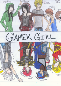
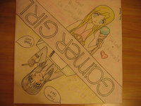
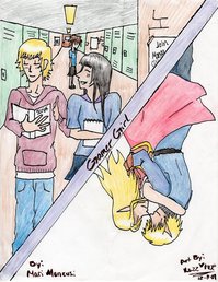
"It's been a year and a half since the original Gamer Girl came out in hardcover, though it's lived on throughout that time as part of both the Scholastic Book Fair and Book Club. (In fact, I think that's where the majority of my readers discovered it!) And I've realized the best thing about this cover is that it's easy for readers--many of them manga artists themselves--to recreate it. I've gotten tons of fan art from readers who drew their own versions of Maddy and Allora, which I love!
"Now it's time for the paperback version of the book to be released. They kept the same cover--which I'm thrilled about--but added an extra tagline, which you have to turn upside down to finish reading. I think the tagline really makes the book pop. It asks the question: 'What do you do when your ho-hum real life - doesn't live up to your amazing virtual reality?'" (Compare the two covers below, hardcover on left).
Thanks, Mari! I think the tagline is great, and I know Gamer Girl has been a huge reader favorite. I loooove the fan art. Seriously, that is amazing. I still remember when a reader named Hailee dressed up like the cover of Violet in Private -- I loved it!
What do you guys think of the Gamer Girls cover and its subtle change?
Cover Stories: Tell Me a Secret by Holly Cupala
 Holly Cupala's debut novel, Tell Me a Secret, is out this week! Hooray! I've been thinking about this book since I first saw what I've come to call "The whisper cover."
Very hot.
Here's Holly with the back story:
"I don't think I had a cover in mind as I was writing, though I did have a clear picture of what the characters looked like--especially the bad-girl older sister, Xanda, and what her younger sister might look like. And of course, the love interest (Kamran, a.k.a. the super hot sci-fi guy). So when my editor asked if I had any ideas in mind, I sent a bunch of pictures!
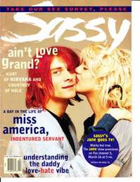 The bad-girl older sister, Xanda, kind of looked like Courtney Love, circa 1992 (right).
"I originally envisioned Miranda to have blond hair, but I think I took the hair color refs out so that any girl could imagine herself in Rand's shoes. I thought of her as having a kind of mysterious, haunted look--did you ever see The Virgin Suicides?  I always thought of the palette of my book as having that kind of aesthetic, kind of "good girl gone bad" in dreamy, washed-out tones (left).

"Kamran is Persian with green eyes, very cute, of course! Something like this (right), but without the suit. (My editor said, 'Wow. I didn't picture him like that before, but I will now!')
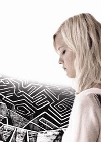
"Then I made this picture myself (below, right) with borrowed images from a labyrinth artist on the web (unfortunately I can't find it now or I would link) and a girl shot from the UO catalogue to capture the tone of the novel - a girl on a journey, and labyrinths play a big metaphorical role.
"It took us a while to figure out the title of the book--it truly came at the 11th hour, about two days before we HAD to get something nailed down.
 They couldn't work on a cover concept until we had the title finalized. Once we hit on TELL ME A SECRET (thank you, subconscious dream state!), they turned a cover concept around in something like 24 hours! And it was amazing! My family was visiting, including my 15 year-old niece Molly who had glued herself to the couch the day before and had read the manuscript in one sitting, and I opened the jpeg and GASPED! 'Quick, everybody, come see this!' Everyone charged into the office for one big collective gasp! Molly said it was perfect, which I took as an excellent sign.
 "The picture was perfect--captured the tone, the darkness and light, and most importantly, it's hot! I was working on the final copyedit at the time they sent it, so I snuck in some details (note the red T-shirt) to a certain scene to capture the moment. It was cool to be able to do that.
"The one piece of input I had was that the title type wasn't quite right for the story. So in the second incarnation, they changed the type and added the amazing quote from Ellen Hopkins, who now has a lifetime subscription to my undying gratitude and chocolate cupcakes any time she wants! So here's the final, which I LOVE. I feel like I won the cover lottery. (Thank you, awesome design team!)
"And thank you, Melissa, for inviting me to do a Cover Story!"
Thanks, Holly! There is so much fun stuff going on for this book:
* The virtual tour is EVERYWHERE. Here's the schedule (leave comments on each post for a chance to win prizes.)
 * The virtual book birthday party happens tomorrow, Tuesday, at Holly's blog. I'm already ready to be there, see?
* Little Willow had authors tell her their secrets, and she's revealing one each day this month... I may be in the mix, possibly... check it out!
Happy Monday!
Cover Stories: Lifted by Wendy Toliver
![Lifted[1].jpg](http://static.squarespace.com/static/53482f88e4b0b891fcd5a71e/5350081be4b048f0b406808a/5350136ae4b048f0b408dba8/1397756778479/Lifted%5B1%5D-thumb-250x350-1608.jpg?format=original) Wendy Toliver's new book, Lifted, is already getting rave reviews. Wings author Aprilynne Pike says, "Lifted is the story of an imperfect heroine seeking her place not only in school, but in life. Its exploration of the amount of truth behind social and religious stereotypes escalates into a double-dog dare to believe them. A haunting morality tale that will leave you questioning just what it means to be 'good.'"Ooh... intriguing! Wendy's here to talk about her cover:
"I had a vague idea of what the cover might look like. I visualized dark or bright colors rather than pastels, and maybe a part of a girl (not her whole body and face) or several girls with cross necklaces.
"In fact, the cover was complete surprise. When you put so much of yourself into a book, it's always scary to see the cover for the first time, particularly if you know it's pretty much set in stone. My agent is always really good to call so we can discuss our first thoughts together. If I remember correctly, I could change a color or something (like if I wanted her hoodie to be a different color) but couldn't add something, for example, the cross necklace I'd proposed.
Wendy Toliver's new book, Lifted, is already getting rave reviews. Wings author Aprilynne Pike says, "Lifted is the story of an imperfect heroine seeking her place not only in school, but in life. Its exploration of the amount of truth behind social and religious stereotypes escalates into a double-dog dare to believe them. A haunting morality tale that will leave you questioning just what it means to be 'good.'"Ooh... intriguing! Wendy's here to talk about her cover:
"I had a vague idea of what the cover might look like. I visualized dark or bright colors rather than pastels, and maybe a part of a girl (not her whole body and face) or several girls with cross necklaces.
"In fact, the cover was complete surprise. When you put so much of yourself into a book, it's always scary to see the cover for the first time, particularly if you know it's pretty much set in stone. My agent is always really good to call so we can discuss our first thoughts together. If I remember correctly, I could change a color or something (like if I wanted her hoodie to be a different color) but couldn't add something, for example, the cross necklace I'd proposed.
 "I think when people read it, they'll be able to see that the girl in the photo does look a lot like how I describe Poppy, so that's good. And I love the colors and the bold font (which is carried throughout the book in the chapter headings, etc.) When I started sharing the cover image with a few author friends, someone called it to my attention that it's the same cover (well, the same image) as AnnDee Ellis's Everything is Fine (right). The weird thing is, Ann Dee and I both live in Utah and we see each other at local author gatherings. My agent and I brought this up with my editor and she mentioned our concern to the art and marketing departments but they really loved the cover Cara E. Petrus had designed for my book and didn't want to change it.
 "Honestly, I wasn't sure what to think but by this time I had fallen in love with the cover. I wrote Ann Dee an email so she wouldn't be surprised when she saw the similarity. Then someone else pointed out yet another YA book with the same image: Safe by Susan Shaw (left). Sheesh!
"I can't say I'm thrilled about the same image being used so often (are there more?) but as some of you might know, it isn't entirely rare for this to happen. For example, there's North of Beautiful by Justina Chen Headley and Evermore by Alyson Noel which I believe Alyson mentioned coming out at about the same time (read their cover stories here). The thing is, and I have to keep telling people this, it's not like the artists at Simon Pulse got together and said, 'Hey! Let's copy another cover!' It just happens sometimes.
"I love the girl's body language. It's a great mix of good girl, bad girl. Love her clothes (very Poppy-like) and the Converses are spot-on. What I don't love is the background. I get that she's in a classroom (with the blackboard behind her) but I don't get the 'Southern private school' vibe from the wood paneling and rickety stool. The background seems too old-fashioned, like a school from the 1970s or something. I'm a major font fanatic and I absolutely love the font and color palette. I also really, really like the spine. It really stands out and looks interesting."
Thanks, Wendy! I really love the font treatment as well, and I also like the way there's a shadow around Poppy but she herself is lit up in a spotlight, almost. I think the presentation of this photo looks really different on all three books. And I can't wait to read Lifted!
What do you guys think?

