Cover Stories

Cover Stories: Love Story

Jennifer Echols has a new book out--yay! She stopped by on her GCC tour to talk about the cover for Love Story. (Check out her previous Cover Stories for Going Too Far and Endless Summer.) Here's Jennifer! "I asked for [my character] Erin in the foreground, looking over her shoulder at Hunter at a desk writing in the background. My publisher doesn’t ask me for my input--I just give it, LOL! I didn’t really think they would follow my advice, because my covers are all from stock photos, not photo shoots, and a cover as specific as the one I asked for would have been hard to find. So I also sent them pictures of what the characters should look like. And I asked that above all, the heroine should look happy.

"When I first saw the cover, I thought, 'The heroine is happy! Hooray!' and also 'Why does the heroine have a diamond stud in her nose?' My editor offered to have it Photoshopped out for me, but I wrote it into the book instead.

"I knew a cover quote would be added, so at one point I asked my editor for a final version of the cover that I could use in ads and so forth. She asked me to wait a few days because the art department was making my name bigger. I did not know what to make of that, and I blogged about it here. But in the end, my name is only a little bigger and pink!"

Thanks, Jennifer. I think this is a really romantic cover, but the pinks/purples aren't overdone, which is key (and I love Jennifer's name in pink instead of black). Sometimes covers get sickly sweet, but I think this one achieves a really nice balance, and a connection with the reader because of the eye contact.

What do you guys think? Happy Love Story reading!

Cover Stories: The Day Before

A couple of weeks ago I noticed lots of girls-in-grass covers (my own included) and I mentioned fellow Contemps author Lisa Schroeder's latest, The Day Before, of which Booklist says: "Readers will find plenty of appeal factors in this outing... delivers a punch at the novel's end." (I love an end punch.)

Now she's here to share her Cover Story! Take it away, Lisa:

"I don't think about covers much, mostly because I've learned that it's not good to get attached to anything since who knows what you'll end up with. However, I really thought the cover would be a beach scene of some kind.

"I was surprised, because there wasn't a grain of sand to be found. I thought it was pretty, but I wasn't sure that it conveyed what the book is about. Although, more and more, I'm not sure that's a cover's purpose, necessarily.

"I e-mailed my editor and asked if they'd tried any beach scenes, and she said they had, but none of them had the impact they were looking for. Part of it was they had a hard time finding an image of a girl on the beach who could pull off the right spunk and tone of Amber, the main character. They felt like the girl on the cover captured Amber's personality and the mood of the book. I e-mailed a few friends, and they all thought the cover was beautiful and a couple of them said the grass reminded them of sandy dunes on the East coast. I'm a West coast gal, so beaches here look different.

"It's a stock photo, and I think it's pretty, and it does convey the tone of the book. Amber's life is about to turn upside down, so it seems fitting that the girl on the cover is pictured upside down. I love the look in her eyes, and I'm guessing that may have been what attracted the designer to this image when selecting it. And the fact that it's partially covered with grass is like she's trying to hide, almost, from the world around her, which is appropriate for the story."

Thanks, Lisa! I can totally see the East Coast sandy-dunes thing, and the intensity of her gaze is noted, too. This one's up soon in my to-be-read pile, so I'll know more of whether I feel like it fits the story after I read it, but I do think the cover is lovely.

What do you guys think?

Cover Stories: Small Town Sinners, Part 2

Check out Part 1 of the Cover Story, about my slight input and inspiration photos, and read Part 1.5 of the Cover Story, in which I get nerdy about fonts.

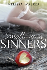
Then, check out this interview with the awesome Joe Horne, who shot the cover photo! (That's the original, left). It hardly changed!

Melissa: What inspired the photo? Joe: My wife wanted to take a photography class at one of the schools around here. She wanted me to take it with her. I thought it would be something fun to do together. I'd been shooting pictures for over 30 years, but had never taken a class. So, we signed up. Our first homework assignment was to shoot fruit. I decided to shoot an apple that showed Eve being banished from the Garden of Eden after eating the forbidden fruit.

Melissa: What can you tell us about the shot? Joe: I talked to a beginning model, Taylor, about sitting for me. We went to a historic schoolhouse in Florence [South Carolina] that I was familiar with. I knew they had just clear cut some timber from behind the school. I wanted the background to appear ruined to show that she was no longer in paradise. It was kind of strange for Taylor. In previous shoots she had been the subject of the pictures. Now she was in the background with her face covered trying to look sad and remorseful. [Check out another photo from the same day's shoot, below left.]

Melissa: How did you find out that the photo was going to be used for the book cover? Joe: I have a profile for my photos on deviantART under GossamerDreams. I get messages from time to time. Some people like my work, some want to give me advice on how to make my pictures better, some just want to know if I have more pictures of a certain model. I got a message wanting to know if the picture could be used for a book cover. I didn't think the request was serious, so I ignored it. Later I got another request from the same person about the picture, so I emailed her and we talked. Of course I agreed. I'd never had a book cover before.

Melissa: What do you think of the final image on the Small Town Sinners cover? Joe: I am very pleased with the final cover. The only thing that was changed was the shape of the bite in the apple. Mine was just a bite, but they made it into a heart . I had adjusted the color and grain to make the apple stand out and give the rest of the photo a surreal effect.

Thank you, Joe! I'm so amazed we got in touch, and I adore this photo, which I think captures the feeling of Small Town Sinners so well! Be sure to look at Joe's portfolio--I have a feeling there are more book covers in his future. I love this one (right).

Stay tuned--tomorrow I'll talk to the cover designer for Small Town Sinners on bn.com!

Remember to try to win the book in the apple-bite challenge!

Cover Stories: A Need So Beautiful

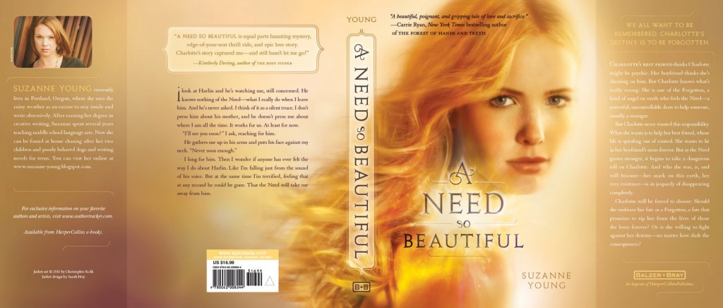
Suzanne Young's new book, A Need So Beautiful, scored a star from Booklist, which deemed it "a clever and well-written fantasy." It's also got an absolutely glowing cover. She stopped by on her Girlfriends Cyber Circuit Tour to tell us about it:

"I had an idea for the cover, but ultimately it would have been too dark. The idea for this one was there from the start, and I think it really captures the warmth and essence of the book.

"When I first saw the image, I was stunned. I loved it. But it didn’t truly hit me how beautiful it was until I saw the entire jacket and back copy:

"Mostly just the colors changed a bit. I didn’t have anything that I wanted to change, so luckily I was pretty happy. It was very different from my first cover experience. [Read about Suzanne's Naughty List covers.]

"It was a photo shoot. I got to see the model they picked, and even got a behind the scenes photo during the shoot. It was very exciting."

Thanks, Suzanne! Check out the behind-the-scenes photo from the shoot (right)--love that fan hair-blowing effect. Like I said, I'm into the glow, and so much yellow! It stands out for me.

What do you guys think of this cover?

Oh, and here's the lovely trailer.

Cover Stories 1.5: Small Town Sinners, Title Fonts

(Read Part 1 of the Cover Story.) Ooh, I forgot! I wasn't sure about the title font at first (but I was wrong). The art department indulged me and did a bunch of mockups:   

Here are the mockups with in block, serif block and the final (image also brightened and apple changed, as noted in yesterday's cover story).

The final font  is definitely the best, right? I know I'm leading you to agree with me, but I really think so! It has bite to it (like this contest). And look how much more my name stands out! I didn't even notice that until just now. Really! (But I'm not above saying... I like it.)

Cover Stories: Small Town Sinners, Part 1

As you know if you read this blog, I'm kind of into covers. So when it comes to the subject of my own covers, I feel especially, um, assertive. I like to give inspiration images, write random things down, and generally insert myself to a point that might be annoying.

When my editor Caroline asked me if I had any cover ideas for Small Town Sinners, I sent her this email:

"I'm going to attach some images and give a little explanation of why they're in the mix for me.

"If we show LACEY: I picture her sort of like an early Sissy Spacek:


"The FEEL: I love the late sunset, dusty, small-town feel of the NYLON cover, the 'portrait' (really small, sorry), and that GUARDIAN ANGELS book. The color and tone of these images is really appealing to me.
 

**I do really love the close-up on one girl kind of cover, and an American gothic 70s feel seems right to me.

"Another Layout thought: The JAMAICA INN cover is a little random, but the grouping of the figures over this 'town,'the way it's laid out, appeals to me too, if we were to show a few characters and maybe some hint of Hell House (not sure how to do this!). OR Totally different direction: The Valley of the Dolls cover is obviously very graphic with text, but I do really like it, and I can see something like this working for Small Town Sinners just because the title feels geometric to me somehow, if that makes sense."

Caroline wrote back to me and said, "We’re definitely on the same page. The first thing that had come to my mind was the description of Lacey from chapter one and the idea of showing her in sort of a dusty sunlight—perhaps a light coming from behind that feels almost spiritual?"

The first version they sent me blew me away! But I felt like the coloring might make the girl seem a little dead (left) so the art department agreed to brighten it for the final (right). Now I love noticing that there's a sun spot in the lens--it's on the bottom right of this close-up (you kind of have to see it in person) and I adore that detail!


Also, I just noticed that the apple bite got bigger (and better, I think)! Remember to enter the apple bite contest to try to win a copy of the book.

So in the end we got a gorgeous cover that went with the first idea and I'm so glad that everyone was really into that concept! I have an interview with the cover designer and then one the photographer of that shot coming next week in Parts 2 and 3 of this Cover Story (you know I have to milk my own!).

What do you guys think of the small changes, the original ideas, etc? I'd love to hear!

Release is just a week away! Yay! Pre-order from your local bookstore or amazon or bn.com or anywhere and I will be super happy!

Cover Stories: The Summer I Learned to Fly

Happy Fourth of July! I spent my weekend curled up with Dana Reinhardt's The Summer I Learned to Fly (finished last night) and it's just an enchanting summer story. Here's Publisher's Weekly's starred review. Read, read, read! And isn't that cover just all twilight and fireflies and wildflowers and good things? Here's Dana to talk about it:

"I never have any idea of what my covers should look like.  I fully recognize that it’s not what I do—I’m not a designer, I’m a writer. I do have strong opinions, though. I know what I like and I know what I don’t and I’m usually pretty good at articulating why.

"They typically ask me if I have any ideas and I typically say no. Then I hold my breath and wait to see what they come up with and hope that I think it’s on the right track. If it’s not, they’ve been great about listening to my reaction.

"With this cover, I fell in love.  Immediately.  This hasn’t always been the case, but it was absolutely the case with this particular cover. It’s just perfect. And it obviously doesn’t hurt to have Markus Zusak’s name on the cover.  In fact, it might even be better if they just took mine off…

"As a reader I always want to understand the cover and how it represents the story inside. Sometimes it’s obvious out the gate, but sometimes it takes awhile before I can make that connection, and sometimes the connection is subtle, tenuous, and occasionally non-existent.  In this case, the cover is, in my opinion, a perfect representation of what this book is about at its heart.  I won’t say more because I don’t want to give too much away, but there will be an aha moment when this cover makes perfect sense, and I love that about it."

Yes! I had my aha moment with this cover as I read the book, and you will too. Amazing. And I love that they're redesigning Dana's other covers. Here's this one, one more time, in the context of our rented Fourth of July house porch:

Dana again: "I’m pretty sure this one is stock photos photoshopped together to create the right effect.  Random House is currently redesigning all of my titles and re-releasing them in the Fall of 2011.  The idea is for them to have a cohesive look—not a box set or anything—but a look that tells you that these books are by the same author.  The Summer I Learned to Fly is the first cover with this new look.  Part of it is the typeface and my name appearing almost as a signature, but also the new overall effect is going to be more photographic like it is here. I haven’t seen all of the final covers yet, but the ideas they’re working with are really great.  Some have required photo shoots and some will use stock footage.

[Note: Dana gave me this Cover Story a while ago, so I've found the redesigned covers! Take a look at the original books (top row) and the redesigned covers (bottom row)]:

What do you guys think?

Cover Stories: Wolves, Boys & Other Things That Might Kill Me

Kristen Chandler's Wolves, Boys & Other Things That Might Kill Me (read Book Harbinger's great review) got a paperback makeover this year, and I love the new cover! So I asked Kris how it came to be, and what she thought about the redesign. Here she is: "I was thinking that the paperback would be like the hardback cover (below right)--urban angsty--but I was wrong. Now it's wilderness angsty. Doesn't it just give you the shivers to look at it?

"I didn't give any input for the paperback. I think that's the way it usually works. I was so used to the hardback cover as the face of the novel... It was like having your friend get a makeover that includes their skin color. But the new cover grew on me quickly.

"I was so consumed with the writing of my next book and the marketing, sharing of the WOLVES I didn't even realize that the paperback would have another cover. So it was sort of like... SUR-PRISE! We hope you love it!

"It's a much different look, but the people at SPEAK wanted to show off the title and do something really different from what is out there on the shelves. I think they succeeded.

"I think the hidden meaning on this cover is that you should buy the book. But don't tell any one that. Let's see if it works."

Thanks, Kris! The original cover stands out to me, but the paperback is completely charming in a different way. Doesn't it seem like the title is echoing off the mountains?

What do you guys think?

Cover Stories: OyMG

Amy Fellner Dominy's debut novel had me laughing as soon as I heard the title and tagline: OyMG "Jewish Girl. Christian Camp. Holy Moly." Now Amy's here to share her Cover Story: "I hate to admit it, but I had no clue what would make a good cover for this book. When my editor asked if I had any suggestions, I drew a complete blank. (Literally.) I’m guessing I did what many authors do:  I crossed my fingers and hoped for the best.

"In truth, my cover was all the things I didn’t want: An actual face for my main character; Religious symbols—including a cross; And no cute guy.

"But I took one look and immediately LOVED it.  Truly!  It just felt 'right.' Thank goodness, because my editor told me that was the 16th version I was seeing. (And no, I didn’t ask to see all the other ones.)

"The only request I made was to have them bump up the romantic elements on the cover. The relationship is such an important part of the book, I didn’t want that to be lost.

"So if you look up near the title you’ll see lips and a heart with 'DY' (for Devon Yeats). In the original cover, they were smaller and green, so they blended more. In the revision, they got bumped up to a larger size and turned pink. It was just enough to give added emphasis without creating too much chaos on the cover.

"I believe it was a stock photo. And we’ve had some discussions about the model in my own family. I think she looks perfect. My husband thinks she’s looks older than fourteen (her age in the book). And my daughter thinks I should have written about a blond girl so she could have posed for the cover.

"I still love the cover for a few reasons. For starters, one of my main worries going in was the title.  A lot of times when I tell people the title is OyMG they’re lost for a moment until they think it through. I wanted the understanding to be immediate at first glance of the cover. And I think it is. Also, I think the bubble treatment is so cute, I’m making OyMG t-shirts.  That’s a sign of love. Finally, I do think the cover reflects the story and Ellie’s struggle with religious identity.  So all in all, I’m feeling pretty lucky."

Thanks, Amy! I am a big fan of illustrated elements on a cover (remember this illustrated cover I found for Lovestruck Summer? Still adore it), so I'm really into the way this one is done (though I would have 100% asked to see those earlier versions, if only for Cover Stories fodder)! The book concept is hilarious and I'm excited to see religion as a part of more YA books this year. Read more about the book, and see the trailer, at The Contemps.

What do you guys think?


Cover Stories: Possession

Elana Johnson's Possession has great buzz. For example: “Emotion pumps through every scene of this thriller. Given all the urgency and action, the novel’s ending may surprise readers as the heroic adventure turns into a tragic love story.” –School Library Journal

The book also has a simple but captivating cover. Here's Elana to talk about that:

"I didn’t dare dream of a cover. That way, if it wasn’t what I’d pictured, I wouldn’t be disappointed. And luckily, someone much smarter than I am designed my cover—and I love it!

"I got to give input after I saw the design, and something I suggested actually got changed. It was something little about the font on my name, which used to be a much tighter, more Zaner-Bloser, type of cursive. I didn’t like the cursive at all. But my editor explained that cursive is actually used to convey romance in a novel. (Who knew?) They did change the tight tight cursive to a much looser, freer cursive. And I love it.

"Truly, the first thing I thought was, 'Holy crap, I can’t breathe, it’s awesome, and holy crap! It’s white! And that butterfly! I love it!'

"The second and third things weren’t as exciting. But I have always loved my cover."

Thanks, Elana! I didn't know about the cursive-romance link, but it does make sense. I like the whiteness of this cover, and the blue/green.

What do you guys think?