 The lovely Saundra Mitchell is here today with a rollercoaster ride of a Cover Story for her latest novel, The Vespertine! Here goes:"I didn't have a specific image in mind for the cover, but I knew in my soul that I wanted the book to be in russet, sunset colors. The main character, Amelia, can see the future, but only at sunset--and the book is full of loving descriptions of that time of day.
"My editor, Julie, sent me a note one Thursday afternoon and asked for a detailed description of Amelia, the main character. She told me that the design department was scheduled to start my cover the next day.
"She didn't ask for any particular input beyond that. But I come from a filmmaking background, where we make contact sheets for everything from paint colors, to car styles, to actors. So I put together this contact sheet and forwarded it with my notes.
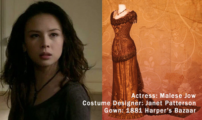 "When I wrote the book, I'd had Malese Jow in my mind as Amelia (I loved her as Anna on The Vampire Diaries) and I'd taken all the clothing directly out of Harper's Bazar, circa 1881-1889. Lucky for me, costume designers do the same thing. The exact gown that Amelia wears in my book is the same pattern that costume designer Janet Patterson used when dressing the cast of Portrait of a Lady. And of course, everything in sunset colors, because that's how I saw the book.
"The first time I saw the cover, I cried! Because what I saw first was the concept art for the cover. I was in New York for the very first time. Julie, my editor, took me on a tour of the offices, which ended at her desk, where she'd just gotten the preliminary art for my cover.
She turned on her monitor, and there it was:
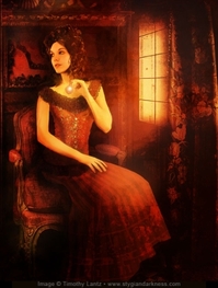 "It was perfect! There's the girl! There's the dress! There are the sunset colors, and even the necklace that Amelia gets during the book!
"Regina Roff, the designer at HMH, owned a deck of Archeon Tarot by artist Timothy Lantz. She thought he would be the perfect artist for my cover, so HMH contracted him and he was available. It's gorgeous, gorgeous art. I loved it so, so much. I could go on for hours about the details, but seriously. It made me cry; it was extraordinary.
"So... of course it had to change.
"There's a feeling in the industry that illustrated covers are for juvenile and middle grade novels; photographic covers are for young adult novels. And a lot of people have a say on the final cover.
 "After a lot of discussion in-house and with some book buyers, people felt that a cover with Mr. Lantz's extraordinary art fell too close to illustration. I was devastated! When I found out it was changing, I sent a note that said that I wouldn't mind seeing a new cover modeled on Melissa de la Cruz's Blue Bloods covers (right), or something wholly iconic. But I honestly didn't know what to expect.
"On the second round of covers, my agent and I had more input. HMH kindly put together three comps, and I was so anxious. After loving the first cover so much, I was prepared to pick the new one based on the art I hated the least.
"But when I saw the comps, I loved them all. They were gorgeous--and really varied. It was so exciting to see so many different artist conceptions of my book. My agent and I had some notes, which my editor took to the jacket meeting.
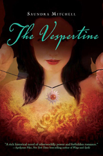
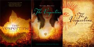 "My fave was actually #3, but I knew at the time that it wouldn't fly as a YA cover. After the jacket meeting, HMH decided on Comp #2 as the final cover. And my only issue was that the clothes we could see were anachronistic to the book. I asked them to hide that as best as they could, and they did a fantastic job of doing that. Plus, it was really exciting to see that they used the exact pendant I'd put in the book right on the cover! And thus, I had a final cover, which was this:
 "So I was really happy again, because once again, HMH had gone above and beyond to create a really meaningful cover for this book. But...
"I had a lot of fun unveiling the final, got lots of neat stuff printed and then... My editor called. She was incredibly apologetic, but they were changing the cover again. People felt the second cover was still too illustrated looking. Everyone really wanted a clean, photographic cover with a lot of BANG to it.
"The second cover had already gone out on digital ARCs, but they were trying to get the new cover done in time for print ARCs. It was looking less and less likely though, because another publisher was interested in using the gorgeous image they'd selected for the third cover. The stock company would only license it to one of us, so it was a nail-biting several days.
"But finally we got word that we could use the image, and so my designer put together a stunning new cover. I cried again, because it was that gorgeous. And here it is:
 "It's remarkable how much that model looks like Malese Jow. How amazing that dress is. How much I want to just grab it and hold it and show it to the world. Friends have called it The Luxe with Motion, and I think they've nailed it. It's just screamingly beautiful.
"The original art is a photographic illustration by Timothy Lantz. The second cover was a stock photo, edited by Regina Roff. The final cover is a photograph by Susan Fox, edited by Regina Roff.
"In the end, I love it. I just love it. Beyond being a great cover, I think it's a truly beautiful piece of art. It captures a moment in the story, but more than that, it really reflects the mood and sensibility.

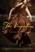 "There's so much storytelling going on in the image too. I think it's mysterious and wonderful and you know what? The first cover showed the girl and the dress from my contact sheet. The second cover showed the exact pendant I'd put in the book. And the third has the girl and the dress again. Every single one of these covers emphasize how much care and thought everyone at HMH has put into my book. It makes me smile every time I see them--all three of them. I'm a lucky, lucky author indeed."
Thank you, Saundra! I love an epic Cover Story, and this one certainly qualifies. I have to say, I'm a sucker for flowy dresses, and I'm so happy that the cover ended up where it did -- it's gorgeous!
What do you guys think?
Cover Stories
Cover Stories: A Kiss in Time by Alex Flinn
 Alex Flinn, who shared the Cover Story for Beastly on Monday, is back to talk about another of her retold fairytale covers, A Kiss in Time, based on Sleeping Beauty. Here's Alex:
"I don't think I had much input for the Kiss in Time hardcover. I was pleased with the color scheme and general look, but I thought it was a bit bland. I've seen other covers by this designer, such as Fairest (below right) and Princess Ben, and they always have a little something more to them than just a girl in a pretty dress. It was obvious that the cover was 'set' when I saw it. It was a photograph, and they'd spent weeks going through dozens of photos to find the perfect one -- it was shot specifically for the book. I liked the colors and the font.
 "The girl does look like Talia in my book, and the dress is important in the story and is as I portrayed it, the same color as the girl's eyes. But I was a bit disappointed that you couldn't tell it was Sleeping Beauty, as you can easily tell that Fairest is Snow White. That said, it has been a successful hardcover. I do think the cover art has caused it to be mostly overlooked by the young-adult library community, because it makes it look like a younger book. However, bookstore sales have made up for that. It is so pretty that you want to pick it up.
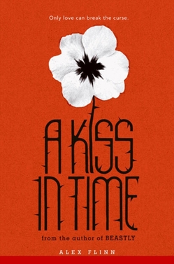 "My editor and I had discussed a spindle for the A Kiss in Time paperback and, in fact, even looked at photos of spindles on Etsy, but they ended up going a different way. When I first saw the cover, left, I didn't really think the flower had much to do with the story.
"I had originally thought that the flower was a pansy. However, I later realized that it was a poppy (the colors are reversed so that the poppy's distinctive red color is the background color while the flower is white). The poppy is a symbol of both sleep (because of the poppy's relationship to opium, as in The Wizard of Oz) and also, remembrance (such as in Macrae's poem, 'In Flanders Field'), both strong themes in Sleeping Beauty. Indeed, the poppy is a symbol of resurrection in Greco-Roman myth, and Talia and her kingdom are resurrected by Jack's kiss. On the cover, the poppy has thorns and, of course, a thorn-covered wall is strongly associated with the story of Sleeping Beauty. Will readers get all this from the cover? Probably not, but it's pretty."
Thanks, Alex! I like the iconic design of the paperback more than the hardcover, to be honest. I also like how it goes with simple Beastly's design. (And I think the thorny font is cool!)
What do you guys think?
Cover Stories: Beastly by Alex Flinn
 Alex Flinn, #1 New York Times bestselling author of Beastly (you may have heard of a little movie based upon this book, no?) is here to talk about the evolution of her cover. Take it away, Alex!
"I'm not a very visual person, and I knew the art department would do their thing. I've generally been pleased with my covers.
"I didn't give much input for Beastly. We may have discussed a rose. I have given more input in the past, but they've really always come up with something completely different than what was discussed, so I don't think I really said anything.
 "Regarding the original cover, above, I was happy with it. I was a bit concerned about whether the rose would be a turn-off to my usual boy audience, but the black cover seems to make it less feminine. At least, plenty of boys read the book.
"Regarding the movie tie-in cover (right), well, of course, I was excited. I knew it would be the poster art for Beastly. I think it's cool how they found a way to include the Beast's handsome look and his ugly look in the same picture.
"The cover is actually somewhat reminiscent (unintentionally, of course) of the cover of my very first novel, Breathing Underwater (below left), which portrays the two sides of the main character's personality.
 "I was really quite pleased with the Beastly cover and had no suggestions. The original cover is a drawing, and the movie tie-in cover is the movie art and features the actors (Vanessa Hudgens and Alex Pettyfer)."
 Thanks, Alex! Note: After we did this interview, the movie poster changed, and so did the tie-in cover. The actual cover on shelves is shown at right.
I really love the original cover -- I think it's lovely and I'm a sucker for black & white & red together. And of course, the movie tie-in will generate lots of interest -- though I think I like the original one better than the new one, I guess the new one has more of a breathless, romantic moment going on. What do you guys think? And have you seen the movie yet?!
PS-Read a full interview with Alex about the book-to-movie process (and what she thinks of the casting) on I Heart Daily.
Cover Stories: The Secret Journeys Of Jack London by Christopher Golden and Tim Lebbon, Illustrated by Greg Ruth
 In a special treat of a Cover Story, there are three people weighing in today. Here are Tim Lebbon (TL) and Christopher Golden (CG), the authors, and Greg Ruth (GR), the illustrator who did the cover (actually, editor Jordan Brown weighs in too, so it's the first ever four-person Cover Story!).Did you have an idea in mind for your cover as you were writing the book?
TL: I think I always imagined the cover featuring Jack himself, probably in an action scene, although I'm always concerned at what a character might look in cases like this. Greg's final product exceeded my wildest expectation - there's so much power in that image, so much Wild, that it just took my breath away.
CG: I had been thinking of something almost antique and old-fashioned looking to go along with the Jack London era adventure tone. Greg managed to come up with something that served that desire while being totally contemporary and beautiful. We're lucky to have him on this. Despite warnings to the contrary, people often do judge books by their covers, and this one is a home run.
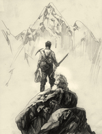
GR: I think the notion going in was to thread the needle between making a cover that was distinctly Jack London, but without actually showing Jack's face... which was of course the hard trick to manage. I needed then to make everything about the image a contributor to his character, and to that I did a number of initial sketches of him atop some snow ridge, either with his back to us, or facing us, but his face obscured by snow and light. We quickly settled on the former and worked it towards fulfilling the initial goal along those lines.
[Below, see two of Greg's eight intial sketches for the cover, at left, all very different ideas, these are the two to which we most gravitated. They loved the scale and the weight of the one with Jack looking out from the precipice, and also the intricate detail of the more close-up image of Jack's back. They asked if Greg could combine them a bit in a more refined sketch, and that one is on the far right:]


 Did your publisher ask for your input before the art dept started working?
TL: We talked generalities about book design, the feel we wanted for it. But we didn't impose any restrictions, because we all had faith that Greg would come up with something wonderful.
CG: We did talk about the desire to have something that set the tone, that was both contemporary and yet communicated the classic adventure tone. Our editor, Jordan Brown, is one of the most perceptive people I've ever met in publishing, and he knew exactly what would pull it all together, and that Greg was the artist for the job.
GR: Yeah it was great in that way--and unusual to be honest. I find we nearly always end up with the best cover when at this early stage I'm given the freedom to sort of pursue our initial course based on what in the book strikes me as a potent image. Typically as an artist on a cover job, you'll get a really heavy handed direction right off the bat, usually initiated by marketing to do essentially just draft an already decided upon image as if you were merely a glove waiting for a hand, rather than being allowed to do what you do that got you the job in the first place. This was absolutely not the case and I think everyone giving me a first crack at it got us where we wanted to go in a way the usual process would have otherwise prevented entirely.
[Greg sent three color sketches, below, so they could decide on a direction for palette. Editor Jordan Brown says, "Although they were all interesting, we ended up going with something closest to the far left version. We loved the other two, actually--the second, which was a bit metaphysical, and the last, which felt a bit more like gritty taiga than frigid tundra--but the first one most caught our eye for the iciness, the swirling weather, and the way Jack stood out against all the snow around him. We asked Greg to see if he could make Jack pop a bit more, set him off against the indifferent and violent landscape around him in a way that is almost violent itself. We also asked if he might be able to make the wolf just a bit more active."]


 What other tweaks happened along the way?
GR: If I recall correctly there were discussions back and forth about how to make the figure look more like Jack--since we weren't going to be relying on his face, the form he cut, his size, stance posture, etc... all had to carry that weight, so we did tweaks that a good deal. There was also some back and forth regarding the wolf especially--and of all the elements of the cover, the wolf went through the most changes simply because the burden of Jack's spirit was resting on his furry shoulders, and it was essential to get him right.
 [At right is the last sketch prior to final art. Editor Jordan says, "You can see that Greg took our somewhat vague direction and really ran with it: Jack's jacket hue has become more vivid, and the wolf is alive with movement. It was clear to us that we had the piece we wanted, and only asked for a few more tiny tweaks - we asked for a bit more deeper red in the jacket, and we wanted to see if Greg could turn Jack's face more toward the camera, in a slightly more heroic silhouette that reveals his age a bit more clearly as seventeen."]
How was the cover created, artistically?
GR: I guess this is mine to answer... umm I probably used portions of myself to get certain details right. If I'm having trouble getting a set of the shoulders right, or the way a hand twists a bit when it's arm is sitting in a certain way, I'll stop and take a picture of myself to get the basic architecture down. Otherwise I really just researched the period for garb, equipment tools, etc... I have this huge folder filled with that kind of stuff and will have that out and running while I'm sketching. While the initial thrust of the painting is what draws you in, it's those details that keep you there--or have you returning to it. As for the wolf, well I had in the recent past done a Conan graphic novel for Dark Horse, and a particular issue was devoted to young Conan fighting off a wolf attack bare handed... so I had a lot of foundation from which to draw upon to get the wolf sorted properly.
 What did you think the first time you saw your cover? Truly! (Final cover at left again).
TL: Wonderful. It summed up so much about the book, and about Jack London, about whom I became fascinated whilst researching the book. He led a remarkable, short life, and he had such a free spirit, and this cover image exudes that sense of unhindered wildness.
CG: So damn lucky. I've had covers run the gamut from awful to wonderful, but with the combination of Greg's art and the amazing design work the folks at Harper have done, this one beats them all. It's such a great, iconic cover.
GR: While I refuse to toot my own horn about this, there are images that I draw or paint that are struggles, that never resolve, or are at best pyrrhic victories, and then there are those that rocket forth as if they're crafting themselves. The latter events are always both the most fun and make the image the most endearing to me personally--of which this assignment was truly and example of. Everything just clicked together. The design was indeed amazing--from the jacket, the more modern type on the cover even down to the binding and case embossing... a book that looks this good is only possible when it's being executed by seriously devoted book nerds, and it has been an absolute joy because of that.
How do you feel about your cover, in the end?
CG: Strangely enough, one of my favorite things on the cover is the mountain in the distance. Jack and the wolf are iconic, but it's the mountain that represents his calling, the lure of the wild and the unknown.
GR: Love Chris' comment about the mountain--while perhaps visually he's right it seems strange to go there first, narratively it's all that matters. Given the stance and set up for the image, this is all about the story of his yearning for the wilderness beyond where he is. He seeks what's over the horizon at every turn, and in the end if I can in any small way deliver that narrative aspect to the single image the cover requires, then I'm over the moon about that. To be honest I tend to really loathe looking at my work after I've done it--it's a terribly unpleasant experience for me, but occasionally a job overcomes that little ego-tantrum, stop focusing entirely upon all the little errors and failings of the piece, and I can look upon it and feel proud about it. This is one of those times. The interior drawings especially. There was just something about the themes, the excellent prose and pacing and the place this book lived that made hearing it's music easy and immediate. Now the only problem is doing it better for the next one!
Thank you, Tim, Christopher, Greg and Jordan! Wow, was that Cover Story epic or WHAT? Just like the book sounds, right? What do you guys think?
PS-This post is part of a huge blog tour, so here's the full schedule in case you want to learn more!
Monday, February 28th
Little Willow at Bildungsroman
Tuesday, March 1st
Kiba Rika (Kimberly Hirsh) of Lectitans
Wednesday, March 2nd
Kim Baccellia from Si, Se Puede! and Young Adults Book Central
Thursday, March 3rd
You're here!
Friday, March 4th
Justin from Little Shop of Stories
Monday, March 7th
Rebecca's Book Blog
Tuesday, March 8th
Martha Brockenbrough, author of Things That Make Us [Sic]
Download the electronic press kit for THE SECRET JOURNEYS OF JACK LONDON.
Cover Stories: Everlasting by Alyson Noel
![everlasting[1].jpg](http://static.squarespace.com/static/53482f88e4b0b891fcd5a71e/5350081be4b048f0b406808a/5350135de4b048f0b408d6a7/1397756765957/everlasting%5B1%5D-thumb-250x377-2491.jpg?format=original) The super-amazing Alyson Noel is here to share her thoughts on the final cover in the Immortals series (can't believe it's ending!). Remember that you can win two of her re-issued books this week on the blog, so enter here by Wednesday 3/2.Now, here's Alyson:
"After writing 16 books (14 published - 2 in production), I still don't give much thought to cover concepts until I'm asked by my publisher to share my thoughts on cover concepts--despite the fact that I imagine the characters so vividly I often feel like I'm transcribing the movie that plays in my head. But when it comes to envisioning a single image meant to both convey the story within and entice potential readers to grab it off the shelf . . .well, I'm more than happy to leave that to the professionals. So it's a good thing I have the wildly talented, Angela Goddard, the St. Martin's cover designer, to rely on.
"As the sixth and final installment in The Immortals series, I'd been thinking about the EVERLASTING cover pretty much since the start. And when asked for my input, I mentioned something about the lotus flower serving as an important symbol, and . . . well . . . that's about it. I was eager to see it, had really high hopes for it, but I just didn't have a defined idea for how it should look.
"When they sent me the final image, I had the same response I did when I first saw the EVERMORE cover--I squealed with delight! I'm thrilled with the result: I love the way the lotus blossom appears lit from within, I love the way Ever and Damen's lips don't quite touch, I love the fact that Damen finally made his cover debut... I just love it overall. I think it's a really great bookend to EVERMORE, and a perfect way to end the series, and I really hope the readers love it too!"
Thanks, Alyson! This epic series has been a huge fan favorite, and the covers just glow. What do you guys think?
The super-amazing Alyson Noel is here to share her thoughts on the final cover in the Immortals series (can't believe it's ending!). Remember that you can win two of her re-issued books this week on the blog, so enter here by Wednesday 3/2.Now, here's Alyson:
"After writing 16 books (14 published - 2 in production), I still don't give much thought to cover concepts until I'm asked by my publisher to share my thoughts on cover concepts--despite the fact that I imagine the characters so vividly I often feel like I'm transcribing the movie that plays in my head. But when it comes to envisioning a single image meant to both convey the story within and entice potential readers to grab it off the shelf . . .well, I'm more than happy to leave that to the professionals. So it's a good thing I have the wildly talented, Angela Goddard, the St. Martin's cover designer, to rely on.
"As the sixth and final installment in The Immortals series, I'd been thinking about the EVERLASTING cover pretty much since the start. And when asked for my input, I mentioned something about the lotus flower serving as an important symbol, and . . . well . . . that's about it. I was eager to see it, had really high hopes for it, but I just didn't have a defined idea for how it should look.
"When they sent me the final image, I had the same response I did when I first saw the EVERMORE cover--I squealed with delight! I'm thrilled with the result: I love the way the lotus blossom appears lit from within, I love the way Ever and Damen's lips don't quite touch, I love the fact that Damen finally made his cover debut... I just love it overall. I think it's a really great bookend to EVERMORE, and a perfect way to end the series, and I really hope the readers love it too!"
Thanks, Alyson! This epic series has been a huge fan favorite, and the covers just glow. What do you guys think?
Cover Stories: Fallen Grace by Mary Hooper
 When I saw the hair on Mary Hooper's penniless watercress seller protagonist in Fallen Grace, I had to find out more. Here's Mary with the Cover Story:
"I really wanted a graveyard and headstones, with a mysterious figure seen in a mist in the background, but the design department had other ideas. When I saw the cover, I loved the image, but was still keen on having a few gravestones!
"Only the background colour changed. In the UK, it started off as a cream cover (below right), but one of the big bookshop chains didn't like this and wanted it more 'moody'; more like the Dark Romance (ie Vampire) books.I like this new, darker, version. Oh -- and in the end they did give me another tombstone or two on the back.

"I had to go back and slightly tweak the colour of my character's hair so that it became that lovely beech-leaf colour.
"In the end, I love the cover and think it especially appropriate of the title that she isn't showing her face. One thing I think is funny is that there is no way that Grace, a slum-dwelling, penniless, starving watercress-seller, would have such gorgeous shiny locks, but I guess it looks better on a cover than lank rats' tail hair.
"Best of all as far as I am concerned: on the UK version of the paperback there will be a strapline on the cover stating, "BEST NEW HISTORICAL NOVEL OF 2010 - The Times." The US and UK covers have the same background colour and image and I was hoping this strapline would be on the US version, but it wasn't. You can read it here now, though!"
Thanks, Mary! I love this cover. The cream version is fine, but the blue-gray background with the striking hair (and hairstyle, which makes me want long hair) is enchanting. What do you guys think?
Check out the trailer too:
Cover Stories: Where I Belong by Gwendolyn Heasley
 The cover for Gwendolyn Heasley's Where I Belong (out this month) made me think of about a million things I love: Texas cowboys, green-gold fields, Louboutins... it's pretty genius. I had to ask her how it came to be:
"I wrote the book somewhat on a whim, and I never (initially) expected it to be published. After the book's sale, I definitely thought about the cover and I figured that there was a good chance it would be a photograph since that's very popular in YA right now.
"It's funny though because none of my favorite YA books growing up ever had photographic images as covers.... Sometimes, I love to reimagine what those covers would have looked like if they were photos.
"The publisher (HarperCollins) was extremely nice about listening to input. They asked for it after the first initial image (which was just a mock-up) of a girl standing on a cobblestone street. This version reflected the NYC Corrinne, but the story primarily takes place in Texas.
"I really wanted a truck on the cover since trucks (especially one named Billie Jean the Second) are important characters in my novel. I wanted the cover to be more country. My editor, agent and I had many conversations about the cover before they actually went to shoot it. I am so happy with HarperCollins for including me in the talks before images were actually shot.
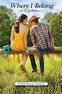 "When I saw the final photograph from the shoot (shown again, right, just for fun), I was incredibly excited. Not only did the art department take careful note of how I described Corrinne, but they also even got her clothes right! The purse and dress are not only Corrinne-like, but they are actually based on what she wore in the book.. down the designers! The purse is Marc Jacobs and the shoes are the famous, red heeled (very expensive) Christian Louboutins And I love how you can see elements of her face, but there's still some mystery to what she looks like! And the boy is very country cute, which is dead on. What girl doesn't like a cowboy!
"My editor worked hard to get me my dream cover. And my agent, Leigh Feldman, worked extremely, extremely hard to get me my dream cover as well. She was a true cheerleader for and champion of my vision. But she's like that all the time, so it didn't surprise me.
"They shot several scenes at the photo shoot including one with a truck. In the end, this image best reflected the novel, and I am absolutely thrilled with it. And I am also incredibly pleased that the reader reaction to it has been extremely strong. I am very happy the final version reflects the city girl in the country. And I like the fact that there's a romantic angle to the cover because the novel is both about finding out who you are and who you should be with.
"The cover was shot for just my book! I can't thank HarperCollins enough for putting that time and money into making the cover look great! And the models wherever they are! I hope to run into them someday in some weird twist of fate.
"I think the cover reflects the fish out of water story that's the cornerstone of WHERE I BELONG. And the grass background (which extends to the back cover) is very vibrant and unique. And I love the hay because Corrinne is a rider and works at a stable, so it alludes to that.
"Beyond that, I think the body language between the two models is very intense and gives the reader/viewer a peek into a very private moment. We all have (or will have -- I promise) amazing, tiny moments in our lives where something clicks -- sometimes it's a personal moment, and sometimes it's a moment with someone else. And I think my cover is a still frame from one of those moments that changes your life. So in five words, I am a huge fan."
Thanks, Gwendolyn! I love this cover. How about you guys?
Here's the trailer, in case you need more incentive to check this one out:
Cover Stories: The Language of Love by Deborah Reber
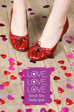 Happy Valentine's Day! I knew exactly which book I wanted to feature today. Actually, it's two books. And Deborah Reber, author of The Language of Love (one of the books in this two-book set) is here to tell the story behind the cover of Love, Love, Love, which also includes a book by Caroline Goode.
"If the cover story for my book Language of Love were to be made into a movie, it would have as many twists and turns as any good romantic comedy.
"It all started with this cover, below right, which I LOVED. This original cover was illustrated by Ann Zeak, who has designed covers for the more than two dozen Simon Pulse Romantic Comedies, the series to which Language of Love originally belonged.
 "In developing this cover, Simon Pulse asked for guidance regarding the physical description of my main characters Janna (Emma Waston pre-pixie haircut) and Julian (a scruffier version of a Zac Efron/Chace Crawford blend) and any insight I could provide on the setting for the book or a scene that might make for a good cover. And this is what they came back with, right.
"I absolutely love this cover, especially the color scheme, the adorable rain jacket and rain boots, and Seattle's landmark Space Needle in the background. The scene portrayed on the cover stems from the night that Janna and Julian fell in love. Awww...
"But then this cover went away.
"Simon Pulse made some changes with their Romantic Comedies series and decided to repackage them and create 2-book collections in a bigger size with a new, photographic cover treatment.
"To be honest, I was pretty bummed when I found out about this, partly because my book publication date got pushed from June to December, partly because I would rather my book have been a standalone as opposed to packaged with another story, and partly because I loved the original cover so very much.
"So, I was pleasantly surprised when a few weeks later, I received an email from my editor with this image attached:
 "As soon as I opened up the jpeg, I realized I could fall in love again.
"I didn't provide any input on this new cover - the publisher worked hard to create a cover that would tie together the two stories contained within without being specific to either one. To me, this cover is all about the mood it evokes - love, happiness, joy, frivolity, playfulness. And then there are those adorable shoes.
"I've gotten more comments on those little red shoes than almost anything else regarding the book. People have responded so favorably to this design, and that, along with the flat finish of the cover, the layout of the interior, and the bang for the buck (hey, you really can't beat 2 books in 1), makes for a pretty great package (IMHO).
"About those shoes...yes, they are too cute. And no, I don't own a pair. Although I am certainly keeping my eyes open."
 Thanks, Deborah! I adore the final cover -- I think the cartoon covers are cute, but sometimes I think they turn off older readers who might love the romance. This story reminds me of Jennifer Echols's tale about Endless Summer, which combined two of her Simon Pulse romantic comedies (left). You definitely can't beat two books in one, and romantic comedies are such bubbly, fun reads that this seems like the perfect book to pick up, oh, today?
What do you guys think of the cover, and of the change in the Simon Pulse romantic comedies line in general?
Photo Friday + Cover Story: Blessed by Cynthia Leitich Smith
 This week, I got to meet the amazing Cynthia Leitich Smith at a super-fun event at the Brooklyn Public Library. She was incredible and dozens of kids were totally engaged as she spoke -- about 30 hands went up when she asked for questions. Loved it! That's us, above.
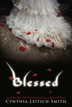 Her latest book, Blessed, came out in January, and the Cover Story is awesome. So here's Cynthia with a Photo Friday/Cover Story mix:
"I knew what I didn't want on the cover of Blessed: a sword. Not because I don't like swords (I do!*) or like them on covers (ditto!), but because the sword in the story is borrowed, and I wanted something that was more closely related to Quincie herself.
"Beyond that, I had no idea. Book one in the series, Tantalize (right), featured a profile of the protagonist.  Book two, Eternal, featured a luminescent angel wing (below left). So there wasn't a standard pattern, and I felt great about that.
"This series isn't the story of one protagonist. It's the story of four. The books are coming out in both prose and graphic format. Some are told in a singular point of view, others in alternating. If I wasn't going to embrace a formula, why should the cover designer(s)?
"I had a lot of faith in Candlewick Press. One of the reasons I decided to first send Tantalize to the house was because of the wonderful art and production values of the books on its list.
 "When I first saw the cover, I was so surprised to see the dress! I don't know why. It's something symbolic of Quincie, which is exactly what I wanted, and it speaks to several themes of the novel.
"I did worry a bit that it would be off-putting to boys, especially because a couple of men in my life made a point of saying so. But I often hear from guy readers who weren't the least repelled by the photo of Quincie on the cover of Tantalize. So, I'm hopeful that, coupled with the other books in the series, it'll be clear that Blessed is for both genders.
"To the extent that girls tend to be the romance readers, there's plenty for them here. But my books aren't genre romances per se. They also feature strong elements of suspense, action, and mystery. So, readers--both male and female--looking for more will find it.
 "I'm crazy about the cover, and I think the white stands out on shelves. I didn't expect to see the rose petals, but the red provides a lovely Gothic juxtaposition as does the makeshift path.
"The gown is Quincie's late mother's wedding dress, and Quincie wears it into battle at the end of the story. Growing up, she felt a bit overshadowed by her mom and has been trying to fill her shoes at the family restaurant.
"More recently, the vampire chef Bradley, who cursed Quincie with his blood, had dressed her in a white nightgown on the night she rose undead. So, this is her way of both distracting him and facing him down on her own terms.
"What's more, a wedding is a sacrament (or at least it is to Quincie), and this is a novel wherein she is given a guardian angel, which reassures her that she's still a child of God. That her soul is still wholly hers.
"Finally, Quincie is fighting alongside her true love, the hybrid werewolf Kieren, which is romantic in its way, especially since they've been recently reunited after what could've been a permanent separation. "They're only seventeen with no plans of marriage at the moment, just reveling in being together and being in love. That said, Kieren's mother is a wedding planner, so you know, if the day ever comes...!
"*I like swords as decorative/art objects and in stories, but in real life, I wouldn't want one pointed at me or you."
Thanks, Cynthia! I think all of her covers are gorgeous, and I'm a sucker for an amazing dress shot. Super Valentiney, right? What do you guys think?
PS-The sky on my walk home from that library visit? So pretty/creepy it made me want to be listening to Cynthia's book on my iPod.
Cover Stories: The Space Between Trees by Katie Williams
 Katie Williams has one of the most jump-out-at-you covers I've seen in a while. It's got three dimensional cut-outs. Seriously! It's hard to do the cover of The Space Between Trees justice in this 2D format, but hopefully you've seen the book in person (if you haven't, definitely seek it out).
Here's Katie with the Cover Story:
"I'm superstitious, so as I'm writing something, I try hard not to think about the will it? or won't it? of publication, and that includes dreaming up cover designs. I must be very strict with myself! In fact, I try to pretend that I have the demon hand from the Evil Dead movies; my left hand may be sending out stuff to editors or my agent, but the rest of me is writing away in an oblivious, artistic bubble.
"Once I found out that The Space Between Trees was accepted for publication, I suppose I may have entertained a cover daydream or two. I probably imagined we'd end up with the body part of a girl--so popular these days--but I never imagined anything as cool as what Chronicle did.
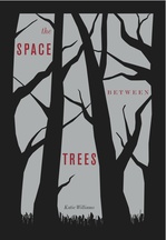
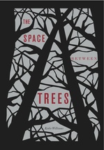
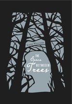 "Chronicle is so good to their authors! My editor asked my for input on the design. She had the idea of the cut-out branches and negative space, which came from the title (also, her idea). I suggested that the tree branches might form the outline of a girl's face, and the art team even mocked that up for us (right). In the end, though, it was too subtle an image for someone glancing at a bookshelf packed with enticing covers.
"The cover of the ARC (advanced reader's copy, above) used a red, gray, and black color scheme and no girl outline. (It also has a typo; see if you can spot it!) But even though the novel isn't girlie, the two main characters are girls, and so Chronicle quite rightly wanted to appeal to that readership. To do this better, the designers added the girl outline and changed the color scheme to a very sharp metallic lavender, below:
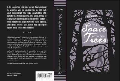 "Okay, I'm not lying here. When I first saw my cover, I genuinely thought, I hope readers judge my book by its cover. I couldn't believe how different it was, how gorgeous, how evocative.
"The cover design--tree branches with the title and image peeking through between them--comes from the title, which is, in turn, taken from a sentence toward the end of the novel. One of the themes explored in The Space Between Trees is that what is not there--a memory, an idea of someone, a lie--can sometimes have more power than what is present and true. The spaces between the trees can be more powerful than the trees themselves. The cut-out cover, which one can open and peer through, expresses this idea better than any flat image could. It truly is the perfect cover for my book."
Ahh. It's gorgeous and unique. Thanks, Katie! I can honestly say that I see hundreds of covers and this one is just, like, BAM!
Have you guys seen it in person? Let me know what you think.
PS-I just had to ask Katie where the typo was, and it's indeed on one of the covers shown here. Ack! So mad I didn't see it. Can you find it? I'll send a mystery gift package to the first person who comments with its location (click to enlarge the covers for a closer look).

