Cover Stories

Cover Stories: Skater Boy

Mari Mancusi has written a ton of YA novels, the latest of which are the Blood Coven series [read those Cover Stories]. Her very first Young Adult book, though, was Sk8er Boy. Now it's  out of print and she's got the e-rights, so she was able to create her own updated cover. Cool, right? Here's Mari with the story: "You never forget your first. And for me, that was Sk8er Boy. My first true love and the title of my first young adult romance, published in 2005. Perhaps the most autobiographical book I've ever written, it's a sort of Romeo and Juliet with text messaging.

"I originally sold the book to Dorchester, a romance publisher who had just introduced a new line of young adult books called Smooch. I had done one other romance for them, but this was my first teen book. So you can imagine how excited I was to see the cover.

"It looks pretty silly now (right), but you have to remember, at the time, those iPod commercials (see below) were really big and so I guess the artist felt it would appeal to a teen crowd. Still, though I knew it was trendy, I never felt as if it captured the feel of my actual book. It's not romantic, for one thing. It's not sweet. You don't get a good feel for the plot or characters. Oh and I hate the girl's purse! At the time, everyone had hobo bags and large purses--hers looks like something out of the late eighties. As does her outfit...

"In short, the cover did not capture the story inside the book. And you know how people judge books by their covers...

"Fast forward six years. The book is now out of print. And I have the rights reverted back to me. Which means I'm able to offer readers the book once again, by self-publishing it as an eBook.

"And this time I didn't have to settle for a cover that didn't fit the book. I had complete creative control. And so I worked with Theresa M. Evangelista, who does covers for Penguin books, to create the perfect feel for my re-release. Theresa worked on another one of my books, Gamer Girl [read that Cover Story], in the past, so I knew she'd come up with something amazing.

"And she did! As you can see, we chose a very sweet, romantic photo and Theresa applied an instagram style filter to give it an even softer look. We also changed the title from Sk8er Boy to Skater Boy--since everyone was always messing up the spelling anyway and I wanted it to be easier to Google. I even had Theresa apply a little sticker for the "First Kiss Club", a new brand I've been working on of upcoming sweet, contemporary romances for tweens and teens.

"I'm so happy with how it all came out. Finally, I have a cover that fits my book. And best of all, now a whole new generation of readers can enjoy my very first teen book!"

Thanks, Mari! I love this tale of retaking an old cover and making it new. Very, very cool. And: That moment on the new cover is hot. What do you guys think?

PS-Skater Boy is available on Kindle or Nook for $3.99!

Win-It Wednesday: The Darlings in Love

Yes, it's Thursday. This site was blacked out yesterday to protest SOPA (more info here). And now: I'm back! Last week's title, Tempest by Julie Cross, goes to... Keanu lover Natalie! Send me your address, N.

This week, I've got a copy of Melissa Kantor's The Darlings in Love, and she's here to share the Cover Story! Just leave a comment on the cover and you're entered to win a copy. Here's Melissa:

"I had a fantasy of the cover, which might be different from an idea. When I was a kid, there was this book Forever, by Judy Blume. On the cover was a locket with a picture of a girl's face, and when you opened the cover, you saw more of that picture--the girl's whole body, the boy she was standing with, etc. It was this amazing reveal. [That's the cover, right]. Well, since pearl pendants play a big role in the story of the Darlings, I wanted the cover to picture a chain with a pearl on it, and when you opened the cover, you saw that the pearl was actually on a girl's neck and that girl was standing with her two best friends. There's a name for that (a cutaway? something like that). But my editor said that covers like that tend to snag and rip and that's a real problem. As happens with so many things in life, reality intruded on fantasy.

"Once the pearl necklace idea was nixed, I think we discussed there being three of something, to symbolize the thee Darlings. The only thing I didn't want was three cupcakes. There are a lot of cupcake covers out there.

"When I first saw my cover, I hated it. I am not exaggerating. I remember calling my editor and making it clear that I was furious. I was like, This is the worst cover! What were you thinking? I hate this cover, etc. She's a very calm, rational person, and she tried to get me to be specific, so I more or less listed everything about the cover (from the font to the color to the cookies) and said why I hated it. I don't know that that was what she had in mind when she said, 'Be specific.'

"The one thing on the front cover that I was able to change was the cookies. They looked more like amoebas (is that how you spell it?) than hearts. I also had a lot of complaints about the back cover, and they took some of those to heart.

"Okay, this is somewhat embarrassing, but now I LOVE the cover. When I got my copy in the mail, I thought it looked so pretty and shiny. I love the color (which I originally hated) and I love how you can see the skyline in the cookies! I'm completely ashamed of my initial response, though I will say in my own defense that things look very different in real life than in the computer image I saw. If you have a chance to compare this image with the real book, you'll see what I mean.  I think the cookies are great, because Victoria (one of the Darlings) loves to cook and the heart-shapes are perfect because all of the Darlings fall in love in this book."

Thanks, Melissa! I am a huge cookie fan. Sara Zarr's Sweethearts remains one of my favorite covers ever, and this one is crazy cute. Also: I'm hungry. And, by the by, I adore those step-back covers too (I just call them Cover Holes, usually. Very VC Andrews.)

What do you guys think?

PS-Read the Cover Story for the first book in the Darlings series, The Darlings Are Forever.

Cover Stories: Catching Jordan

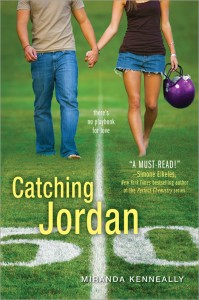
You guys, I'm reading Miranda Kenneally's Catching Jordan right now, and it's filling my Friday Night Lights void! Yay! Here's Miranda with her Cover Story: "I imagined my main character, Jordan, lying head-to-toe in a patch of grass with her best friend, Sam Henry. She’d be holding a football and he would be playing with some white clover.

"[My publisher] didn’t ask for input, but I couldn’t have been happier with the first options I saw.

"There were three options (see below), and I didn’t have any comments other than, 'I love them!'


"Believe it or not, the first time I saw the final cover I was standing on an airport runway during a meeting. I got really excited and showed everyone with me. The colors really popped and the moment was surreal, because I had been working on the book for so long. Also, I thought the guy’s bicep was really hot. I believe they used a variety of stock photos.

"The title of the book ended up changing [from Score], so that was a big deal. Otherwise, it was mostly little tweaks – adding the purple helmet and changing where the fonts were centered on the page.

"At first, I didn’t even think about the meaning of the 50-yard line running between them. Then I started to realize that it symbolized Jordan’s inability to let go and follow her feelings, rather than what she thinks she’s 'supposed to do.'"

Thanks, Miranda! First, I love the title change. And while I do like the girl-in-grass pics, the final image is epic. It's a great scene, a movie poster, a perfect image. The fact that SHE is holding the helmet is fantastic too, and of course, it fits.

What do you guys think?


Cover Stories: Don't Breathe a Word

Holly Cupala was here to talk about the cover of her debut novel, Tell Me a Secret. Now, her second novel, Don't Breathe a Word, is out this month, and it has a cover that manages to convey both darkness and sparkle. Here's Holly with the Cover Story:

"After the gorgeous cover HarperTeen put together for Tell Me a Secret, I knew to expect something fantastic for my second, Don't Breathe a Word… though it came about in a completely different (and for me, much more nail-biting) way…

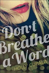
"The original working title was Street Creed, which is what the design team initially had to work with. The first cover concept was… steamy (below). It featured two gorgeous creatures, probably Italian models, who met as if by chance after a swirling, beaded-dress-bedecked night for an almost-kiss. Sigh.

"But it didn’t feel like my book.

"Don’t Breathe a Word is the story of Joy, who runs away from home to escape an abusive relationship to the streets of Seattle. She finds allies who have secrets of their own, including Creed—a homeless boy who dreams of making it in the music industry.

"There is a steamy relationship (and Creed is swoonworthy!), but there are no beaded dresses. In fact, the only scene where that dress could have appeared was at a fundraiser party where Joy meets her boyfriend Asher—the dark reason she has to leave. Also, I was worried with the final title, it would look like 'Don’t Breathe a Word about that naughty thing we did after the prom.' No. Oh no.

"The thought of responding to my publisher without effusiveness completely terrified me. Not because my editor isn’t fantastic (she is!) but because conflict is way low on my totem pole of desirable activities. But like I said, my editor is fantastic! She completely understood where I was coming from, and they set to work on a new cover.

"I sent a link to some photos I loved (several of them including bokeh light flares), and here’s what they came up with:

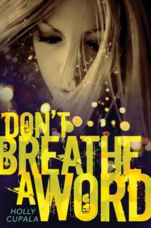
"Love! It captured the movement, the darkness, the grit, and even the glamour of living on the streets.

"But…unfortunately the photo (the original of which is here at iAnton’s flickr) was already contracted for not one but two other book covers. Luckily he had another that we loved even more, and voila, here is brilliant designer Ray Shappell’s final cover:

Thanks, Holly! I think the final image is magical, and I love the hint of huge color without actual inclusion of many colors. Does that make sense? Anyway, what do you guys think?


Cover Stories: Unraveling Isobel

Eileen Cook has been here before, sharing Cover Stories for What Would Emma Do?The Education of Hailey Kendrick and Getting Revenge on Lauren Wood (all awesome tales, btw). Her new release is Unraveling Isobel, and there's a rainbow Cover Story to tell: "When I finished this book I was certain I knew what should be on the cover.  I pictured a creepy gothic house perched on top of a cliff overlooking the ocean.  I’d been imagining the house in the book for so long I could imagine it perfectly.  I’d even drawn floor plans of the house when writing the book.  Of course the problem with having this type of clear vision, it’s really hard to find something in the real world that matches.

"I’m incredibly lucky to work with the team at Simon Pulse. They always invite me to participate in the cover design process. They talk to me not only about what I imagine the cover looking at, but also the feeling I want the cover to impart. My cover designer, Cara Petrus, wanted to make sure that the cover had some of the creepy gothic feel, but also wasn’t too dark as the book has humor too.  Cara picked up on Isobel’s interest in art and also her feeling of being trapped. The concept of her hands being held by her own art work was perfect. Part of what Isobel struggles with in the book is that she isn’t sure if she is seeing ghosts, if she’s going crazy, or if someone is trying to get rid of her by having everyone believe she’s crazy. For me the cover hints at all of this.

"They tried out different color backgrounds, the final image is the official cover."
Thanks, Eileen! Check out a couple of the other color scheme ideas they had:
Ooh, look how there are two Ls in "Unraveling" on the earlier versions. I believe that's the British spelling, actually. Anyway, I like the blue final. These two are pretty in their own way, but the blue tone fits with the book's description, imho. From Goodreads:Isobel’s life is falling apart. Her mom just married some guy she met on the internet only three months before, and is moving them to his sprawling, gothic mansion off the coast of nowhere. Goodbye, best friend. Goodbye, social life. Hello, icky new stepfather, crunchy granola town, and unbelievably good-looking, officially off-limits stepbrother.

But on her first night in her new home, Isobel starts to fear that it isn’t only her life that’s unraveling—her sanity might be giving way too. Because either Isobel is losing her mind, just like her artist father did before her, or she’s seeing ghosts. Either way, Isobel’s fast on her way to being the talk of the town for all the wrong reasons.

What do you guys think?

Cover Stories: Unbreak My Heart

Writing my own Cover Story is always odd. But here goes. I sent Caroline, my editor at Bloomsbury, a bunch of inspiration images for this cover (a couple are below). You know, girl, sailboat, sun, water... okay, so I was kind of vague.


When they came back to me, it was with this first draft (right). And it DID capture the girl, sailboat, big sky stuff. But the boat? It wasn't right. So here's how I responded:

Thanks so much for sending along this design! I do like the echoing heart from SINNERS and the general feeling of being out on the water, glimmering sun, and mood of the girl. I have a couple of things I'd like to mention though:

1. That boat is a Catamaran, totally different from what Clem's family is on. I think because the boat is such a big part of the story, it matters. 

2. The pink feels a little like it veers over the cheese line. Maybe it's the pink with the heart, maybe it's the pink and purple of my name... it just feels a bit like it's trying too hard somehow to shout "Love Story!" Maybe there's a way to get a similar tone in there with a natural element, like a sunset?

And Bloomsbury was great, really took my concerns to heart. Everyone really loved the girl (myself included) so at first they tried to adjust the boat so it would look more like Clem's... but that just made it look less like a real boat. So they went in a totally different direction (left). I liked this image, though I had reservations. Here's how I responded:

My initial thoughts are: Cute. Feel like I've seen similar images before, but that's probably okay. Would like it to look more like a big river/lake and less swampy but I assume that can be done. Like the green dress and the sunlight--would love the sunlight to always be a part of my covers because I LOVED the lens flare on SMALL TOWN SINNERS, which was subtle but awesome, and there's one here too. Part of me misses the boat, but if it's included I do think it has to be the right sailboat, so maybe this is a better direction. 

And then they found another boat photo that everyone liked, and they sent me this:

I loved it instantly. The sail, the wind, the sun, the water... the girl. It felt so much like Clem! My agent raised the issue that the girl looked a little young, and Caroline said they could play with ways to age her up a little bit. Actually, here's what Caroline said exactly (so interesting!): I spoke with the designer and he is going to try making her chin and forehead a bit more prominent—basically elongating her face so it’s not quite so cute in a young way.  We’re going to try elongating her body a little as well.  I also suggested adding some wispy hair in front of her cheek.  I think when all of this is combined, she’ll look closer to 15/16.  Fingers crossed! 

I even got used to the heart (and started kind of loving it and hoping that all of my covers would have hearts from now on!).

Then the internal discussions at Bloomsbury kept coming back to everyone really liking the pink of that very first design. They missed it. I have to admit, I didn't. I really adored the green-blue-on-blue. I'm into blue. But I liked this cover and was willing to go with the colors that everyone thought would make the book most pick-up-able. And so here's where we landed:

I keep staring at it. I'm glad the pink is lightened a bit, and I like the contrast with the blue water. I really like it--it makes me so happy. It's out May 22, 2012. I hope you like it! (And that you'll like the inside parts too, of course!)

Happy New Year, you guys!

Cover Stories: Drink, Slay, Love

Sarah Beth Durst has shared the Cover Stories for her novels Enchanted Ivy and Ice, and now she's here to tell her perspective on the scintillating cover of Drink, Slay, Love. "Creating the cover for DRINK, SLAY, LOVE was a traumatic experience. The problem began when the vampire hired to pose as Pearl came to the photo shoot hungry. She drained three assistants before someone had the presence of mind to pass her the bottle of donated blood that you see on the cover. The photographer snapped shots of her as she sated the last of her hunger with the bottled blood. Though they'd originally planned for a panorama, he was forced to do a close-up due to the carnage that littered the studio behind her.

"Okay, that's not true. She only drank from two people and both survived.

"Seriously, I don't know the story behind this cover. I only know that I love it. The little smile on her face perfectly captures the attitude of my vampire girl Pearl. Pearl is fierce, funny, fearless, and mostly evil... or at least she is before her unfortunate encounter with a were-unicorn. She was the most fun to write of any character I've ever written.

"This cover was designed for Simon & Schuster by Evan Schwartz and Jessica Handelman. My hat is off to them. And I hope they didn't lose too much blood."

Thanks, Sarah! I mean, I wouldn't have messed with this perfection either... that cover is hands-down gorgeous. Anyone else think Pearl's lips look kind of like Anne Hathaway's?

Oh, and in case you wonder if the insides live up to the outsides, here's what Kirkus had to say: "Combining a sense of humor with the dark appeal of supernatural romance, this book is funny, scary and thought provoking all at once. Even jaded fans of the supernatural will find fun in this one."

NICE. Happy Monday!

Cover Stories: Interview with Regina Roff

Regina Roff designs book covers for Bloomsbury/Walker, and she was the one who created the final version of Lauren Baratz-Logstead's Little Women and Me (read that Cover Story from Lauren's POV). Now Regina's here to share her side of that cover's story, and share a few other covers she's been working on (like that gorgeous one at left):

"When I came onto Little Women and Me, it was already started by another designer. It was one of the first books I worked on at Bloomsbury/Walker, so it was a really exciting project for me. The art director explained the story to me loosely and showed me a few of the original cover comps (like the one posted below, right). The team liked that direction but they also wanted to see some other options.

"So, I sat down and read the story, to get a feel for the tone, mood, etc of the novel. I was instantly transported into the world that Lauren Baratz-Logsted created! I wanted to capture the feeling of being from the outside looking in on this classic story of LITTLE WOMEN. At first, most of my cover comps were similar to what had already been tried: they featured images of girls reading, etc. Then I thought it'd be interesting to see the main character sort of 'spying' on the characters in LITTLE WOMEN. I had a few options where a girl pulled back a curtain on a scene of LITTLE WOMEN, but they didn't have the impact I was hoping for. After looking and looking for more 'spying' images, I ended up finding the image on the final cover, the girl popping through a piece of paper. That's where everything started coming together, with the original LITTLE WOMEN artwork and the modern girl coming through the page.

"We worried that the unaltered LITTLE WOMEN artwork would make the book look oddly anachronistic, so I played with ways of making the art look more modern. I did a lot of Photoshop with creating 4 color separations, half tone dot screen patterns, and then splicing it all back together again. [um...Design speak redacted; translation: MAGIC!] It was my little design tribute to my love of pop art and Roy Lichtenstein. I liked the result because it almost looked like a colorized negative of the original art, so you could read the final image as the girl coming out of the book or the girl looking into the book. Originally, the main character was popping out over the faces of the LITTLE WOMEN characters (I thought I was being clever with a visual metaphor about how she 'becomes' a character, haha!) but the team thought it made the artwork less recognizable. In the end, I'm glad we ended up composing the image the way we did because it definitely makes it feel like the main character is an 'addition' to the LITTLE WOMEN cast of characters!

"Some other fun covers I've designed for Bloomsbury and Walker are Alexandra Harvey's latest Drake book BLEEDING HEARTS and the bind-up of the first 3 books, RULING PASSION (below). Those were great fun for me to work on because I love, love, love the Drakes, and I especially love Lucy. (Lucy and I have the same hair cut and cat eye glasses, not to mention a bit of a preoccupation with slaying vampires.)


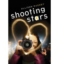
"Most of the covers I've worked on won't be hitting the shelves until the Spring or Fall of next year, but those include Trish Doller's SOMETHING LIKE NORMAL, Allison Rushby's SHOOTING STARS and Amy McAuley's VIOLINS OF AUTUMN (all shown below).


"(Full disclosure: I almost missed getting off the bus during my morning commute because I was so engrossed in reading a draft of VIOLINS OF AUTUMN when I was conceiving the cover design. It's THAT good!!!) There are a LOT more coming out in the Fall, but they're not ready yet."

Thanks, Regina! It's really interesting to hear things from an Art Department perspective, and these covers you've been working on are lovely! What do you guys think?

Cover Stories: Off Leash

Renee Pace's Off Leash was a semi-finalist in the Amazon Breakthrough Novel Contest, and she had control of the cover design, so she's here to talk about it:

"I knew I wanted a skinny teenage boy and a boxer dog for my cover. That was it. I also wanted it to have a nitty gritty feel. Those were my three outlines to my cover artist.

"When I saw the cover I was floored. She nailed it. I loved that the dog was looking back at the boy but the boy’s looking out at the reader.

"I didn’t want anything changed. It was like Angela Waters had read my mind and took the picture from my head to make my cover.

"We used stock photos only and I gather from my cover artists that securing teen photos is really hard.

"My cover tells me three things. One both my teen and dog are alone but together. That one glance back by the dog tells me he’s waiting for the boy and with how the boy is looking with such a questionable look on his face it just makes me get goose bumps because that’s what that story is about. A boy and a dog and their complicated friendship. The setting is perfect – that alley conveys to the reader that life isn’t great for both of my characters."

Thanks, Renee! It's interesting to hear how it goes when authors have such a big role in cover design. What do you guys think?

Cover Stories: Life's a Witch

Brittany Geragotelis' novel, available December 8th, is a YA retelling of the Salem Witch Trials, and it has been read like a bazillion times since being posted on wattpad.com. She's publishing the book herself (read a little about that) and she had a huge hand in the cover design, which is what she's on the blog to talk about.

Here's Brittany:

"I always knew that I didn't want the full face of my main character to be shown on the cover. As a reader and book reviewer, I understand how important a book cover is. The covers I'm most drawn to are ones which display a partial identity (Gossip GirlI'd Tell You I Love You But Then I'd Have to Kill You, etc). I think this is because it looks trendy and modern, while not giving away the whole look of your main character. I think this is important for the reader, because then they can really create the final look of the character in their own imaginations.

"I really wanted the character to have a very strong pose on the cover, too, so when I was looking for images, that was especially important to me. I always pictured my main character's hands on her hips, looking very super-hero-esque and strong; a pose that would convey to the reader that she's very powerful.

"Lastly, I wanted to find a picture that showed the character in an outfit that my main character would wear--and that had to include red pumps. In Life's a Witch, Hadley is obsessed with fashion and thinks that a great pair of heels is the answer to any situation. Her favorite color is red--which is very important to the storyline--so I knew I had to have that element in there, as well.

"I never pictured the cover shot as being black and white, but after I saw this photo, I kept thinking about how great and dramatic it was. When my designer said she could turn the shoes in the picture red, I knew I'd found my shot.

"I was so lucky to have had my very talented designer friend, Toni Misthos, create my cover. She's read a lot of my books, so when I asked her if she'd design my book cover, she didn't hesitate.

"She was only able to read part of Life's a Witch before she designed the cover though, since it wasn't done yet at the time, but I told her what I was looking for and the general storyline. At this point, we both started searching through stock photography for a specific type of girl and came up with about a dozen shots to choose from. In the end, we kept going back to the one we ended up choosing.

"Toni always knew that designing my book cover was my thing, and because we'd worked together (she was the art director at the magazine I work for), she understood that I'm very opinionated and picky, so she didn't really try to fight me on anything. But as far as the font for the cover and placement, I let her choose that. She gave me a few options and in the end we chose the one we both liked most.

"I offered to pay her, but we ended up with an even trade. She's back in school and needed someone to proofread her papers before she turned them in, so I agreed to do that as a way to pay her back. It was a win/win (although I may have gotten the better end of this deal)! Since then, Toni's designed my second book cover as well. She's a genius at art design. If anyone's interested in a professional-looking cover and doesn't mind spending a little bit of money, they should check her out at fotinimisthos.com.

"The first time I saw my finished cover, I thought, 'Man, that's hot!' Ha! But really, I felt that it was classy and sassy, dramatic and powerful, just like my main character. I was so proud of the way my book was portrayed visually. I'm actually still impressed by it today, but then again, I'm a little biased.

"Because I was so heavily involved with the design of the cover from the beginning, there weren't a whole lot of suggestions I had to make throughout the process. Toni knows me and my tastes so well, that she zeroed in on what I wanted right away.

"The cover didn't really change much from version one to the version my fans see today. But the final product was definitely different than my original concept. That's to be expected though, when you're not doing your own original photography...you sort of have to settle for the closest thing to your vision. "The photo was definitely a stock photo. I actually went on istock.com (a site we use for stock photography at work) and searched through their files. The image I chose wasn't exactly cheap, and later on, I had to purchase a much bigger file (this equals more money) of the photo to ensure that I was covered if I needed to do any promotional stuff with it later. Good thing, too, because I'm using the same image now for the print version of Life's a Witch.

"I really love my cover! But then again, I was super-involved in designing it, so there's nothing for me to complain about. I get so many compliments on it today and I really feel like it showcases the book perfectly. There's no doubt in my mind that having a smart-looking, enticing cover has helped pull in potential readers."

Thanks, Brittany. I really like the cover (I'm a fan of that style, too, as my Violet books have that type of feel, as well as the black and white with a pop of color thing...), and I think the image is strong.

What do you guys think?