 Karen Mahoney is here to tell the tale behind her amazingly gorgeous new cover. The Iron Witch is out this month!"My publisher asked for my input on the cover, which was awesome! (And unexpected.) I'm lucky that Flux are open to author input - although obviously there's no guarantee that what you say will be in any way 'followed' or slavishly adhered to. All I really wanted was to make sure that we didn't actually see Donna's face (I'm not so keen on that with covers, though there are always exceptions that I fall in love with), and that we get to see her iron tattoos. Other than that, I just left it up to the art department.
"Truly, the very first time I saw the initial cover concept I fell in love. I can honestly say that the cover for The Iron Witch is perfect - every single part of it. I can't believe I was so lucky with my first ever book! I didn't have any need to ask for changes (even if they would have been considered) because there was simply nothing I wanted to change. I couldn't believe how well all the elements came together: Donna's pose shows how conflicted she is, and how angst-filled the decision she has to make; her tattoos are gorgeous and exactly how I imagined them; and she's even holding a vial of the Elixir of Life (which plays a big part in the story). The vial is beautiful, and Lisa Novak - the amazing designer - made the liquid inside it red, which is accurate to the story. I couldn't possibly ask for more.
"I'll now pass you over to Lisa Novak from Flux to tell you more about how she actually put the cover together. It's so interesting to hear Lisa talk about the cover in this way. Everything she says about the presentation of the main character (Donna Underwood) and the general atmosphere of the cover - and, therefore, of the book - is just perfect:
Lisa: "The image of the girl is stock photography. I don't know anything about what prompted the photographer to take the photo the way he did but I can tell you that it is titled 'Grief.'
  The only part of the photo that had color in it when I found it was the girl's hair, the photographer had desaturated the rest of the photo to focus the viewer's eye on the hair, the highlights, the way it fell. Because that sort of photo treatment wouldn't work for our book I added the color back into her skin before adding the 'iron tattoo' (right).
"When I'm putting together a cover like The Iron Witch I start by searching for the main element, which in this case was the girl. There are about half a dozen stock photo sites that I typically use and after entering some basic search words I end up sifting through hundreds of photos to find the one that speaks most strongly to the book. Sometimes this search can be over in an hour, other times it might take days. I think this one came to me somewhere around the 6 - 8 hour mark of scanning images.
"Once I find an image that feels like it might be right I'll look at it and see what I can add or change to make it become the book even more. In this case, I knew I needed to add the iron tattoo to Donna's arm and hand. I wanted something delicate, but densely entwined, and ultimately strong looking in a feminine way.
 "Next came the vial (left). Because the rest of the cover is fairly stark I wanted the vial to be intricate and beautiful and something you couldn't take your eyes off of. After adding the red Elixir I thought it looked almost a little too out of place and richly colored so I pulled back the saturation a bit and ended up giving it a bit of a steampunky look in doing so.
"And finally, to keep the image from floating away in space and to tie her to the title, I added the same iron filigree in the open area around Donna that is on her arm. I think it gives it an overcrowded feeling and helps heighten the tension going on with the angle of her arm and the fact that she's hiding her face from us. I think the cover makes people slightly uncomfortable, yet draws them in at the same time."
 "You can see some alternate cover concepts on Lisa's website [one is on the right] but, really, everyone at Flux was in agreement that there was no competition and our chosen cover was The One."
Thanks, Kaz and Lisa! This design is so intricate and lovely -- you can tell how much thought went into it at first glance. The colors are perfect, and the sparkle of the vial is completely intriguing.
What do you guys think?
Cover Stories
Cover Stories: Head Games by Keri Mikulski
 Keri Mikulski shared her Cover Story for Screwball here in 2009, and now she's back to talk about her new release, Head Games:"As I began writing HEAD GAMES, I definitely pictured a cover that consisted of a combination of boys and basketball. But when it came to the actual moment, I was so engrossed in writing and revising the book, I didn't even think about the cover.
"When I first saw the cover, I was in love! Natalie Sousa, the fabulous designer at Penguin, truly captured Taylor Thomas, the main character. And she did a great job implementing the different features of the first two Pretty Tough Books - PRETTY TOUGH and PLAYING WITH THE BOYS (below). The smirk, the clothes, the beach court, the basketball, the feel of the cover - perfect!

 "The original version changed a bit. The basketball scene in the background was tweaked to make it more obvious it was a guys vs. girls game.
"The final cover truly captures the essence of the book - from the basketball to the romance to the beach to the tension on and off the court - it's perfect!"
Thanks, Keri! I love books about sporty girls who are also somewhat girly, and of course I'm totally intrigued by the runway/modeling angle! What do you guys think?
PS-Here's the trailer:
Cover Stories: A Girl Named Mister by Nikki Grimes
 A Girl Named Mister, by Nikki Grimes, came out last fall. Kirkus Reviews says, "This novel in poetry looks clearly at both teen pregnancy and struggles with faith. Mister is exceptionally well characterized...The language is intimate and immediate."The cover is one that I've stared at a bit in the bookstore, so I had to ask Nikki about the back story. Here she is:
"OMG, I am so in love with the current cover, I'd completely forgotten what it took to arrive at it! I had no musings on a cover when I wrote the text. I never do. But when it comes to covers, I definitely know what I do or don't like when I see it.
 "I remember the original cover proposed to me (right), and I shudder. It featured a young girl who was too mature, and worldly-wise for Mister, and a very stilted image of Mary, which did not align with the fresh-faced young teenager I had in mind. In fact, I wrote Mary as though she and Mister were the same age, while the Mary they had first chosen appeared considerably older. I expressed my concerns to my editor, and the designer went back to work on a new comp. Boy, am I glad!
"If I remember correctly, the trailer and cover were both in production around the same time. I was asked to select one of three possible actresses for the trailer, and the young lady I chose was used for the cover profile, as well.
"When I saw the final cover, it took my breath away! It couldn't be more perfect.
 "The young lady I chose for the trailer and, as it happens, the cover, had the perfect blend of innocence and maturity that matched my character. The flower design that overlays the left side of the photo suggests a blossoming which is on point, too. Mister grows and blossoms in important ways during the course of her story.
"One key feature that makes this cover work is the angle the girl was shot at. She appears to be stepping out of the darkness, into the light, which of course is what Mister does in the story. Brilliant!"
Thanks, Nikki! I think the cover conveys a lot of emotion, and looking at the full spread, I love effect of the illustrated edges and the blue and yellow combination.
What do you guys think?
PS-Watch the trailer, starring the cover model:
Cover Stories: The Darlings Are Forever by Melissa Kantor
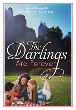 The lovely Melissa Kantor's latest novel, The Darlings Are Forever, is out this month. She dropped by to talk about that oh-so-Central-Park cover:
"I'm not a very visual person, so it's rare for me to have a cover in mind for a book I'm writing. And I'm always amazed when my editor shows me a potential cover. It's like--wow, how'd you think of that? The only cover I ever came up with was the one for The Breakup Bible, right, and that's because it's kind of an inside joke.
  The book is named for a really unhelpful advice book that the main character gets, and my book has the same cover as the (imaginary) advice book.
"So I really had no idea what they should do for the cover of The Darlings Are Forever, and I was just as surprised when I saw it as I ever am!
"Hyperion is very nice about asking for input--and I never have any good ideas. I always say something like, 'What about a charm bracelet?' even though I've never written a book with a charm bracelet as an iconic item. And I often suggest a backpack spilling out its contents. Actually, that's my website, now that I think of it--a bag with everything being dumped out of it. I think because it's my worst fear (spilling out all my stuff in public). Hmm, maybe I'm over analyzing here.
"I always hate the covers the first time I see them. Really. Each time, I'm like, UGH! Why did you do that? Then it grows on me.
"I made a bunch of suggestions. I hated the first font for the title, and then I saw the movie Rebecca, and the title for that movie is in a really dramatic font that I absolutely loved. I actually googled a still of the title and then emailed it to my editor:
 "The basic concept remained what it was from the beginning, but I had a BUNCH of small changes I wanted made, everything from the girls' wardrobes to the way the light fell over the scene to Victoria's hair color. And they were really good about trying to integrate them. Everything big is pretty much the same, but everything small changed. I like the feel of it a lot better now. (See the initial cover, left, and the final cover, right, side by side, below):
 "They did a photo shoot, which I thought was really cool. They did one for my first book (Confessions of a Not It Girl, left) also. It's a picture of a girl's butt (the main character thinks her butt is way too big, and she kind of obsesses about it). The only problem was, at every event I did, someone always asked me if it was my butt on the cover (it's not).
"I've come to really like how the three girls are pictured. It's a moment that feels natural. They're having a picnic in Central Park, and it's such a New York City book and so much of their friendship is talking about their lives while they sit somewhere in Manhattan and eat. So the cover feels very true to the book and the Darlings."
Thanks, Melissa! I really appreciate the tweaks in the girls. You can see all of their faces now and they just look much more book-cover-worthy than the initial draft. Glad the Central Park setting didn't change -- it's gorgeous.
What do you guys think of this cover? PS-You can download Chapter 1 on Melissa's website!
Cover Stories: Deadly Little Games by Laurie Faria Stolarz
 Laurie Faria Stolarz shared the story behind Deadly Little Secrets, the first book in her Touch series, and she's back to tell us about the cover of the third book, Deadly Little Games."Since it's the third book in the series, I had an idea of what they might do for the cover. The first two books show a female character (but not her face), in a dark outdoor setting (the woods). Since this book takes place in winter, I knew they'd incorporate snow in some way. I'm happy with the covers to these books. I like how beautiful they look together and the fonts the artist chose. I also like that we don't see Camelia's face. It's more mysterious and it doesn't overly influence how the reader will picture the character.


 "I loved the Deadly Little Games cover right away. I haven't found any hidden meanings within the cover of this book, but with the first book in the Touch series (Deadly Little Secrets), the hand of the girl on the cover is slightly illuminated, hinting at the touch power that the characters have."
Thanks, Laurie! What I really love about this whole series of cover is the sense of movement they have. Also, I'm a sucker for covers that include weather, and I'm especially feeling the snow right now (there's something sparkling and magical about the flakes, right?)... What do you guys think?
PS-Watch the trailer (and enter the contest Laurie's hosting!)
Cover Stories: The Education of Hailey Kendrick by Eileen Cook
Last year, Eileen Cook stopped by to share the story behind her bright, doll-starring cover for Getting Revenge on Lauren Wood. She's back with a new release, The Education of Hailey Kendrick, which Kirkus calls "the highest quality--like a gourmet truffle" in a starred review! This new cover is just as bright as the last (with less doll), and here's Eileen to tell its tale:
 "I have two (or at least two) great weaknesses as a writer. I'm lousy at titles and terrible at imagining covers. I'm so lucky to have the team at Simon Pulse behind me. My editor somehow manages to avoid laughing out loud at my titles ideas and the cover designer, Cara can be counted on to come up with some great ideas.
"The book takes place in an exclusive boarding school so my first idea was having a scene where you see Hailey climbing over the wall to sneak off campus. However, we didn't want it to look like she was breaking out of jail...
 "Cara then had an idea that she quickly sketched out with photoshop where it was the main character in her school uniform with a lollipop (right). The problem was that it looked a bit 'porny.' You have to watch out for those school uniforms -- who knew a blazer and knee highs could be so racy.
"The third time was the charm. When I opened the email with the cover the bright colors and typeface really jumped out at me. It felt like a great fit for the book."
Thanks, Eileen! I agree that the lollipop is a bit much -- it takes over the cover. The final image is just as bright and bubbly, so I think it's a great pick! Also, for some reason I love the look of that brick wall, which grounds the whole image somehow.
What do you guys think?
PS-Enter to win a copy of this book (and watch a great Happy New Year video by Eileen) at Wattpad!
Cover Stories: Hold Still by Nina LaCour
 I think Hold Still, which is a beautiful book, has gotten two great covers (hardcover and paperback) so I had to ask Nina LaCour about each one. Here she is:"I was super worried about my cover. My mom used to be a graphic designer so I grew up a little bit of a design snob. My biggest worry was that the art team would make the book look to girly, or too light, that they would strike a tone that didn't suit the story. So when I heard that Mia Nolting (who had been writing out the journal entries in the novel since before I even had an agent) was going to do the cover art, I was thrilled and relieved. I love Mia's work. It's clean and delicate and has this awesome current, indie quality while still being poignant and honest and really moving. Plus, she's my friend. I loved the first concept she came up with: a girl in jeans with a camera around her neck, a strip mall behind her, a layer of text (below). The concept evolved from there to include a girl's face with the camera raised in front of it and another girl spinning in the distance, and I liked this idea of overlapping images.
 "Then, I got a call from my wonderful editor, Julie Strauss-Gabel, who told me that people at Penguin were getting excited about the book, and what we thought was going to be a pretty quiet book was actually going to be a 'big' book for the fall season. I was thrilled to hear this news, but bummed to hear that it meant we were moving in a different direction with the cover. Mia's drawings were no longer going to be on it--instead we would be going with a photograph.
"The next cover I saw was a complete departure. It was a photograph of a mournful-looking girl with a large shadow hovering behind her. The photograph was black and white and the title was written in a red computer font. I did not like this cover. The girl was too glamorous and it felt so oppressively sad. Hold Still is a sad book, but I see it as ultimately hopeful. It's funny because this cover was the opposite of my initial fears that the book would look too light and fluffy. Now it looked like it was all about suffering. I panicked.
 "Slowly, though, the cover evolved and I grew to like the new direction (right). The art team held a photo shoot with a different model who looked more like I imagine Caitlin. Mia's embellishments appeared as the leaves in the corner, and one of her early ideas of torn paper also showed up. Her hand lettering replaced the computer fonts, and ultimately it looked like a good cross between the artistic hand done cover we initially dreamed up and the more commercial photographic cover that came after.
"Then, a year later and out of the blue, came news of the paperback redesign. Sara Crowe, my lovely agent, called me and told me that she hadn't seen the cover yet but that it was described to her as 'a girl with her arms out like she's flying.' Yikes! Again, I got worried. But then I saw the new cover (below), and I was blown away.
 "It still feels sad to me, but it also has the raw hope that fills the last sections of the book. When I showed it to my writing group, one of my friends said, 'That's exactly what you want to feel like when you're fifteen,' something that struck me as very true. Rosie Hardy took the photograph, and it's a self-portrait which fits perfectly with the events in the novel. Theresa Evangelista designed both the hardcover and paperback, and I feel really fortunate to have two such different and striking covers that represent different aspects of my novel."
Thanks, Nina! I love knowing that the paperback image is a self-portrait, and I really do think both covers are winners. What do you guys think?
Cover Stories: Paranormalcy by Kiersten White
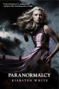 Kiersten White's Paranormalcy has a gorgeous, dark cover with lots of movement. Here she is to tell the story of how it came about:
"I went in knowing that authors don't have much say in covers so I really didn't have anything specific in mind. In fact, my editor asked me for ideas and I was like, 'Wait, what?? I have no ideas!' I didn't want to get attached to an image and then be disappointed in what ended up being used.
"That being said, I did have several things I didn't want. My greatest fear was that the cover would be hot pink and feature a headless torso.
"The one idea I had was two arms crossing the cover and holding hands in the middle--one glowing slightly, and one a nearly invisible outline, to represent the two main characters. I'm really, really glad they didn't listen to that. I also suggested a hand rising out of a grave and a pink booted foot standing on it, but it was way too Buffy-esque, and I'm again glad they didn't even consider it. At one point they told me they were playing with an extreme close up of eyes, which I liked because eyes are very important in the book.
"All along the way I was really hoping that my cover wouldn't feature a model.
"When I first saw the cover, I freaked out--in a good way. I was shocked that they went so dark and dramatic with it, but I was so, so pleased. I was worried because of the humorous tone that it would get a very playful treatment that wouldn't be very true to the darker elements of the book. So when I saw their initial concept with the foreboding, dark background and the full model in the foreground I was very surprised and very excited. All of my fears about using a model disappeared because it was such a striking image and felt atypical.
"We got the cover mock-up to get a feel for the design, which we loved, and then they sent it to us again when all of the elements were in place but still being tweaked. We suggested shifting the placement of the thistles in the foreground and softening some of the lines around the model.
"They took our comments to heart. Of course, we didn't suggest anything huge, but we really didn't need to since it was such a jaw-droppingly beautiful image. But they did change the thistles and fix some of the lines.
"They changed her dress to flow directly out instead of swooping down a bit first (and I'll admit I did like the swoop, but the flowing went over better onto the back of the cover), and adjusted some of the smaller elements. But it remained pretty much the same.
"They did a casting call and sent me the photos of the model they picked. I loved her because while she's obviously beautiful, she's also a little unusual looking and has striking eyes, which was important to me. My editor sent me video from the photo shoot, in which the poor model had four huge fans blowing on her and people all around holding her dress out with fishing line! They actually took a whole series of photos of her to use for future books, which was really great (see a shot from the shoot, below). I'm glad they planned ahead so we can have a consistent look. After that they put in the back- and foregrounds and type elements.
 "I think the final cover is a great representation of the book. Some people have complained that it's too dark, but I love the counterbalance of the dark, stormy sky with Evie's white blond hair and shimmering pink dress, because she really is this sort of beacon of hope and humor in a very dark, dangerous landscape. If I could change anything I'd have a hint of smile on her face, but all in all I think it's an incredible cover. And it did end up being an almost exact match to a scene in the book, which was awesome! All in all I feel incredibly fortunate that I ended up with a cover much better than I had imagined or hoped for. I love it! And just wait until you see the sequel's cover..."
Beautiful cover aside, this book sounds seriously good. Have you guys read it yet? What do you think of the cover?
PS-Here's the trailer, which makes me need it NOW.
Cover Stories: Girl Stolen by April Henry
 April Henry's Girl Stolen is about a girl who's asleep in her mom's car when the car is stolen, with her inside. Also, she's blind. Stakes? HIGH.Here's April to talk about the cover:
"I have to confess that I am not good at visualizing covers for my own books. I love book covers and am also married to a graphic designer who asks for feedback, but that's more reacting than acting, so I did not give any input.
"My agent had a comp in hard copy and mine hadn't arrived yet. She told me she loved it. I was dying of curiosity! She managed to take a slightly blurry photo of it with her camera phone and then emailed it to me. When I saw it, I fell in love, too.
"My editor and I discussed little changes. For example, the girl is wearing fingernail polish on the cover. In the book there is no mention of her wearing fingernail polish, but I decided it was something Cheyenne might do to fit in, so I suggested adding a line about it.
"Initially, the polish looked a little uneven, so it was plausible that a blind girl had done it. Then they decided to scuff up her nails so that they looked more like she had been fighting (she's been kidnapped). The cover designer told me that all the fingernail polish, in whatever state, was added in Photoshop.
"We also discussed whether there should be any punctuation on the cover, and I was presented with two covers to choose from.
"The photo is of art director Rich Deas' neighbor. He told me has used her before for other covers. He also told me, 'When possible, I like to create images with my own photos and illustrations. It feels more natural than looking through a million images trying to find something that almost suits what I am looking for.'
[Rich shared the below images with April, which include more of his ideas/mockups that got them to the final cover]:


 "I love everything about my cover -- especially the little sliver between two fingers where you can just see her right eye. I hope Rich works on my next cover."
Thanks, April! Girl Stolen is a part of The Contemps Challenge (which you should be accepting right about now, if you haven't already). Hello!
Read April's fascinating interview with Rich about this cover design on her blog. I think this final cover is chilling, and I love the details in it (nail polish, her ring, even the longish sleeves on her shirt, which looks like one of those knit undershirts I always wear in winter). I also love seeing the original ideas and the covers that Rich contemplated.
What do you guys think?
Cover Stories: Matched by Ally Condie
 Ally Condie's Matched was just named #1 on the Winter 2010/2011 Kid's Indie Next List. And its cover is up there among the best of the year too, so I asked Ally to tell that tale, and here she is:
"I didn't have anything in mind for a cover. I'm not a very creative person visually. I certainly appreciate it in others--my mother is a professional artist, and I have grown up appreciating visual art in its many forms--but my mind doesn't seem to work that way. So, I was just excited to see what the designers had in mind!
"My publisher asked for ideas, and I didn't really have any suggestions for them.
"Honestly, when I first saw the cover I wanted to cry. Tears of joy. I thought it was perfect. The model is just how I pictured Cassia looking, but I like that she's in profile so we can imagine her features. The dress is beautiful and has significance to the story, as does the bubble/glass world and the color green. And that particular shade of green they selected is beautiful. I am also a fan of very clean design, and this cover has that in spades. Theresa Evangelista was the designer for the cover and she is amazing.
"Before this cover, there was another concept that Penguin had that we didn't use. It was also beautiful, but this one is even better.
"The final cover was shot with a model. And, in this case, it was a self-portrait! The model and photographer are one and the same, a very talented young woman named Samantha Aide.
"I love my cover. It's a beautiful piece of art and I feel incredibly lucky that such talented people worked on the project. I did find one little piece of hidden meaning that I didn't notice at first. In the book, there are three important tablets that the characters take. The tablets are red, green, and blue. If you look closely at the bubble, you can see very subtle red, green, and blue highlights along the surface. I love that. I think the cover relates to the story in the book perfectly--Cassia is trapped in this beautiful, protective, but ultimately imprisoning world. And, in the end, it is a world that she can break, if she so chooses."
Thanks, Ally! I love the colors and the glimmering magic in this cover. I can't believe the photographer and subject are one and the same--what a cool trick. I also found this cover, which may be another version (UK?). I'm not sure... but it adds the tagline, a blurb and changes the title color.
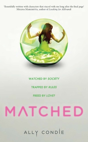 What do you guys think of the cover?
PS-Here's the news on Crossed, the sequel to Matched.
