Cover Stories

Cover Stories: Dani Noir/Fade Out by Nova Ren Suma

The astoundingly talented Nova Ren Suma is here with an epic Cover Story! So without further ado, here she is: DN hardcover front
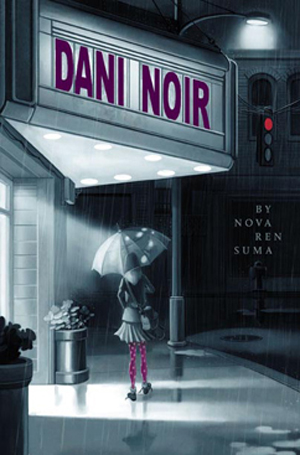
"My first published novel, Dani Noir, is about a thirteen-year-old girl named Dani who is obsessed with old noir movies and femmes fatales like Rita Hayworth. In the story, Dani uncovers a noirish secret in her small mountain town and sets off chasing a mystery girl who’s spotted wearing a pair of polka-dot tights. This book was written for a tween audience, and the cover that Simon & Schuster / Aladdin came up with for the book perfectly captured the voice and the mood of the story—as well as the mystery girl’s polka-dot tights. I felt like the illustrator, Marcos Calo, truly 'got' the character of Dani, down to the way she’s creeping behind the wall on the back cover, tailing the girl you see on the front.

(To see the stages the illustrator went through in coming to this final image, visit his blog to take a look at his sketches.)
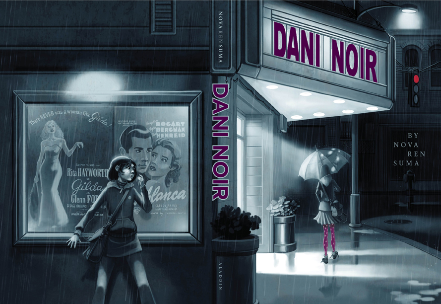
DN hardcover front and back

"I’d originally envisioned a black-and-white noir-style photograph, but when my editor brought me the final version of this image, which wrapped around to reveal Dani hiding on the back cover, I was excitedly surprised, especially that original art was commissioned. And it’s thanks to the illustrator’s vision, in fact—since the girl on the front cover is holding an umbrella—that I rewrote one of the fantasy sequences to take place in a rainstorm.

"Dani Noir came out in hardcover in 2009, and a paperback edition with the same cover was planned for the following year…

"…But then the paperback edition was canceled at the last minute. I was upset that the book wouldn’t make it to paperback, especially since readers kept asking me when the paperback edition would be out and saying they couldn’t find the hardcover in stores anymore. I was sad, but there wasn’t much I could do. One day I’d have a book that made it to paperback, I told myself.

"In fact, I would. Because the story of Dani Noir wasn’t over...

"Fast-forward about anotherFO paperback year to the day I got a phone call from my agent. Now having moved on and working on books with a new publisher, this was a call I absolutely wasn’t expecting. My agent told me that an editor at a different imprint at Simon & Schuster wanted to publish Dani Noir in paperback. Only… the imprint was Simon Pulse, which publishes only YA books. They thought the book would translate well to a lower YA audience—and it turned out they would even let me make some line edits for the republication. But they wanted to give the book a new cover, and they even had a new title in mind: Fade Out.
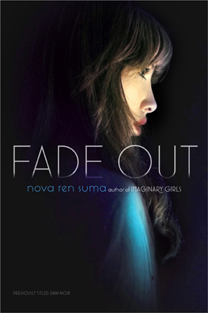
"I was thrilled. A book I thought was over now had a second chance at life! And yet… it wasn’t until I hung up the phone that I realized how strange it was to lose what felt like the perfect title for the book. It’s words that mean something to we authors, after all.

"I did want to keep my original title because it was one of my favorite things about the book, but Simon Pulse wanted to distinguish this book from the first version, since the new edition would be on the YA shelves instead of with middle-grade. I came up with a list of other title options, but editorial and sales and marketing and everyone who counted liked Fade Out, so Fade Out it stayed.

"When I announced Fade Out, I was contacted by numerous other authors who were happy for me… but confused. How did this happen? Why was I losing my awesome original cover? Why was I letting them change my title? And wouldn’t readers be confused?

"Well, fellow writers, if you had the sudden chance to have the novel you thought would never make it to paperback come out as you’d hoped… but looking completely different and called something else, might you do it, too?

"I felt like this was a gift I couldn’t pass up, and making it to paperback so the book would hopefully find new readers was the most important thing.

"When the cover for Fade Out was first sent to me, I opened it excitedly on the street, on my phone. And stopped. It was beautiful, arresting even. It was mysterious. And yet it felt like a cover for a completely other book to me. Who was the girl? It couldn’t be Dani… she’s thirteen years old. Was it meant to be Dani’s fantasy image of herself? Could I explain it that way? Did this look like too sophisticated of a cover for this story… and would it be misleading to readers? Would they pick up this cover thinking it was a certain kind of book and be disappointed at what they found inside?

"I was flooded with questions. I remember saying something like I loved the cover image, but this cover made me want to write a whole different story to merit it.

"The photograph wasn’t black-and-white, but, ironically, it was more in keeping with what I thought the original cover of Dani Noir would be. (I think my desire for photographic covers, just in general, is related to how I think I was meant to be writing YA over middle-grade/tween, but that’s a whole other conversation.) I found out later that the image is by a photographer named Ilina Simeonova—and it’s a self-portrait. (She’s created quite a few book covers—check out her portfolio!)

"The new, beautiful cover image stayed, as did the new title, and Fade Out came out in paperback in 2012 and, if the emails I get are any indication, it’s thanks to this second chance at life that the book found readers it may not have found before."

Thank you, Nova! This is an extraordinary story--I'm not sure I've heard of the title/cover/audience change before (anyone else?), but YAY for expanded readerships and paperback dreams come true.

What do you guys think of these covers? I think the original feels more unique to me, but the paperback YA is gorgeous, too, and I honestly like them both.

PS-Next week, Nova will be back to talk about Imaginary Girls, a book I adore.


Cover Stories: 3 by Lauren Baratz-Logsted

Lauren Baratz-Logsted has a bunch of new e-books out, and with them come new covers! Here she is to talk about three: "Along with my husband Greg Logsted and our daughter Jackie, I created The Sisters 8 series (read some previous Cover Stories) for young readers ages 6-10 that launched in 2008. The ninth book was published this fall and even though the series has sold nearly 200,000 copies to date, the publisher has no intention of continuing at this time. And yet daily, I get emails from kids, asking for more books in the series; and those kids keep getting older with each day that passes. So, I decided to launch my own series, this time for 8-12-year-olds!

Cover 16Here’s the description of Book 1: GUYS AGAINST THE GIRLS:

There's trouble at Hat City Middle School! This first volume in an exciting new series by the author of the popular Sisters 8 series introduces readers to the six guys and six girls who make up a special class at Hat City Middle School. When a substitute teacher says something she shouldn't, the girls are outraged. Then their regular teacher makes matters worse, and everyone is outraged. Soon the guys and girls are facing off about everything, but will it end in victory or disaster? Told in alternating first-person plural viewpoints, GUYS AGAINST THE GIRLS is as original in its execution as any middle-grade novel out there today.

The cover for this was created by Griffin Ced. I said I wanted a red buzzer somewhere on the cover – because a red buzzer figures prominently in the storyline – and possibly some equations, since math is a great source of conflict in the book, and this is what he come up with. I love the way the school is literally splitting in two from the conflict and there’s my red buzzer, right over the entryway.

Here’s the description for Book 2 in the Hat City Middle School Series: ROBBIE KNIGHTLEY:

Cover 5aA modern-day Dennis the Menace, Robbie Knightley stumbles through life annoying the next-door neighbor, frustrating his teachers and perplexing his parents, who can't quite understand why he's so different than his six older sisters. When Robbie opens his Christmas presents prematurely without remorse for the second year running, his parents consult his therapist grandfather and Robbie hears his parents say they think there's something wrong with him, something missing. Robbie decides he'll get by in life by keeping his mouth shut and avoiding spending too much time with other people. But when a five-day class trip is unexpectedly moved up and he can't get out of it, Robbie fears the worst: that his friends will see him for who he really is, a boy with something missing.

"This time, I was a little more specific in my desires. I said I wanted a school bus stranded in a snowstorm and this is what Christiana Miller, working with Griffin Ced, came up with. Yes, I asked for a stranded school bus, but I never envisioned all these extras they gave me, like the icicles hanging from the top, framing it.

Jane2Last, but not least, JANE’S WORLD:

In 2003, The Thin Pink Line, a dark comedy about a sociopathic Londoner who fakes an entire pregnancy, was published. It was released in 11 countries and received a starred Kirkus review with Publishers Weekly calling it "hilarious and original"; a sequel, Crossing the Line, followed. Now, with the publication of JANE'S WORLD, four of the standout characters from those books - ditsy receptionist Constance; beleaguered blond bombshell editor Dodo; penny-pinching and bottom-pinching Stan from Accounting; and adorable baby Emma - all get to finally tell their sides of the story of what it's like being in the orbit of crazy Jane Taylor. No matter who's talking, it's always JANE'S WORLD.

"A couple of pieces of items you should know: The Thin Pink Line was indeed originally published in 2003 and, according to my most recent royalty statement, has sold over 172,000 copies worldwide to date. A few years ago, when Amazon had its Amazon Shorts program going, these stories were sold there as individual pieces. Then that program folded and they returned to living solely on my hard drive. But once again, through the wonders of e-publishing, they’re together, only this time as a single set. Back when The Thin Pink Line and its sequel, Crossing the Line, were published, I dreamed of doing a series of stories based on the characters. I wanted to call it Jane’s World and I knew exactly what I wanted it to look like. I told Rachel Cole at Littera Book Designs about my vision and this is what she gave me: exactly what I wanted.

"Three books, three different covers, three different designers. Through listening to what I wanted – and sometimes knowing what I wanted even when I didn’t know! – I ended up with all of this.

"So, I know what I think of these covers – love, love, love and love. Now what do you think?"

Thanks, Lauren! I always think it's interesting when authors work on covers themselves. Jane's World is my favorite of these three, maybe because I'm drawn to older-reader covers.

What do you guys think?

Cover Stories: Blaze by Laurie Boyle Crompton

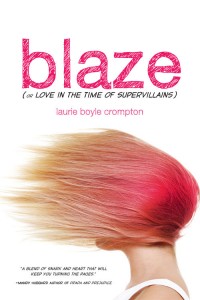
9781402273438-300 Laurie Boyle Crompton's book went through a cover and title change, from Fangirl to Blaze (or Love in the Time of Supervillains)! The final, left, reminds me of another one I love (Girl Wonder) but it's also wholly original. From font choices to that great feeling of motion, this is a great package, I think. Here's Laurie to tell its tale:

"Fangirl CoverSeeing your new book’s cover for the very first time is one of the best parts of this (long!) publishing process. I still remember getting the email from my fabulous editor just a few months after Sourcebooks bought Fangirl. When I opened the attachment the image of a girl wearing a superhero mask with pink hair and the most intense look on her face flashed onto my screen. The girl looked like she was ready to kick some serious butt. It was like no other cover I’d ever seen. I was instantly in love. (Right)

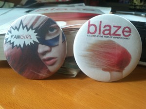
photo (69) (2)"I exchanged happy Squee-filled emails with my editor and was given permission to share the cover online. She did caution that it was non-final and said I shouldn't use it for any promotional materials just yet, but honestly, I couldn't imagine that fierce cover getting any better! Once I finished wallpapering the internet with it, I pulled out my old button-maker and got to work making the cutest buttons (left). Oh, how I loved my little Fangirl buttons. Perhaps they will be collector’s items one day because everything about my book changed.

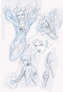
Blog Art - BlazingGoddessSketches"The title, the cover, even the release date was pushed back in order to include interior artwork. I’d envisioned artwork from the beginning and so news of all the changes brought mixed emotions. Excited for the artwork, but mourning my beloved kick-butt cover. (See artwork on right by artist Anne Cain: ©2012 Anne Cain.)

"The design team wanted to move away from the comic niche of the original cover and title. While writing the book I worked hard to make it accessible to those who don’t speak comic geek so I agreed it would be a shame if nobody outside the comic realm ever opened the book. I had to trust that Sourcebooks would come up with yet another amazing cover. And boy did they!

"My new cover is just brilliant. Don’t tell my old cover, but I’m totally gaga for the new one. It still has the hint of comic book influence with the font and subtitle, but I think the overall image has broader appeal. The pure white background sets off the bold image of the model’s windblown hair perfectly. In the book Blaze dyes her hair pink using Kool-Aid and although realistically it might be pinker on the ends I love the way her blowing hair looks just like a pink flame! She is ablaze! And the way her face is hidden fits in so well with her feeling invisible and then later wanting to hide. I couldn't be happier with the way everything turned out and I must say - the new cover actually looks pretty cute on buttons, too!"

Thanks, Laurie! I think I've made my views clear: Great cover! The first one is also cool, but the second one feels more like it bridges the comic geek-real world gap really well.

What do you guys think?

Cover Stories: Take a Bow, Paperback

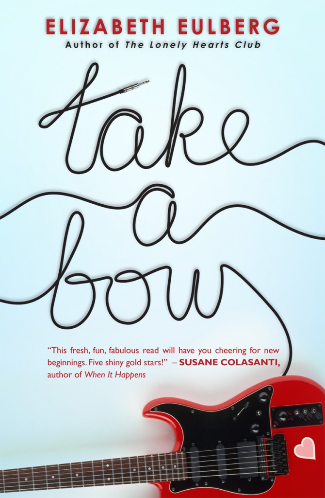
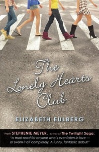
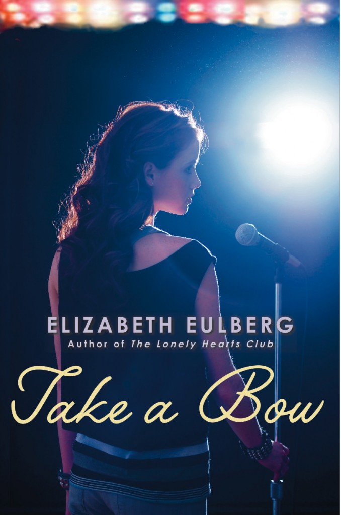
The fantastic Take A Bow-PBcvrElizabeth Eulberg shared the story for the hardcover of Take a Bow, and now the paperback is out this month with a brand new face! Here's Elizabeth to talk about the change: lonelyhearts"You'd think I would've learned my lesson by now. Back before my first book, The Lonely Hearts Club, was published three years ago, I got a call from my editor that the cover was changing. I got really nervous, but then I saw the new cover and was instantly relieved (mostly because I didn't realize they were using my idea!). It's still my favorite cover (right).

"So fast forward to a few months ago when my editor informed me that the cover was changing for the paperback release of my third novel, Take a Bow. But I love the cover (below right)! Why does it have to change? There was some sulking involved.

TakeABow

"Then the cover was sent to me and I was told that I could wait a few days to let them know what I thought. But I didn't need to. I LOVED this new cover the second I saw it. While I still adore the original, I think the new cover is perfect for the paperback: it's bright, it stands out, it has a guitar on it!

"Plus, I think boys might not be too embarrassed about picking it up. It's now my second favorite book cover of mine (behind The Lonely Hearts Club). So I promise going forward to not judge a cover until I see it!"

Thanks, Elizabeth! I like the new cover a lot too. I'm finding myself drawn to less people more object covers lately, and I love the little heart on the guitar. Adorable without being cloying.

What do you guys think of the cover redesign?

Cover Stories: Return To Me

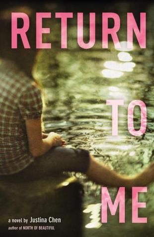
return to meJustina Chen pours her heart into her novels, as all writers do in some way. But this latest one? It really is her heart. Read the back story about the novel here, and check out the Cover Story below. Thanks, Justina. "After toiling over RETURN TO ME for the better part of two years, mostly at four in the morning when the world was dark and dormant, I took myself off to Hawaii. There, in the high-sheen sunlight, I came across a red tropical flower that arrested my heart: the ohia lehua. It wasn't the color or the shape of the flower that enthralled me, but the tenacity of that flower, growing stubbornly in a field of hardened, black lava. So at one point, I could imagine that flower in the background of the book cover. Either that or a close-up of a fairy house, which my protagonist--an aspiring architect named Reb--crafted from found materials in the garden: twigs, leaves, pine needles.

north of beautiful"All that said, I have the utmost respect for Little, Brown's art department. Amazing designers, including RETURN TO ME's Tracy Shaw, have done outstanding jobs, translating my words into a singular image for every one of my book covers. I mean, isn't North of Beautiful gorgeous with the compass rose overlaid atop Terra's cheek? [Read the Cover Story.] And Girl Overboard--could there be any other cover but that one? So I knew that I should just stay mum when it was time for the art department to get involved and allow the creative geniuses free reign over their magic.

"Smart move! My editor showed me one concept and one concept only for RETURN TO ME. As soon as I saw the pdf, I knew the concept was The One, my story's soulmate. It's not just the cover I adore, but the entire designed book right down to the perfectly architected font, page layout, and interior pages. The interleaves separating the three sections of the book are so beautifully designed, I teared up when I viewed them the first time. So you can only imagine how I felt when I held the hardbound book in my two hands: it was as if my heart had returned to me, better than before."

Thank you, Justina! I love the faded and fuzzy parts of this cover, almost like a filter that makes it dreamlike in parts, sharp in others. I also really like the light play on the water and the pink translucent lettering of the title. What do you guys think?

Cover Stories: Just One Day by Gayle Forman

just one dayGayle Forman has shared Cover Stories for her lovely novels If I Stay and Where She Went -- these were epic tales of covers tried and tweaked. Her new novel, Just One Day, has a lovely, reflective cover. And this one? It's got a pretty straightforward Cover Story: "Penguin sent me a cover.  I liked it."

Sometimes it's that simple! Yay! And I think this cover is great. For me, it captures the introspective nature of traveling, and how going on a journey can point your  mind inward and help you figure out things about yourself. Can't wait to read!

What do you guys think?

Cover Stories: Fangtabulous by Lucienne Diver


Fangtabulous
Lucienne Diver has shared her Cover Stories before, most recently the story of Fangtastic. She's back with the story behind the cover of the follow-up to that book: Fangtabulous, of course. "I would never make it as a cover artist!  I see the book like a movie playing out in my head as I’m writing it, but never as a still shot with an iconic image that would perfectly represent the book.

"Flux has always been great about asking for input on my covers.  When asked about Fangtabulous, I said, 'Gina in a graveyard with something ghostly perhaps forming from one of the gravestones would be really wonderful.' I’m pleased to have gotten the little ghost girl that Gina befriends on the cover with her.

"In the first version of the cover, Gina looked more mean girl than mischievous. (Also vapid, which isn’t Gina at all. She may be a fashionista, but not to the exclusion of all else!) Luckily, Flux was great about finding another image with the same model and changing the eye color to suit the character.

"The final version of the Fangtabulous cover is head and shoulders above the previous incarnation! I believe it’s stock photography, though how they got the ghost girl to show on camera... ;-)

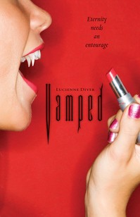
"In terms of how I feel about the cover, I’m torn. I was really so taken with the covers for Vamped and Revamped—the unique design, the very striking reds—that I was nervous when Flux took the covers for Fangtastic and Fangtabulous in a new direction. I understood the change—the Vamped and Revamped covers looked like chick-lit, and that wasn’t a big selling point, so they wanted to give the later two books an edgier feel.  I’d love to hear what readers/viewers think."

Read the Cover Stories for Vamped and ReVamped, and see those covers below:

Vamped-thumb-200x308-95 ReVamped-thumb-250x385-1897

What do you guys think of the original two covers and the new direction? I admit to loving those two first covers--the beauty aspect of lipstick and nails (hi, Lana del Rey!) feels so standout to me. The new ones, though, maybe are more accessible/relatable to readers? Thoughts?

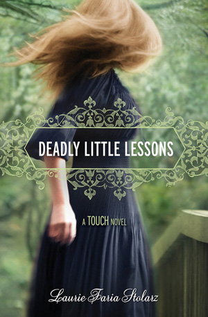
Cover Stories: Deadly Little Lessons

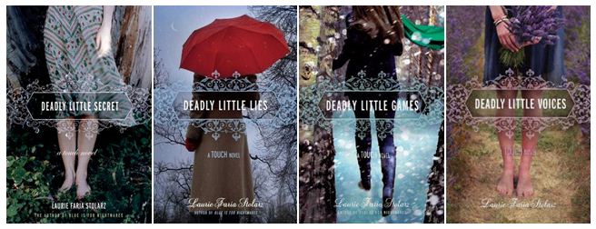
dllessons2Laurie Faria Stolarz has been here to tell the stories behind three of her previous books in the Touch series, and now book 5 is here! The covers all tie together so beautifully, I think. Here's Laurie: "DEADLY LITTLE LESSONS is the fifth book in the TOUCH series, so I already knew the cover would look similar in some way to the others in the series. All of the books feature a young girl, turned away so you can't see her face. They're all dark and mysterious, eluding to the genre of the novel. And there's a romantic quality to the artwork, too. The girl is always dressed in long dresses with wind blowing. Her hair is always tousled. The books are paranormal romance, so I think the covers work really well conveying that."

[See the first four books below]:

the deadlies

"From the first, I loved this cover. As I mentioned, I sort of knew what to expect with the girl featured on the cover, but the colors in this one - the striking emerald green - is just so beautiful to me. I have a feeling it's a stock photo, because I've seen it used on the cover of another book. This is my favorite cover in the series, for sure."

Thanks, Laurie! I love the wispy, faded tones of these covers, and the consistent title treatment is lovely too! What do you guys think?

PS-Contest alert! Enter the Karma Chameleon contest for a chance to win autographed copies of Laurie's books.

Cover Stories: Vessel by Sarah Beth Durst

Sarah Beth Durst seems to luck out with her covers. (See the Cover Stories for Drink, Slay, Love and Ice as proof.) Her latest novel, Vessel, is no exception. Here's Sarah: "I was in the parking lot at Dunkin' Donuts when the email with the cover art came in. My husband was fetching Munchkins, and I waited for three extremely long minutes for him to return to the car. As soon as he opened the car door, I shouted, 'It's here! It's here! It's really here!'

"'Wow, you must really like Munchkins,' he said.

"I shoved my phone at him. 'The cover art!!!'

"Great! What does it look like?"

"'I don't know,' I said. 'I can't look. You look.'

"He opened the jpg attachment while I scarfed down Munchkins. Then he said, 'You can look,' and handed the phone back to me.

"I looked and said, 'Eeeeeeeeeeeeeeeeeeeeeeeee!!! I love it!'

"And that sums up the extent of my involvement in the gorgeousness that is the cover art for my new novel VESSEL. The cover was designed by photographer Jaime Ibarra and the Simon & Schuster art department, and I am in awe of their awesomeness.

"I actually had a hint of the awesomeness that was coming when I ran across a journal entry on Deviant Art about the cover shoot. There's one photo of the model practicing whooshing the fabric and another of the makeup artist painting on Liyana's tattoos. (The tattoos identify her as her clan's vessel. You really, really don't want a deity to possess the wrong person.)

"VESSEL is a sweeping epic adventure set in a harsh desert land where serpents made of unbreakable glass fly through the sky and wolves made of only sand hunt within storms. Liyana is destined to be a vessel, to sacrifice herself so her clan's goddess can inhabit her body... but her goddess never comes. I think the cover art captures the novel perfectly. Thanks so much for inviting me to share it!"

Thanks, Sarah! Definitely click on the behind-the-scenes link, you guys. It's crazy how a photo shoot can translate into such an ethereal cover.

What do you think?

PS-This book is racking up the starred reviews, and you can read the first two chapters here.